15. Argument into Design: Editions as a Sub-Species of the Printed Book
© Hans Walter Gabler, CC BY 4.0 https://doi.org/10.11647/OBP.0120.15
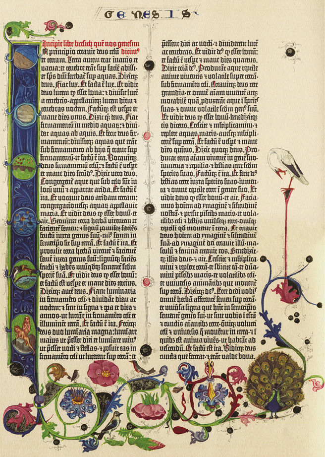
Fig. 15.1 The Gutenberg Bible, https://commons.wikimedia.org/wiki/File:Gutenberg_Bible_B42_Genesis.JPG
The invention of printing constituted, as we know, a media watershed. Essentially, too, the invention of printing brought with it the invention of the book. The codex already existed, it is true, for hundreds of years in the time of manuscript culture. Still, for my present purposes it is convenient to maintain that the invention of printing also brought with it the invention of the cultural artefact of ‘the book’, as we know it.
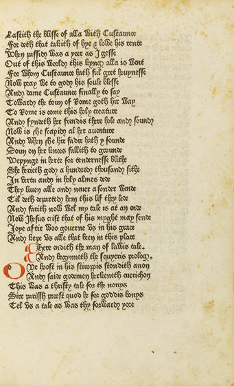
A function common to both manuscripts and books is that of transmitting written testimony of human knowledge, culture and thought—that is, the function of transmitting texts. A perennial debate among medievalists is whether, or in what manner and to what extent, the activity of scribes in the age of the manuscript should be seen (and appreciated) as an activity of editing. This cannot concern us here. But I will insist on what is non-controversial. This is that among the very first printers were also the first editors of early modern times. Gutenberg perhaps does not yet qualify as an editor-cum-printer when producing with movable type a visual replica of a manuscript of the Bible; nor, strictly speaking, does Caxton, in deploying the new medium of print to spread, say, Chaucer’s Canterbury Tales. In terms of design, we may easily see that Gutenberg still brought a medieval attitude of manuscript culture to his work: he just happened inventively to clone his high-quality scribal copy of the Bible into multiple exemplars. Caxton, too, imaged his book much like a manuscript (see Figs. 15.1 and 15.2).
Fig. 15.2 Caxton edition of Chaucer, ‘The Man of Law’s Tale’
At the same time, however, we are accustomed to speaking of the Gutenberg Bible or of Caxton’s Chaucer as editions, and of doing so, not least, for the one simple reason that they are books. With the book comes a change of perspective on transmission, a change that springs, in its turn, from a Renaissance spirit of renewal out of which the novel technique of printing was put in the service of a proliferation of cultural texts. The technique, we know, acted as a major stimulus to the printing trade, at first in Venice. From there was created a market for the texts on which so much of the intellectual renewal of the period depended. Those were the texts, in Greek and Latin, of the Ancients. Foremost among Venetian printers, Aldus Manutius organised systematic searches for manuscript copy from which to print editions of ancient texts. They are quite properly termed ‘editions’ because they generally resulted from editorial surveillance by humanist scholars. In short, the beginnings of the new medium were also the beginnings of scholarly editing.
At the very heart of bookmaking lies a desire to lay out books to express their contents.1 Books as editions in this light posed particular challenges of design. From the very beginnings of the techniques and art of printing, editions have been a definable class of books playing an important role in the emergence of conventions for shaping books, and designing book pages. What this essay proposes to do is to look into the relationship between editing and bookmaking that runs through the history of the book as cultural artefact. This means first to consider books as editions of texts and of authors (a discussion confined here largely to the Renaissance, with particular emphasis on Shakespeare, although this thread alone could be amply spun out right down to the present). Next, I will focus attention on the eighteenth and the nineteenth centuries and on books as editions accommodating in their pages the matter and concerns of their editors—to the point where, in the history of editing and the making of books as editions, the mutuality threatens to dissolve in vapidities. The third movement in this sonata on ‘Argument into Design’ will sample variations of a renewed interdependence of editorial conceptions and book-page design that sprung from a strengthening of editing as an intellectual discipline in the twentieth century.
* * *
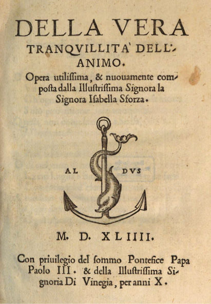
Printing the texts of the venerable Ancients in multiple copies (and with an overhaul of editing, to boot), rather than merely copying them out once more by hand in single exemplars, appears immediately to have boosted the visual aesthetics of the new medium. Aldus Manutius’s typefaces and beautifully proportioned type pages are still capable of sending shivers of delight down our spines (see Fig. 15.3). The design aesthetics, in the first place, stand in the service of both the texts and the editing.
Fig. 15.3 Aldus Manutius: a title page. Bayerische Staatsbibliothek, Sig. 4 Ph.pr. 163, http://www.mdz-nbn-resolving.de/urn/resolver.pl?urn=urn:nbn:de:bvb:12-bsb10166566-2
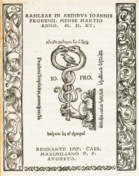
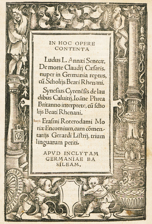
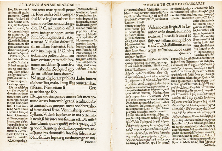
Here, for instance, are colophon, title-page and a two-page opening of a book of 1515 (see Figs. 15.4–15.6),2 not from Manutius and Venice, but from the major Basle printer and publisher, Frobenius, with the age’s and the new invention’s spirit of exploration behind it: the edition in print of a then just freshly rediscovered political satire on the Roman emperor Claudius, Apocolocyntosis divi Claudii, attributable to Seneca the Younger, and edited by Beatus Rhenanus, a close associate of Erasmus of Rotterdam.3 In the layout of the two pages of text, variably sized in space and type size, as well as variably surrounded by commentary columns printed in both Latin and Greek, the sample shows how the printing of a book as an edition met the challenges of harmonizing typography and content in the two dimensions of the book pages. The pages invite a traversing not linearly only, but relationally, or in a manner of ‘radial reading’, as Jerome J. McGann has termed such deployment of our reading skills.4
Fig. 15.4 A quarto printed by Johannes Frobenius, Basel, 1515: colophon.
Private collection
Fig. 15.5 From same quarto: title page/contents. Private collection
Fig. 15.6 From same quarto: opening c3v-c4. Private collection
Amazingly, early printing was thus quick to realise what are, in essence, hypertexts. To us, ‘hypertext’ is a buzzword of the late twentieth century. What it implies is a mode of relational rather than linear reading, of cross-referencing a text both inside and outside the given book rather than merely taking it in consecutively from upper left-hand corner to bottom right-hand corner of each page, and from cover to cover of the book. With intelligence to trigger it, ‘hypertexting’ is a fundamental mode of organising knowledge in given media environments. The mode is older than the book. We may observe it, for instance, in the Middle Ages long before the technique of printing was thought of (in Europe). We see it there, that is, if we cast our eye beyond the transmissions of literary genres and take into account, too, say, the proliferation of the Bible in manuscripts, or of chronicles, or of law texts.
From a manuscript page of Canonical Law (see Fig. 15.7) we perceive clearly the principle of hypertexting.5 The areas and units of scripted text on the page, it is true, are hierarchically organised. At the centre stands the Law Text itself in two larger-lettered columns, divided and framed by the white space of gutter, margins and footer. We register the offsetting function of this white space inside the page, even though, at the same time, it accommodates sets of marginalia in italic fine script. Columns of commentary extending to the full height of the page frame the centre in its entirety. From the outside page-length margin beyond the right-hand commentary column, moreover, marginalia speak yet again to the page’s centre. We know how to read such an arrangement—we are culturally conditioned to read not only consecutively, but relationally as well, and therefore to recognise the physical arrangement before us as a materialisation and enactment of the dialogicity of our own reading process.6 Yet what this page assumes us to be capable of, too, is multimedial reading. For what it offers are not words only, is not merely the text of the Law, but a prominent image of a scene of a mass offering in supplication for justice. Far from being merely illustrative of the page’s verbal content, as we in our modern logocentricity might misunderstand it to be, the image is to induce us, rather, to contemplate that content further—or else, to start our reading from it, and only then to enter the verbal text for an intellectual grasp of the whole content of the page before us. Fully integrated into the process of relational texting and reading, the image refracts imaginatively the literal sense of the legal utterance—or, as we might perhaps say, hypertextualises the page before us multimedially.
Comparing this example to the instance of early printing we have already looked at, we recognise that the print medium from early on shaped itself into patterns patently designed to support processes of relational reading. If from the very beginnings of the techniques and art of bookmaking, editions have been a definable class of books, which have played an important role in the emergence of conventions for shaping books, and designing book pages, then the printer-publishers like Manutius or Frobenius had templates to fall back on when they fashioned the new medium into designs that laid out editorial arguments, and supported processes of relational reading in and of editions. Behind the printers’ designs lie not only conventions of page display older than the art of printing. Behind them lies also the intellectual force of editing. To be materially structured, or patterned, onto pages in manuscript and print, texts must have been pre-patterned by editors: that is, the editors’ arguments must have been appropriately articulated materially and (as we would nowadays say) tagged into the source matter, so as to generate the designs to be given by scribes or typesetters to the edition pages.
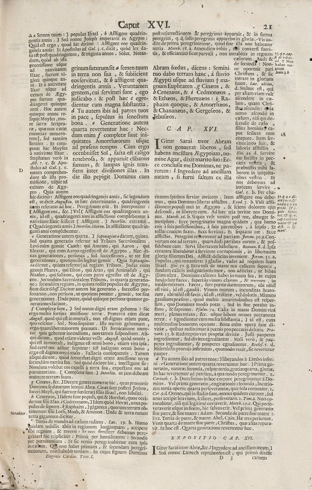
At the level of the print surface, this could turn into something rather drearily explicit, as is apparently the case in Fig. 15.8. Yet if we do not cling to the customary subordination of the commentary surroundings as they frame the text situated in the middle of the page’s upper half, but instead, by way of experiment, reverse the perspective, we suddenly see something else. We perceive that the contents of what, in the page design, are typographically the two main columns of the page before us (its ‘notes’), may be understood as a reservoir of knowledge from which the page’s ‘text’ could be said to be constructed.
Fig. 15.7 Gregor IX, Decretalium Liber, V Cod. 2040, Fol. 168r. Courtesy of the Österreichische Nationalbibliothek, Vienna
Fig. 15.8 Hugo de Sancto Charo, Biblical commentaries, 1703.
Courtesy of the Herzog August Bibliothek, Wolfenbüttel (Germany)
This may be a preposterous view to take of the actual text on which the page is centred. It is a biblical text, entitled (one would have thought) to priority at any time. Yet in truth, one could equally class it as a hermetic text condemned to utter incomprehensibility without such sources of knowledge—factual, theological, cultural, lexical and semantic, or contextual—as are here adduced to construct its meaning in all its layers and dimensions. The logical consequence of this, turned into design, is that, typographically, the biblical text forms merely a strictly circumscribed two-column inset, in the middle of the page’s upper half, into the commentary’s display of learning. This reversal of our sightlines gives us the essence of what an edition is, and what editorial presentation is all about: it is an achievement, often scholarly in nature, of networking texts and knowledge. The editor’s intelligent predisposition, via the typesetter’s intelligent disposition of his skill in typography, ultimately enables the intelligent reader and user to assimilate knowledge from an edition’s design.
Editions in books opened up possibilities for experimentation and material realisation that went beyond simple inscriptional copying from a source to a target exemplar. Categorizing from our illustration, as well as from our experience with editions at large: what is it that an edition demands of the page, of the left- and right-hand-page opening, and of the book as a whole? For basic reading, it should provide a text. This, in an edition, is by definition an edited text. What this means is that the text provided in the edition differs in textual, and often also presentational, detail from text (and presentation) in antecedent manifestations. Hence arises the edition’s obligation to register the differences. Alongside the text, in other words, the edition must, or should, also give an apparatus. Now, the task of the apparatus is not merely to report the textual differences in a transmission, but also to account for them and to justify their treatment in the establishing of the edition text. As such, the establishing of an edited text arises from text-critical analysis and editorial reasoning: this constitutes the argument underlying the editing and should be—had better be—logically consistent and coherent as a narrative. It is the complex editorial argument, together with the edited text, that needs to be given room and intelligible expression in the edition as book. The argument’s several dimensions may find expression at the medial interface, on the book page, in either the semiotics of codes and symbols, or in natural language—with significant cross-referencings between them. Suitably accultured to editions in book form as we are, we realise the need to be capable of reading the complex semiotics of an edition in print. These, in turn, are very much the result of converting an editor’s organisation of the edition’s materials, explanations, and local as well as encompassing argument into the typographic as well as topographic arrangement of the book pages—in other words, of designing the book to represent and render intelligible the editorial argument. The typesetter, typographer and book designer—whether one person, or two, or three, or a veritable shop department each—assume their share in turning an edition into a book.
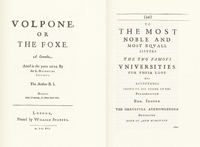
These are considerations essential at the material and content level of the book as an artefact. Beyond the specifics of materiality and content, there is of course also the book’s ‘self-awareness’ to be considered, its capacity for broader claims that equally tends to play a part in public bids for attention that books make by classing themselves as editions. Ben Jonson, for one, underscored his role as a public personality by publishing his writings—or publishing himself, as one might also say, dressed up in, and as, his oeuvre. He did so in 1616 with a volume in folio, whose contents he systematically edited, either from unpublished manuscripts, or from earlier individual printings which at times he even rewrote (see Figs. 15.9 and 15.10). So attuned are we to a hierarchy of book formats, and to the standing of any given format within that hierarchy, that we accept Ben Jonson as, so to speak, commensurate with his folio—the volume being at once both the objective and the fulfilment of the personal, or personality, claim. As a pars pro toto, acknowledging the acceptance given to Volpone by the sister universities, Oxford and Cambridge, Ben Jonson thus tellingly dedicates to them ‘both it and himselfe’ (see Fig. 15.10).
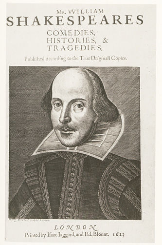
The portrayal of the author as a public figure in the guise of his published oeuvre may well be seen as a peculiar manifestation of Renaissance anthropocentricity. In a context like the present, a reference to the Ben Jonson folio of 1616 tends to lead instantly to pairing it with the Shakespeare First Folio of 1623 (see Fig. 15.11).
Fig. 15.9 The Workes of Beniamin Jonson, 1616: title-page
Fig. 15.10 The Workes of Beniamin Jonson, Volpone: part title and dedication page
Fig. 15.11 William Shakespeare, First Folio, 1623: title-page
Fig. 15.12 William Shakespeare, First Folio: ‘A Catalogue’
The title-page of this volume of surpassing cultural fame gives us a portrait of Shakespeare—rather than, say, as in the Jonson folio, the scripted name of the author framed by a triumphal arch (see Fig. 15.9). Thus it offers direct visual evidence of the book’s author focus—to which equally the subsequent commendatory poems bear witness, chief among them Ben Jonson’s panegyric. The Catalogue page, in its turn (see Fig. 15.12), that is: the volume’s list of contents, manifests the printers’ skill in turning editorial argument into design. It does so by composing onto just one folio page a survey of the contents to follow over the 900-and-something subsequent pages. The layout of the Catalogue is the work of an accomplished typesetter in the printing-house. But the matter to display was given him by the editors, for the Catalogue embodies an argument. It proposes that Shakespeare compartmentalised his writings distinctly into Comedies, Histories, and Tragedies. This, be it noted, is the dominant conception of his oeuvre under which we still live. Thus decreed by the Folio editors, it materialised into typographic design at the hands of a Folio compositor responsible for setting the Catalogue. Over the centuries, it has become engraved ever more deeply in next-to-innumerable Shakespeare editions, and consequently adopted, too, as an encompassing matrix for Shakespeare scholarship and criticism.
Not until 1986, at long last, did the editors of the Oxford Shakespeare (Stanley Wells, Gary Taylor and their associates) untie the knot their earliest predecessors had tied. They arranged their edition no longer in terms of genre, but of chronology. Nobody before had ever attempted anything like this over the four centuries of Shakespeare transmission deriving from the First Folio. That the First Folio’s ‘Tragedies’ section, for instance, is so strangely framed by the apparent non-tragedies Troilus and Cressida and Cymbeline (of which Troilus and Cressida, moreover, is even missing from the Catalogue), never led to manifest editorial measures. Rather, on grounds that the Folio editors must have erred, these plays were reasoned out of any ‘tragedy’ status, purely on critical terms. Conversely, they were, off and on, actually reasoned into such a status by the pull of the Folio’s generic grouping. The generic matrix of the First Folio as such always held water—until the redesigning of Shakespeare as book in the 1986 Oxford edition. Furthermore: by unlacing the stays of the Folio’s arrangement by genres, the Oxford edition was free at last—and was, as far as I can recall, the first Shakespeare edition ever to exercise the liberty—to establish to the full, in an edition, that William Shakespeare, beyond authoring the plays canonised in and by the First Folio, was also in fact author, or part-author, of other plays not therein contained, as well as of brief epics and lyric poems (the 154 sonnets among them). The Oxford one-volume text edition contains the entire Shakespearean oeuvre in all its genres. The way this edition now images Shakespeare differs fundamentally from the image of the author conveyed by Shakespeare’s own contemporaries by means of the First Folio.7
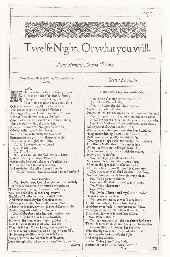
To return to the First Folio itself: more yet can be said about how the presumptive conceptions and arguments of its editors were turned into manifest book design. The editors were a sizeable consortium. On the one hand, they were members of Shakespeare’s own theatre company. On the other hand, the consortium included the several printers sharing the entrepreneurial risk of monumentalizing Shakespeare posthumously in that Folio volume. As likely as not, it was mainly the publishers who, from a point of view of the art of printing, urged a bookish disposition of the texts themselves at the ‘interface’ level of the book pages. An instance of this disposition is to be seen in the fact that the plays, in the First Folio, are (with varying insistence) divided into acts and scenes. This is a pattern of division that would have fallen to the printing-house typesetters, anyhow, to put into practice (see Fig. 15.13). The introduction of act-and-scene divisions goes together with the literary (and ultimately ‘classical’) claim made for the Shakespearean oeuvre by compartmentalising it into the three generic categories. Shakespeare, the playwright, thereby became an author under a literary rather than a theatrical dispensation. Consequently, too, he became a writer containable in a book, and in book conventions of textual representation. ‘Shakespeare the book’, moreover, was designed to be read: the divisional patterning of the book’s pages is the product of the typographical skill employed to favour a reading encounter with his plays.
Fig. 15.13 William Shakespeare, First Folio,
Twelfe Night, Or what you will: opening page
The new bid for Shakespeare’s texts as book texts, and as reading texts—which, when so regarded, is so clearly an editorial bid—becomes most apparent (even just to the eye) when one compares the printing of the First Folio with that of any given printing of individual plays in Quarto antecedent to the First Folio. The quartos are palpably dramatic scripts-in-type, aides-memoires to the plays’ oral performance on the stage. To have turned dramatic scripts-in-type (that is, the pre-existing quartos), as well as the playhouse store of Shakespearean plays in manuscript, into a fully-fledged book, the First Folio, may thus be credited to the combined editorial efforts of actors as playhouse literati, of generically and textually aware redactors in playhouse and printing-house, and of classically educated publishers and their advisers—among whom, who knows, even Ben Jonson may all the time have been hiding; he, after all, was the most aware among Jacobean authors of poetic and poetological traditions and conventions.
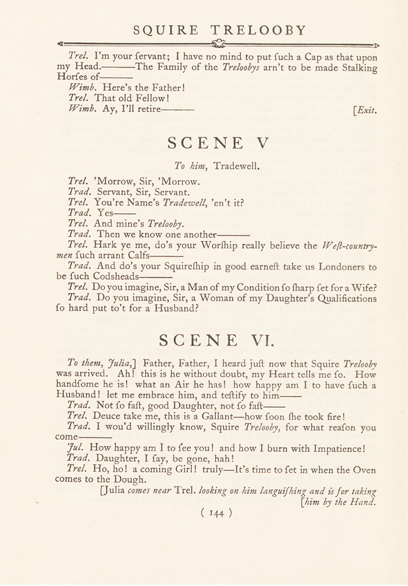
In the research and writings of D. F. McKenzie may be discerned a significant parallel to the notion of ‘Shakespeare the book’. McKenzie investigated, for material a hundred years later, the conversion of William Congreve’s dramatic oeuvre from its first-order appearance in play quartos into its second-order appearance in Congreve’s collected works, as dramatic texts to be read.8 While Shakespeare could not himself ‘set forth, and oversee’ the collection of his dramatic writings into the Folio volume of his oeuvre, being, as his editors phrased it, ‘by death de-parted from that right’,9 the editorial bid was, with Congreve, as it was with Ben Jonson, the author’s own. Congreve saw to it that publisher and printers realised in typographical design his authorial, as well as editorial, awareness that the plays were now offered up for reading. McKenzie also named the typographical pattern followed in the conversion—a pattern rendering palpable, in the design of print, essential structural features of the texts presented. While the texts were, and fundamentally of course remained, dramatic texts of an overarching continuity, the pattern adopted for their presentation was densely articulated into sub-units inviting frequent pauses in the reading—and resulting in satisfying type-page design.
Fig. 15.14 William Congreve [Works, ed. M. Summers, 1924], Squire Trelooby:
scene divisions in print
This patterning amounted to the introduction into Britain of an innovative mode of scene division, articulating dramatic action into scenes conventional in the French printing tradition. The traditional English convention of marking scene divisions only at so-called ‘moments of clear-stage’ favoured, as scenes, self-contained units of action and theme. The French convention, by contrast, recognised a new scene with every main entrance or exit of characters. Thus, the French sense of the scene favoured a character orientation over thematic structuring. It privileged the movement of characters through the play, and in and out of the theatrical space of the stage. The typography of French dramatic printing rendered such progression perceptible to readers of a play in a book as it would be visually immediate to an audience in the theatre. Congreve’s resorting to the French convention for printing the book (and reading) edition of his plays—a ‘neo-classical’ convention in terms of British printing traditions—amounted to an authorial as well as editorial reconfiguring of the shape of his plays.
* * *
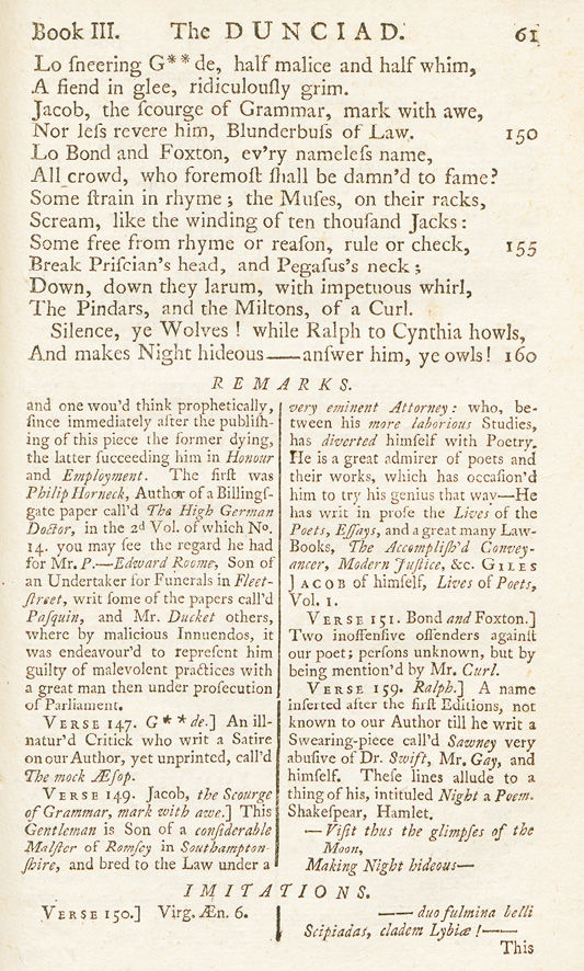
From texts and authors, and aspects of editorially instigated book design mainly in their several and combined service, we may proceed now to areas of direct interdependence between editors and the book pages on which they seek expression for their co-textual labour. The format of learned editions as printed in books, developed as it had been for texts predominantly in the ancient languages in the course of the first couple of centuries since the invention of printing, had by the early eighteenth century become both so standardised and so notorious, that the age’s greatest wit, Alexander Pope, could mercilessly use it as vehicle for his all-round satire of the dunces of the age, the Dunciad (see Fig. 15.15).10 Looking at this page, we discern that, with its internal references, the poetic argument carries hypertextually, as one might say, from top-of-the-page text to footnote text, and back again—as, with its external references, it indeed carries out of the page, too. In this manner of presentation, the Dunciad is an eminently writerly, or should one properly say: printerly, work. Without the design matrix of editions in print, it would have been unrealisable, even unthinkable.
Fig. 15.15 Scriblerus (Alexander Pope), The Dunciad,
Variorum, London, 1729, p. 61, n. 3
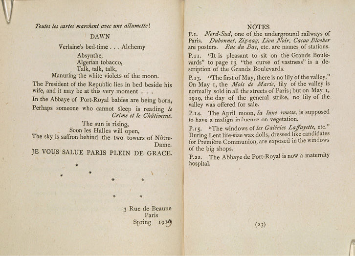
I will pick up below on the matter of the footnote space in editions, but I want to indicate briefly a path I shall not take into the thorns of this particular rose garden. Poets of later times come to mind who integrate notes into their creations on paper: Coleridge, with his marginal glosses to the 1817 text for the Rime of the Ancyent Marinere (a restyling, that is, almost twenty years after the poem’s first publication); or T. S. Eliot with the notorious notes to The Waste Land—a ‘first’ in modernist poetry, we always thought, until alerted to Hope Mirrlees’s long poem Paris of three years earlier, typeset by Virginia Woolf, printed on the hand press on the Woolfs’s dinner-table and published by the Hogarth Press in 1919 (see Fig. 15.16).11 To my knowledge, Eliot never indicated that he had seen and imitated this—yet his connections were close enough, both to Virginia and Leonard Woolf and the Hogarth Press, and to Hope Mirrlees (for whom, a fellow-convert to Catholicism, he in later years became the literary executor), that the parallel would seem more than a mere coincidence.
Fig. 15.16 Hope Mirrlees, Paris, 1919: eked out by a page of notes
Back to the eighteenth century. The practice of editing had expanded beyond Latin and Greek. In Britain, it was above all the Elizabethan and Jacobean dramatists who were deemed worthy of the honour of canonisation in editions, chiefly among them Shakespeare, or, among poets, John Milton. The scholar who took pride in editing Paradise Lost was Richard Bentley. He was an outstanding editor of Latin authors; he edited Milton however much according to the same recipes he had developed and applied to his editing of the Classics, discerning faults in the original texts (the first editions of the epic’s two versions of 1667 and 1674, respectively) that he, Bentley, as the superior posthumous critic and editor felt capable of righting by conjecture, and emending. The format of the typical printed pages of conventionalised editions allowed him to argue his Milton in footnoted lists of variants, annotations, and commentary.
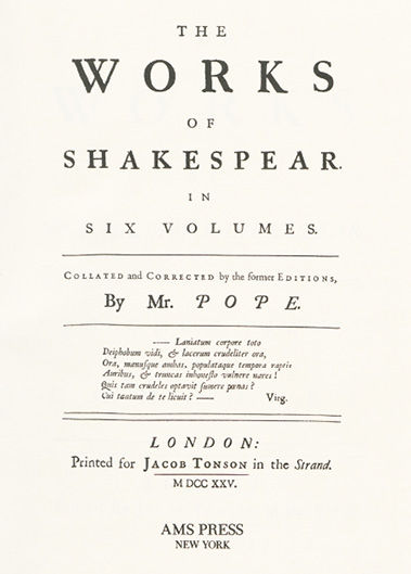
Shakespeare editions proliferated in the Augustan age. They now without exception paired the author’s name with an editor’s name: Rowe, Pope (see Fig. 15.17), Theobald, Warburton, Hanmer, Samuel Johnson, and the rest. The editions’ title-pages thus argued that no longer just the text, but importantly the editor as well stood as guarantor for the author and the oeuvre. Each editor, so personalised, had his own argument designed into his edition’s layout. An editorial order of the day was to modernise, to bring authors and texts of the past into the fold of the present. This was so general an attitude that, in fact, it was largely implemented silently, as throughout, for instance, with spellings and typographical conventions such as the patterns of capitalization characteristic of the times. (The contemporising by modernisation of spellings and word forms has remained a feature to this day of editions of Shakespeare, more so than of many of his literary and dramatic contemporaries.) All eighteenth-century editors, moreover, held in one way or another that Shakespeare’s versification could not possibly have been as irregular as it appeared from the earliest printed tradition. This assumption made it the editor’s natural duty to regularise Shakespeare’s verse—and to invoke Augustan prosodic norms to do so. (Much of the eighteenth-century regularisation of Shakespeare’s verse is with us still.) In contrast to the orthographic and prosodic alterations, verbal changes did not usually go unsignalled. Rather, they were emphasised and argued in footnotes. A culture of editing acquired in academic training following the example of ancient texts, combined with the typographical conventions developed by the printing trade to answer to this culture in the layout of books, thus began to introduce the footnote into editions of Shakespeare.
Fig. 15.17 Alexander Pope’s Shakespeare edition, 1725: title-page
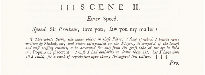
This combination provided the grounds for (for instance) Alexander Pope, sensitively, judiciously and normatively judgmental as he was, to restyle, and (with the best of intentions) often enough to rewrite Shakespeare (see Fig. 15.19)—or to voice his regret when editorial ethics won out over his authorial instincts (see Fig. 15.18).
Fig. 15.18 Pope’s Shakespeare: editor’s distancing footnote
Fig. 15.19 Two pages from Pope’s Shakespeare
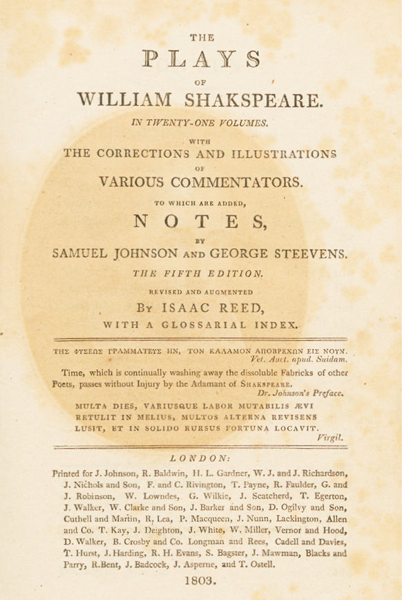
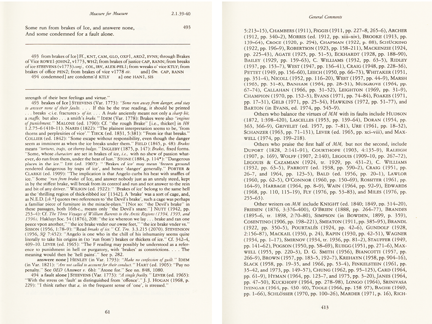
Footnotes in editions, as we know them, have in the main two purposes: to report and discuss readings, so as to justify those chosen for the edited text against those rejected; and to discuss and problematise meanings of words, and the meaning or meaning potential of the text. The eighteenth-century gentlemen editors engaged predominantly in discussions of meaning, thus valuing the communicative dimension of the footnote. The footnote space in their editions became the sparring ground for debate (with luck, spirited; frequently controversial; and sometimes, stimulatingly, both) for the benefit of the educated dilettanti of the age, chief among whom were the editors themselves. The footnote space in these editions was, as it were, the period coffee-house transposed onto the printed page. Yet who wanted (or could afford) to bring together the whole array, say, of contemporary Shakespeare editions on their bookshelves and desks? The difficulty was solved with the edition cum notis variorum: the Variorum edition. The First Variorum, compiled by Samuel Johnson and George Steevens, was published in 1803 (see Fig. 15.20) as an assembly of editorial notes and commentary culled from the Shakespeare editions of the eighteenth-century editors (see Fig. 15.21). The First Variorum’s third edition of 1821 marked the end of a characteristically eighteenth-century commentary culture around an author, and an author’s text, in editions that gave shape, accordingly, to the books in which they appeared.
To move forward in the note space from the late eighteenth century to the late nineteenth and into the twentieth century means to move from footnoting as the product of cultured communication to footnoting of mass provision—and at times, alas, even of mass destruction. It means to move from the age of reason to the age of positivism. As a book form, the Variorum edition was resuscitated towards the end of the nineteenth century by Horace Howard Furness, father and son, in the United States. What they revived had mutated in its underlying conception since Johnson and Steevens; and as we know, it has continued to change as the edition has evolved into today’s New Variorum under the auspices of the Modern Language Association of America. In terms of design, the edition’s volumes are focused once more on the note space.
Fig. 15.20 Isaac Reed’s revision of Johnson and Steevens’
[First] Variorum Shakespeare, 1803: title-page
Fig. 15.21 [First] Variorum Shakespeare: a random page opening
Fig. 15.22 The New Variorum Measure for Measure, 1980: random apparatus and commentary pages. All rights reserved
The text may almost, or even entirely, be crowded out from the page (see Fig. 15.22, left). The mode of design thus becomes what Stephen Dedalus, in James Joyce’s Ulysses, satirises as: ‘[f]ive lines of text and ten pages of notes about the folk and the fishgods of Dundrum.’ (U 1, 365–6612), which suggests not an eighteenth-century coffee-house mode of socialising over the fine points of meaning of texts, but rather a drowning of text and work and author in heavily positivist scholarship. The notae variorum in the New Variorum edition assemble erudition generated in a professionalised field of academic pursuit—the Shakespeare industry (see Fig. 15.22, right).
There is a dark side to the positivist approach: it can appear, or become, thoughtless. And needless to say, the phenomenon is not confined to the age of positivism. Alexander Pope, for one, castigated thoughtlessness in editions even in his day (witness The Dunciad). It becomes manifest always in the effect it takes at the surface, at the interface of the medium: that is, in the design, or lack of it, of the book pages. At the high tide of a positivist conducting of scholarship, it could become rampant; in editions, it took form particularly in what cannot but be recognised as unreasonable (because unreasoned and unreasoning) compilations of variants in apparatuses. In German, these are called ‘Variantenfriedhöfe’—‘cemeteries of variants’. In cemeteries of variants the relationship between editorial argument and book design has sunk into the doldrums: editorial argument has lost the reasoned grip on variant materials required of it, and the making of books has become reduced to routines of reproduction. Thoughtless editing issues in correspondingly thoughtless, typographically dead design. The making of editions as books has become reduced to routines of assembly-line production.
* * *
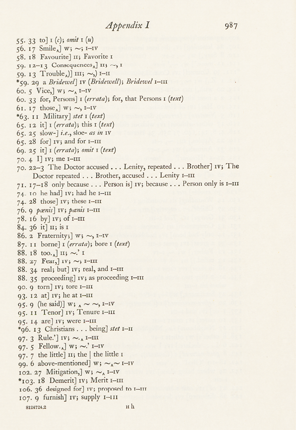
What remains to be considered are counter-moves, in the twentieth century, in response to the dissociation, in functional terms, of editorial endeavour and book design just observed, and this will be illustrated with examples from the fields both of Anglo-American and of German scholarly editing. From the recent past, we know the popularly voiced reaction to apparatus-heavy editions: nobody wants to read texts in editions with footnotes. In the United States from the middle of the twentieth century onwards, Fredson Bowers was a main mover in turning the sentiment into a new look in book design for critical editions. Edited texts were provided as clear-text presentations on uncluttered pages; the apparatuses related to the textual editing went into appendices at the back of the edition volumes. Under the aegis of an otherwise militant rift between scholarship and criticism, the ‘new-look’ editions were the gift of the scholars to the critics who, under the dispensation of the New Criticism then in fashion, were a priori apt to take texts as given. The New Editors, on their part, set the highest store by the establishment of texts and gave little or no attention to those traditionally fundamental critical endeavours of editorial scholarship, annotation and commentary. If not abandoned altogether, these became paratextual, in that they were rigorously relegated to the backs of volumes or into separate volumes. Even if so sequestered, it is true, these sections of the ‘new-look’ editions are anything but thoughtless. In, say, Bowers’s Dekker, or his Marlowe, his Dramatic Works in the Beaumont and Fletcher Canon, his Fieldings (both Joseph Andrews and Tom Jones), or his Stephen Crane, one invariably finds prefaces to the edited texts that rigorously argue the given edition’s rationale and procedure; to them, in turn, the apparatus lists at the end of the edition volumes are systematically correlated. In the apparatus lists, argument is expressed through a shorthand of symbols which condenses, by its semiotics, the editorial reasoning following from the analysis of the textual transmission and its stemmatics. Correspondingly, the apparatus symbols support and justify, too, the editorial decisions underlying the establishing of the edited text (see Fig. 15.23). The intricate meta-textual semantics of the apparatuses in Bowers-type editions deserve renewed attention today for their potential of reimplementation in the mode of relational links in the digital medium. As yet, the intellectual substance of their stringent formalisations seems too little recognised, due in considerable degree, no doubt, to the relegation of apparatuses and commentary to the realm of the paratextual. At their clear-text surface, the ‘new-look’ editions hearken to an ideology of scholarship erased. Yet in this manner, paradoxically, they too turn editorial argument into design, by endeavouring, as they do, to make a scholarly edition look just like any other book.
Fig. 15.23 Henry Fielding, Joseph Andrews, ed. by Fredson Bowers, 1974:
apparatus page. All rights reserved
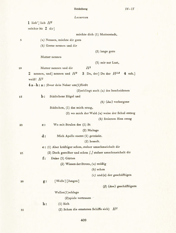
German editing in the twentieth century similarly departed from the breadth and comprehensiveness inherent in the traditions of the scholarly edition through its interrelationship of text and apparatus, annotation and commentary, which thus contextualised one another. Editorial scholarship here, too, focused mainly on the establishment of edition texts. Yet the modes of doing so differed significantly from those adopted in Anglo-American editing. They sprang from the real history of texts and works and led increasingly towards a genetic orientation in editing. The postulate was that states of textual variation and processes of textual development, whether over stretches of distinguishable versions, or recognisable as layers of composition on draft manuscripts, deserved to be edited, and to be designed into book pages, in their own right. In consequence, a new type of edition entered the field, namely the Handschriftenedition, or ‘manuscript edition’. Friedrich Beissner’s edition of the poet Friedrich Hölderlin, begun in the 1940s, was the first to kindle an awareness of what it might mean to adopt a genetic orientation in editing. Beissner’s conception of textual genetics was teleologic: it was predicated, that is, on the assumption that authors wrote, and texts progressed, towards pre-intuited and pre-planned goals of perfection. This basic idea informed the layout of the apparatus pages in the edition as book—for Beissner in his way, as Bowers in his, separated clear reading texts and apparatus. In the apparatus—constituting here a survey of changes in manuscript—the stepped-up presentation in print models the progression of the writing through fragments of text (see Fig. 15.24).
Subsequently, Hans Zeller, entering the field of genetically oriented editing a couple of decades after Beissner, saw textual genetics much more in terms of the processes of writing and the oppositions in variation themselves.13 Zeller’s chef-d’oeuvre is an edition of the Swiss poet Conrad Ferdinand Meyer (see Fig. 15.25). The ways Zeller attempted to visualise typographically the processes and oppositions of writing and variation differ markedly from Beissner’s. Two features stand out as essential in Zeller’s conception and inform the deployment of typography for his editorial presentations. One arises from the basic tenet that acts and processes of writing and revision always take place in context. This notion materialises on the printed page by way of what he terms the ‘integral apparatus’: apparatus is no longer excerpted, reading by reading, from the edited text and placed, by reference and lemma, in footnotes or at the back of volumes. Its indications of change, rather, remain embedded in the flow of a text as a whole that provides the invariant context for changes of composition and revision.
Fig. 15.24 Friedrich Hölderlin, ‘Heidelberg’, ed. by Friedrich Beissner, 1951: ‘Stepped-up’ apparatus of successive readings (cf. Fig. 15.27). All rights reserved
Fig. 15.25 Conrad Ferdinand Meyer, ed. by Hans Zeller, 1975: synopsis of a textual progression through successive documents. All rights reserved
Zeller’s mode of representation of textual flow and change within invariance is synoptic. The scholarly editing proper takes place and presents itself through design in the edition’s synopses. These may be synopses either of the several layers of writing in a draft, or synopses of the progression of variation through a succession of documents, both pre-published and published (this is what we have before us in the illustration). Typographic patterning is deployed to indicate the acts and processes of writing and revision. Bold-face is resorted to, for instance, both to mark out invariance and to highlight textual states that, past initial fluidity, attain stability (in fair copy, say, and eventually in publication). Patterning is thus achieved, on the one hand, by means of typeface (lean as opposed to bold, for example) and perhaps font, as well as by topographical positioning (a reading and its variants will form a column).
But on the other hand, there is also an array of symbols spread over the pages whose meaning is less obvious to the eye. These symbols, as a beyond-text extension of the ‘integral apparatus’, represent, on the printed page, the second essential feature in Zeller’s conception. He claims that the meta-textual semiotics on the printed page should have the power to allow the user of the edition to reconstruct the document of original inscription behind the editorial representation—and to reconstruct that source with a double purpose: namely, both to double-check and, so to speak, adjudicate the editor’s textual decisions; but also to study the authorial writing processes themselves. Images of the actual documents, however, were not supplied—it was, at the time the Meyer edition was conceived, both technically and commercially prohibitive to reproduce them, save in very small numbers. Instead, it was the edition’s grand achievement to abstract the documents into their meta-symbols. It was, at the same time, its great weakness. For in practice, the powers of reimagination that these meta-symbols called for were patently beyond the capabilities of both textual scholars and critics.
The next stage of editorial argument converted into book design came, in Germany, with the second significant Hölderlin edition of the twentieth century. Dietrich E. Sattler, its chief protagonist, answered two challenges raised by Beissner’s Hölderlin edition, on the one hand, and Zeller’s Conrad Ferdinand Meyer edition, on the other hand. He favoured a view of Hölderlin and Hölderlin’s poetry that differed from Beissner’s, in that he prioritised what he perceived as a non-teleology of the poet’s oeuvre, significantly involving much undirected and unachieved writing; he insisted—contrary to Zeller—that the writing processes could ultimately be perceived and studied only against the visual presence of the documents themselves in which they took place.
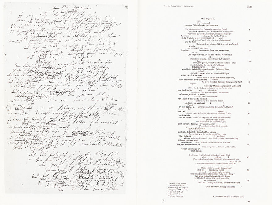
Fig. 15.26 Friedrich Hölderlin, ‘Mein Eigenthum’, ed. by D. E. Sattler, 1984: visualisation of writing process. From vol. 4 of Sämtliche Werke, Frankfurter Ausgabe. © and courtesy Verlag Stroemfeld/Roter Stern, Frankfurt am Main and Basel, all rights reserved
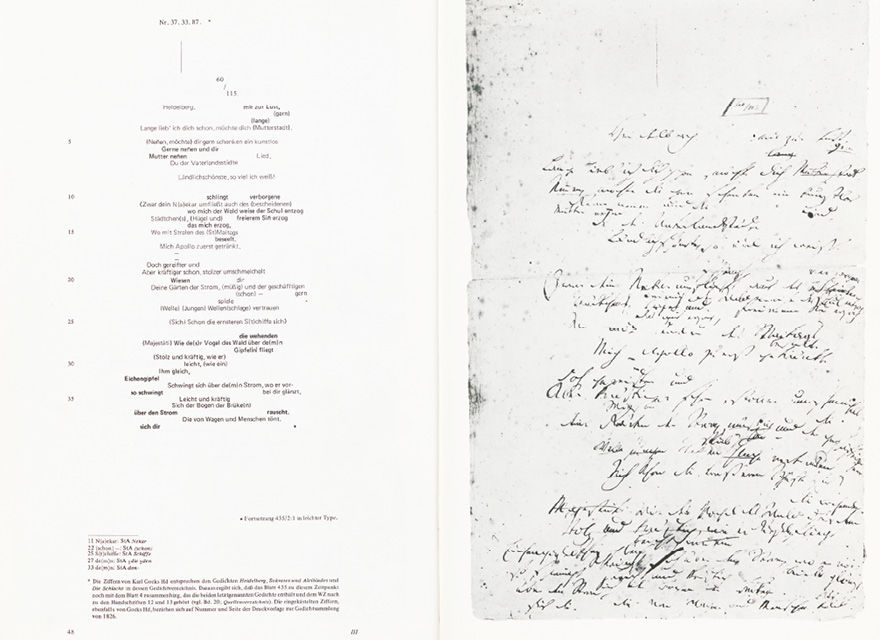
Fig. 15.27 Friedrich Hölderlin, ‘Heidelberg’, ed. by D. E. Sattler, 1984: visualisation of writing process (cf. Fig. 24). From vol. 4 of Sämtliche Werke, Frankfurter Ausgabe. © and courtesy Verlag Stroemfeld/Roter Stern, Frankfurt am Main and Basel, all rights reserved
Sattler’s ‘Frankfurt’ edition consequently juxtaposed image and transcription (see Fig. 15.26), as for instance with this multiple-layered holograph draft presented in facsimile, and face to face with a transcription, correspondingly layered typographically. Again, it was an altered concept and editorial argument that resulted in an alternative design for its presentation, and thus it is that the very backbone of the Sattler Hölderlin edition are its facsimiles of the poet’s manuscripts. (To highlight the distance measured since the Beissner’s Hölderlin, Fig. 15.27 illustrates the draft of the poem Heidelberg from an opening in Sattler’s edition. The right-hand page shows the facsimile, and of this, the left-hand page gives an integral apparatus transcription, in contrast to which Fig. 15.24 illustrated Beissner’s ‘stepped-up’ apparatus.)
* * *
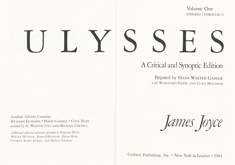
At this point I believe I may extend the discussion to include my own edition of James Joyce’s Ulysses, and to triangulate it with the Meyer and the Hölderlin. This edition is called a ‘Critical and Synoptic Edition’ (see Fig. 15.28). From the terms of the title follow the main features of the edition’s design as a book. It presents Joyce’s text twice, on facing pages (see Fig. 15.29). My initial idea was to provide parallel volumes. It was the publisher, Gavin Borden of Garland Publishing in New York, who wanted to juxtapose the double presentation on facing pages—which meant that it was the publisher who thus determined the design of the book. To achieve the double presentation, we employed a double mode of editing: a genetically oriented one to assemble the left-hand pages, and a critical-editing mode to generate the right-hand-page reading text from the materials set out on the left-hand pages.14 The left-hand-page display is formatted as a synopsis of the development of the text from Joyce’s fair copy via typescript and proofs (at times up to twelve successive sets of proofs) to the first edition.15
Fig. 15.28 James Joyce, Ulysses: A Critical and Synoptic Edition, ed. by Hans Walter Gabler et al., 1984: title-page opening. © H. W. Gabler, CC BY 4.0
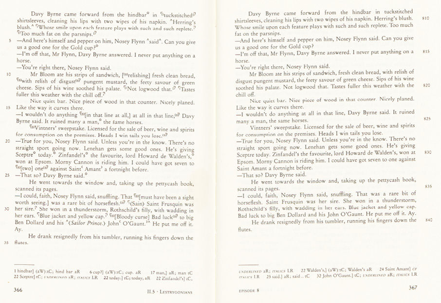
Fig. 15.29 Ulysses: A Critical and Synoptic Edition: genetic synopsis (left page) facing reading text (right page). © H. W. Gabler, CC BY 4.0
Typographically designed as a synopsis, the left-hand-page core edition is (obviously enough) near kin to the German scholarly editions. Those left-hand pages constitute, essentially, an ‘integral apparatus’ of the development of the text of Ulysses under Joyce’s hands for the stretch of composition and revision traceable through the documents named. If it is important, however, to recognise that these left-hand pages qualify as an ‘integral apparatus’, it is equally important to realise that this, as such, differs subtly yet markedly from the integrating synopses in, say, the Conrad Ferdinand Meyer edition. The difference results from a differently conceived and argued relationship between the original documents and the text, which in its turn leads (once more) to significantly different features of design for the edition as book.
Even though the Meyer edition operates without facsimiles, while the Sattler Hölderlin edition relies quite heavily on facsimile reproduction, the two conceptually share a sense that document and inscription, document and text are so interdependent as to be inseparable. This, no doubt, is physically true. Yet it does not follow that, logically, there is no alternative. In fact, and especially as editors, we separate texts all the time, logically, from documents. In the case of Ulysses, therefore, the real conditions of the pre-publication transmission helped me to build upon such a logic. The goal was to edit the text of Ulysses in its entirety, and to do this throughout from Joyce’s own writing of it. Yet the difficulty was that no one document existed containing that text as written (I mean: as penned) in its entirety by Joyce himself. Nonetheless, practically every word for Ulysses as ultimately published existed in Joyce’s hand—the only drawback being that the writing was spread over a multitude of material documents. The solution was to sever logically all inscription in Joyce’s hand from its respective carrier documents, and to transfer it virtually to one imaginary document. On this imaginary, or virtual document, the cumulated authorial text represented the novel’s successive composition and pre-publication revision in distinguishable layers. I gave this manuscript, which did not really exist, a name and called it the ‘continuous manuscript’; and having assembled it, I proceeded to edit Ulysses from the real text of composition and revision virtually cumulated as the ‘continuous manuscript text’.
This was a neat editorial ploy, to be sure—but I will not here and now go further into its implications for editorial theory and practice (nor into the controversies it raised). The salient point for this essay is that, in order to turn a genetically oriented conception of editing into a design for an edition as book, I managed to loosen, both logically and heuristically, the physical, real-life, union of document and text. In the synoptic edition, I believe I succeeded in patterning the textual development of Ulysses at a middle distance from the documents that bore witness to that development. This patterning gave a design to the left-hand-page ‘integral apparatus’ which differed from the design, say, of the Conrad Ferdinand Meyer edition, and was yet consistent in itself.
What this apparatus, this representation of textual development, could do without was the whole array of symbols abstracting, yet miming the real manuscript appearance and conditions, such as featured in the Meyer edition. The representation in the Ulysses edition was concerned exclusively with the textual changes as such; for these changes were conceived of as taking place not on, but between documents—which in textual terms is, after all, what they do: for what on one document is marked to be deleted, or interlined as a change, or added between lines or in the margin as fresh text, is to be found integrated into the text-in-progress properly only in the following document.16
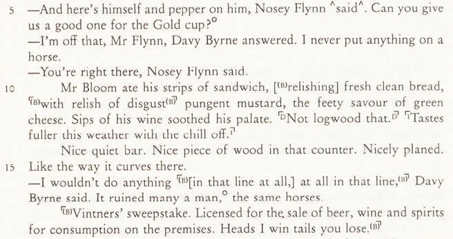
From my sample, here, in lines 10–13 of Fig. 15.30, is one instance of what happens between documents—between an earlier state of Joyce’s working papers as witnessed in his fair copy (reading: ‘Mr Bloom ate his strips of sandwich, relishing fresh clean bread, pungent mustard, the feety savour of green cheese. Sips of his wine soothed his palate.’), and a later state of those working papers as witnessed in the typescript made from them (with the passage rephrased as: ‘Mr Bloom ate his strips of sandwich, fresh clean bread, with relish of disgust pungent mustard, the feety savour of green cheese. Sips of his wine soothed his palate.’
Fig. 15.30 Ulysses: A Critical and Synoptic Edition: synopsis design (detail).
© H. W. Gabler, CC BY 4.0
Subsequently, the passage became further extended by ‘Not logwood that.’, hand-written into the printer’s copy for the first edition, and once more by ‘Tastes fuller this weather with the chill off.’, added to the first placard proofs (U 8, 818–21)). As it happens, we have an outside report of Joyce’s habit and motivation of working in this manner. Frank Budgen, his confidant in Zurich, records a remark of Joyce’s that he had written merely two sentences all day. ‘You have been seeking the mot juste?’ Budgen ventured. ‘No,’ Joyce replied, ‘I have the words already. What I am seeking is the perfect order of words in the sentence.’17 In the example, the sentence as recorded in the fair copy concatenates appositions in a series: ‘relishing … bread—mustard—cheese’; in the revision as evidenced in the typescript, the sentence appears constructed to mimic the layering of the sandwich itself.
Joyce’s claim that he might work on such minute stylistic adjustments for extended lengths of time suggests that countless changes were made mentally, as well as on paper, that simply will have left no material traces. This gives support to my editorial contention that mainly the textual changes as text (meaning: as result of the processes of composition and revision) should be the focus of critical interest, and hence be prioritised as the object of edited representation. It legitimises my editorial expedient, I believe, of mostly filtering out all contingencies into which the changes were embedded in the physically and materially real document (meaning: of largely omitting a record of the traces on paper of those processes). Taking this stance made it in fact possible to do what I did: namely, to represent a textual development synoptically in print without at the same time being obliged to tie in document images for visualisation and verification.18 For our Ulysses edition, too, therefore, I can only emphasise once more how interdependent are editorial conception and argument, on the one hand, and design of the book pages, on the other hand.
* * *
And yet: seen, finally, in another light, the editions I have ended up by discussing, whether Zeller’s Conrad Ferdinand Meyer edition, Sattler’s Hölderlin edition, or my own Ulysses edition, show that scholarly editions as books may have reached the limits of what, in the medium of the book, is capable of representation. Zeller’s and Sattler’s genetically oriented editions of Conrad Ferdinand Meyer’s and Friedrich Hölderlin’s poetry were, each in its way, grounded in the documents vouching for the texts inscribed in them and, at the same time, happening on them. The Meyer edition, lacking both technical and financial means to reproduce document facsimiles in more than a very few instances, resorted to strangely abstracting the writing processes and resulting texts from the documents into the complex set of symbols of its ‘integral apparatus’. The Sattler Hölderlin edition, by contrast, resorted importantly to facsimile reproduction to establish and visualise the text/writing and document relationship which formed the core of its editorial interest. The Ulysses edition, in its turn, assumed that the documents on which it relied and from which it was constructed could be consulted outside itself. As an edition, it divorced, logically, text from document and consequently presented itself as a genetically stratified edition of the development of the text. Yet, as an edition, it is still predicated, as are Zeller’s Meyer and Sattler’s Hölderlin, on being simultaneously grounded in, and abstracted from, documents—the ultimate aporia of editions in book form.
Inevitably (for the time they were conceived and realised), all three are editions in book form. They endeavour to represent, by editorial means and typographical design, three- and four-dimensional processes of writing and of textual development (three-dimensional by writing and overwriting on the manuscript page, and four-dimensional with respect to the time axis to be inferred from those writing and overwriting patterns). Even so, however, the representation remains tied to, and bound within, the static two-dimensionality of the book page. This constitutes a practical dilemma with weighty theoretical implications. In terms both of practice and of theory, writing and text are dynamic and processual: writing is a human activity in time, and text simply is not, and is nothing, unless it constitutes itself and is constructed in form and meaning through reading. On such an elementary premise rests, too, the conception and argument underlying the scholarly edition as a genre of learning. Logically, writing and text exceed by their very nature the limits of what, in the medium of the book, is capable of representation. Hence, the book (or codex, or scroll) has since time immemorial been a pragmatic compromise for the construction, or establishment, of editions. Editions have inevitably had to resort to representing again on the material of paper (or papyrus, or parchment) the objects for editing that they found transmitted on just such paper (or papyrus, or parchment), in the first place. This means that editions have always hitherto (and as it were, ‘naturally’) been editions of texts. They have not been capable of presenting and representing writing processes other than from a perspective of their results as text, and texts. For the representation of writing in print can always only be the representation of a product, never of the process that is of the very nature of writing (as it is ultimately, too, of text, constituting itself meaningfully only through reading). Essentially, therefore, the two-dimensionality of the book page is incongruous not only with the third dimension established by the changes and revisions on, say, a draft page by its manifest over- and under-writings, but all the more also with the fourth dimension, time, of which those changes and revisions are but the material traces. Mutatis mutandis the same goes for the processes of change a text undergoes over a series of documents, whether unpublished or published.
At our historical moment in time, therefore, when we are facing once again a media watershed—now from printing and the book to data processing—we may become aware of the opportunities data processing holds for designing scholarly editions. Books are and remain books, and it is books we read. But to switch to another medium for editions, meaning: to situate scholarly editions in the digital medium, opens horizons of a new order. What physically exists, is transmitted and lives in the material medium of paper and ink, may henceforth yet be analysed and critically penetrated in and through the digital medium. Digital virtualising has the potential of reaching out beyond the two-dimensionality of material documents. It can effectively illusion the third dimension of space, and the fourth dimension of time. Editions thus become designable, in the virtuality of the digital medium, as genuinely relational webs of discourse; thus they should prove capable, too, of overcoming, for instance, tendencies to mere positivist cumulation, such as they belong (as we have seen) to the more deplorable side-effects of the heritage of editing in the medium of paper and ink. To conceive of the implementation of scholarly editions in the digital medium is likely to prove an exciting challenge, which editorial scholarship, however, as well as the brave new world of interface design, are still only just beginning to take up. In intellectual and analytical terms, moreover, an in-depth understanding of what, over centuries, editors and typographers have achieved in the book medium, through fruitful symbiosis of scholarship and the printing trade, is likely to give reliable support in meeting that challenge.
1 D. F. McKenzie contends that ‘a book itself might be an expressive intellectual structure, in the way that a building directly manifests abstract intellectual forms[.]’ ‘Typography and Meaning: The Case of William Congreve’, in D. F. McKenzie, Making Meaning, ed. by Peter D. McDonald and Michael F. Suarez (Amherst and Boston: University of Massachussets Press, 2002), pp. 198–236 (p. 212).
2 The book from which these images were taken lives in the library of my colleague and friend Werner von Koppenfels, who kindly allowed me to include this example.
3 With this are collected Synesius of Cyrene’s ‘Praise of Baldness’, and Erasmus’s ‘Praise of Folly’.
4 Jerome J. McGann introduced his notion of ‘radial reading’ at a conference on New Directions in Textual Studies at the University of Texas at Austin’s Harry Ransom Humanities Research Center in 1989. The paper appeared in print as ‘How To Read a Book’, in a volume under the conference title, New Directions in Textual Studies, ed. by Dave Oliphant and Robin Bradford (Austin: Harry Ransom Humanities Research Center/University of Texas Press, 1990), pp. 13–37.
5 Gregory IX, Decretalium Liber V. Bologna, third quarter of the 14th century; Vienna: Österreichische Nationalbibliothek, Cod. 2040, fol. 168r; Dr Norbert Ott kindly brought this folio to my attention, for which I am grateful, as I am for the stimulating conversations we have had over the years, including during the preparation of this essay.
6 Since this essay was given as a lecture, my attention has been drawn to comparable practices of design in manuscript writing and book printing in Hebrew, founded in traditions of Talmudic learning of which I have neither visual nor analytical experience.
7 I develop these observations further under the aspect of ‘canonisation’ in the following essay, ‘Cultural versus Editiorial Canonising’, p. 363.
8 McKenzie, pp. 223–36, discusses the issue in detail.
9 John Heminge and Henry Condell, in: ‘To the great Variety of Readers’. Lines 95–97 in the ‘Preface’ to the First Folio, in ‘General Introduction’ in The Complete Works of William Shakespeare: Reprinted From the First Folio, ed. by Charlotte Porter and H. A. Clarke; with an introduction by John Churton Collins (London: T. Fisher Unwin, [1906]), p. iv, http://etext.virginia.edu/shakespeare/folio/
10 This image, too, is of a page from an early edition (printed in Dublin) of the Dunciad in Werner von Koppenfels’s possession.
11 Hope Mirrlees, Paris, edited and annotated by Julia Briggs, in her contribution ‘Hope Mirrlees and Continental Modernism’, in Gender in Modernism. New Geographies, Complex Intersections, ed. by Bonnie Kime Scott (Urbana and Chicago: University of Illinois Press, 2007), pp. 261–303.
12 The reference ‘U + episode and line number’ is the one meanwhile generally adopted from the editions of Ulysses under my editorship since 1984-1986.
13 In terms of literary theory, he was of a structuralist persuasion. A single variant sufficed, he is famous or infamous for saying, one single variant sufficed to change a given text into an autonomously other text; for it constitutes, or from it emanate, new structures both of language and of meaning. Theoretically unexceptional, such a stance went thoroughly against the grain of Anglo-American critical editing according to the lodestar of the author’s (final) intention. Thomas Tanselle, for one, as its prophet, expressly refutes Hans Zeller in ‘The Editorial Problem of Final Authorial Intention’, Studies in Bibliography, 29 (1976), 167–211 (p. 197, n. 52).
14 The right-hand-page clear reading text is the text that has been taken over for the commercial editions of Ulysses by Random House in the US and The Bodley Head (now also Random House) in the UK.
15 To achieve the juxtaposition, we were able, even in the early 1980s, to rely on an advanced digital typesetting programme, itself the final module in the TUSTEP text data processing system with the help of which we edited Ulysses from scratch. See our contemporary report: Hans Walter Gabler, ‘Computer-aided critical edition of Ulysses’, Protokoll des 18. Kolloquiums über die Anwendung der Elektronischen Datenverarbeitung in den Geisteswissenschaften an der Universität Tübingen vom 30. Juni 1979, http://www.tustep.uni-tuebingen.de/prot/prot18e.html. Published as ‘Computer-Aided Critical Edition of Ulysses’, ALLC [Association of Literary and Linguistic Computing] Bulletin, 8 (1981), 232–48.
16 Revisions inscribed on one document and found integrated in the next document may be called ‘inter-document changes’. For the sake of precision, it should be remarked, too, that autograph changes on a given document may of course every now and again be layered in themselves. The edition’s integral apparatus reports such ‘intra-document changes’, too, essentially as textual changes and does not record their manner of inscription or topographical position on the given document page. In other words, the integral apparatus devised for the Ulysses edition carries its premise of a logical separation of document and text even into its treatment of writing traces on individual documents.
17 Frank Budgen, James Joyce and the Making of ‘Ulysses’, and Other Writings, with an introduction by Clive Hart (London: Oxford University Press, 1972, 1989), p. 20.
18 At the same time, it should not be overlooked that, in terms of the visual reproduction of original documents, the Ulysses edition was, and is, in a singularly fortunate position. Not only does Joyce’s entire fair-copy manuscript exist in a superior facsimile, published by the manuscript’s owner, the Rosenbach Foundation in Philadelphia. All surviving drafts, typescripts, galley proofs (placards) and page proofs, too, have been photographically reprinted, filling twelve of the sixty-three volumes of The James Joyce Archive. These reproductions, held in a spread of research libraries, allow the relation of the editing of the textual development of Ulysses, as achieved in the Critical and Synoptic Edition, to the evidence of the writing-out of the composition and revision in the original documents themselves. To this end, the encoding of the levels of textual change in the edition’s left-hand pages also functions as an index grid to the documents.


