9 On perspective—and music
© Stephen Robertson, CC BY 4.0 https://doi.org/10.11647/OBP.0225.09
Apart from brief references to mosaics and weaving, I started Chapter 7 with the beginning of the mechanisation of image-making, the invention of photography. However, just as much as language itself (and probably for longer), the language of images has been developed over thousands of years of human history and prehistory. Our ability to understand, make sense of, interpret photographic images when they came along did not come out of thin air, nor was it entirely intuitive. It grew out of our earlier understanding, developed through art, of the possible relationships between the three-dimensional world and a two-dimensional representation of it. While I could not begin to chart all the ways in which painting and the other arts have contributed to the way we see photographs, there is one aspect that illustrates this contribution very well.
If you studied art at school, or perhaps later, you might have learnt about the rules of perspective (this might depend on your age, however!). This set of rules, this idea of a formal system of perspective, was an invention of the early Italian Renaissance. It is often presented as the ‘correct’ way to represent the three-dimensional world on a two-dimensional piece of paper. However, there are different ways of doing this, equally valid but with different characteristics. So before tackling perspective, I will look at two other domains.
Architecture
If you look at an architect’s elevation drawing of a building, consider first the base of the building. It seems that you are looking at this with your eye at ground level. Now look at the roof: it appears now that your eye is at roof-level. You can see the same phenomenon at both sides, and indeed everywhere in the picture: your eye is always directly opposite the part you are looking at. An engineering drawing, of a machine part for example, will normally have the same characteristic.
This is sometimes known as parallel projection. Imagine a piece of paper held vertically beside the three-dimensional object. From each point of the object, imagine a line perpendicular to the paper; where it hits the paper is where that point of the object is represented. Of course in the case of a building, that would seem to require a piece of paper as large as the building! But such drawings are normally reduced in scale to a more manageable size—the important thing is that this rescaling happens after the parallel projection stage, when the image is already two-dimensional.
Architects and engineers employ such drawings for views of, say, the sides of a building based on a rectangular plan. They may also use them for angled views; to many people, such angled views look a little strange, because they do not follow the usual perspective rules. Parallel lines in the real world remain parallel in the drawing; while an artist working in perspective would expect parallel lines seen from an angle to appear to aim for a vanishing point. Figure 7 shows a cube in two different projections. You might find my perspective view slightly strange, because I have assumed that my sheet of glass is not vertical but angled down very slightly, so that even the vertical edges of the cube are not parallel in the projection. However, you would see such an effect as normal in a view looking up at a tall building, or (let’s say in a horror movie) down a lift shaft.
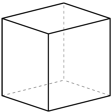
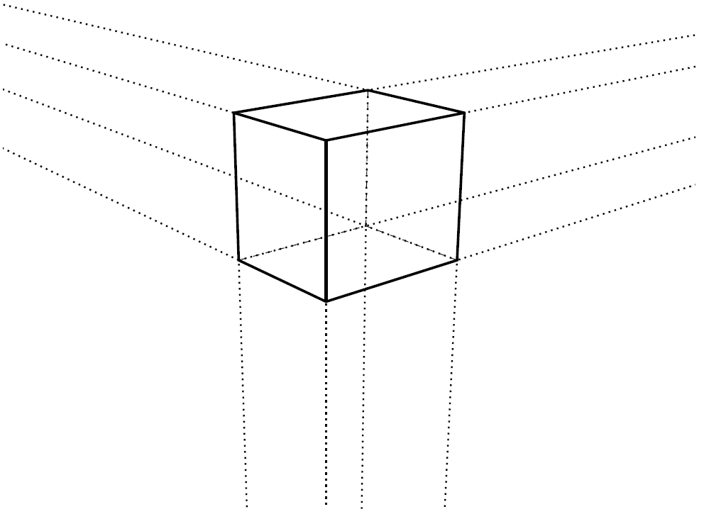
Fig. 7. Views of a cube. Diagram: the author.
The reason that parallel projection is common in architecture and engineering is that it has many advantages for those fields. In particular, measurements can be made on the drawing and translated, unambiguously and accurately, to measurements in the three-dimensional world. This is simply not true of perspective drawing.
Cartography
The problem with maps is not so much the three-dimensionality of the world (though that is interesting too) as the curvature of the earth’s surface. One would like to represent any part of the world on a flat map, while preserving many of the properties of the real world in the representation—for example straight lines, direction and distance. For relatively small areas, this can be done accurately enough for most purposes. But for large areas (such as large countries, continents, oceans), it is impossible.
Once again, it is a question of projection—of projecting a part of the curved surface of the earth onto a flat plane. Cartographers have studied the question of what projection(s) to use since at least the second century CE (the Greeks, of course, already understood that the earth was round). One of the major reasons for such study is navigation. Many different projections have been proposed and used, and because it is impossible to preserve all the properties that one would like, each is a compromise.
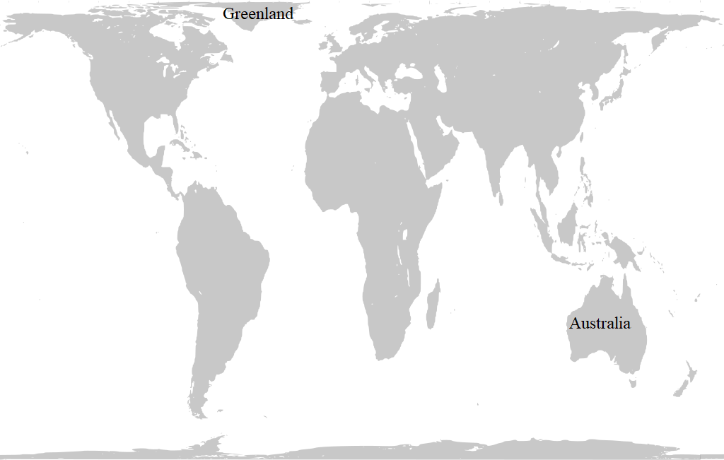
Perhaps the best known is that of Mercator, which preserves bearings (that is, lines of constant bearing on the earth’s surface are straight lines on Mercator), but makes for extreme variations of relative size. Figure 8 shows a map of the world in the Mercator projection (Google’s map of the world is similar). Have a look at Greenland. Because Greenland is near the north pole, it looks huge on the Mercator projection. Now look at Australia, quite near the equator—it looks much smaller. Actually the land area of Australia is more than three times the land area of Greenland. The nearest equivalent to a straight line on the earth’s surface is a great circle (a circle that divides the sphere exactly in half); in general, great circles look not at all straight on Mercator. And don’t ask Google Maps to show you a map of the North Pole, or a proper map of the continent of Antarctica. The poles simply do not exist on the Mercator projection.

Figure 9 shows the world in the Peters projection. This projection distorts the shapes of the countries badly, but instead preserves their relative land areas.
Art
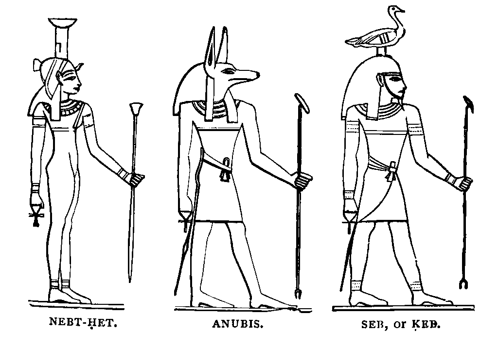
Have a look at a reproduction of a picture of a human figure taken from the wall of an ancient Egyptian tomb. Probably you will see the following. The head is in profile, seen from the height of the head. The feet are also in profile, seen from ground level. The torso is also seen from its own height, but full frontal. An example can be seen in Figure 10.
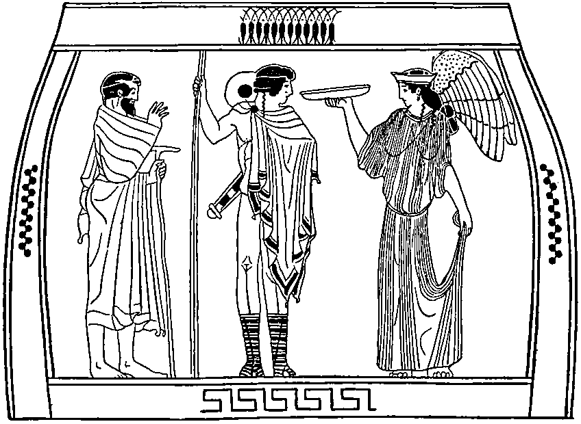
Now look instead at a human figure from a classical Greek vase (again, there is an example in Figure 11). Here again, probably each part of the body is seen from its own level, although without the changing view from front or side. Such a view seems to the modern eye much more ‘realistic’, but the projection is more akin to architectural projection than to perspective.
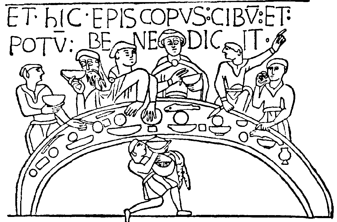
Now look at a medieval picture with multiple figures. Very likely, the central figure or figures are large, and peripheral or less important figures are smaller. The relative location of the figures does not determine their relative size; quite possibly there are foreground figures, nearer the artist than the central figures, but smaller on the canvas. Figure 12 shows a small section of the Bayeux Tapestry.
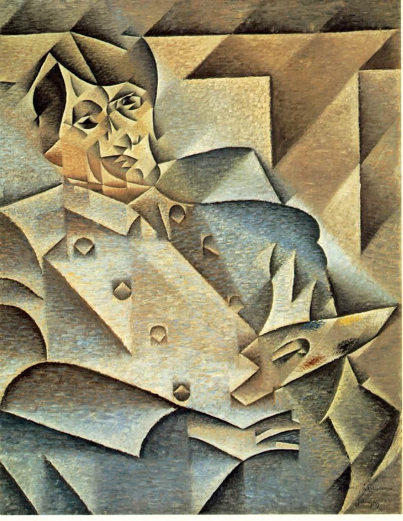
Now look at some paintings from the Edo period, 17th–19th centuries, of Japanese art. Distant objects (like Mount Fuji) will be small, and there may be closer perspective effects, but the foreground may well be represented, from an angle, in something like architectural projection (see for example the painting by Katsushika Hokusai, Figure 13). Now look at the paintings of the Cubists in 20th century Europe. You may see a figure or object from multiple angles simultaneously (see for example the portrait by Juan Gris of Pablo Picasso, Figure 14).

All of these artists are choosing to represent the world in particular ways. In the latter two cases, the artists concerned were probably well aware of the rules of perspective as laid down early in the Renaissance. But even in the earlier cases, the artists knew perfectly well that more distant objects look smaller: that if your friend walks away from you down the road, there comes a moment when you can cover her with your thumb stretched out at arm’s length. You do not, of course, imagine that her size actually changes; nor do you assume for a moment that a person whom you first see at a distance is very small. Actually, with the help of other clues, you can probably judge fairly accurately the height of a person, whether he or she is right next to you or 100 yards away.
Some artists of the ancient world, particularly in classical Greece, thought seriously about how to represent 3D in 2D, and there are some pictures that reveal strong perspective aspects. But the real triumph of perspective had to wait until the Renaissance.
Perspective in Western art
The artists of the early Italian Renaissance, such as Masaccio, Mantegna, and Piero della Francesca, wanted to create a variety of realistic art that would represent the world consistently, in some sense as we see it. They devised a set of rules for doing this—rather mathematical in nature. In fact Piero (a true Renaissance man!) was a mathematician as well as an artist, and wrote a mathematical treatise on the matter. The earlier diagram of a cube in perspective shows one aspect of this mathematical analysis: the way that any number of parallel lines in the real world appear in perspective to line up with a vanishing point—in the case of horizontal lines, this vanishing point is on the horizon.
We can think of the rules as follows. The artist places a flat sheet of glass vertically on a stand, and looks at the world through it. In order to do this properly, the artist has to fix the viewpoint—the point from which she looks through the glass—and not move while painting. Then she paints on the glass, placing every part of the image exactly in line with the part of the world that she is representing. In other words, she projects the three-dimensional world onto the two-dimensional sheet of glass, using the (fixed) viewpoint as the point of projection. Figure 15 shows Albrecht Dürer’s diagram of this process, showing how the artist has a fixed viewpoint.
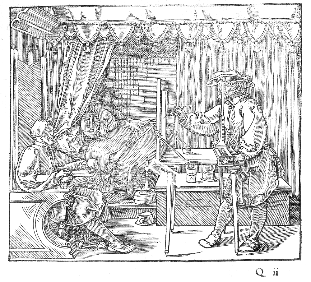
The theory of perspective quickly became one of the staples of Western art. For several hundred years, artists were taught the rules of perspective, and by and large followed them. And the rest of us learnt to appreciate perspective, and to regard it as natural and, in some sense, the correct way to paint or draw.
The problem with perspective
Perspective is how the eye sees the world. And therefore painting a picture in perspective is the right way for the artist to convey to the viewers how she sees the world. Right?
Well, in truth, there are interesting problems with perspective, and the major one is revealed by the description above of how to do it. Remember the fixed viewpoint? If the artist follows the rules, and if the viewer then places his or her eyes in relation to the sheet of glass, exactly where the artist was looking from when doing the painting, then the viewer will see what the artist saw (or at least will see everything in the same geometric relationship). But if the viewer looks at the painting from any other position, the view is distorted. Nonetheless, we have become so used to perspective pictures that we no longer see the distortion.
Actually, even if they are painting in perspective, artists take some liberties with the rules. For example, if the painting contains a full moon at the top left of the canvas, an exact application of the rules requires the moon to be an angled ellipse on the canvas, rather than a circle. Seen (only) from the correct position, the ellipse looks like a circle. But because we typically do not look from the right place, because we are also aware of the plane of the painted surface as well as of the 3D world being portrayed, and because we think we know what shape the moon is, the ellipse would tend to jar with us. As a result, many artists would simply disobey the rules at this point, and give us a moon that is circular on the canvas.
Optical projection
Long before photography, it was known that a pinhole or lens could be used to project an image onto a screen. The pinhole idea was known in antiquity (since at least the fifth century BCE), and it was understoood that the image it produces is upside down because light travels in straight lines. In fact, although it is in reverse, with the reference point for projection in between the world and the image instead of the other side of a glass screen, the projection principle in the camera obscura is mathematically identical to that of Renaissance perspective. The first clear description of a camera obscura, a darkened room with a small hole in one wall, was by Leonardo da Vinci, but the principle was well known by then.
The principle of the magnifying glass lens was also known in antiquity, although lenses did not come into widespread use until around the 13th century CE, particularly with the invention of spectacles. Sometime in the 16th century, it was realised that a lens could be used instead of a pinhole in a camera obscura, gathering much more light to make a much better image. A lens and a mirror, mounted in a turret on top of a building, could be used to project an image (which could be viewed the right way up) into a darkened room below. Modern versions of this may be seen in various places, including the observatory at Greenwich.
A camera obscura with a simple lens follows the same projection principle, as does a photographic camera. Thus, when photographs came along in the 19th century, the images were instantly recognisable as using essentially the same kind of perspective that had been common in painting for several hundred years. Such images are indeed in ‘correct’ perspective, although the same qualification applies: they are only correct from a single viewpoint.
Camera lenses
Actually, most camera lenses are more complex than single magnifying glasses. In particular, many cameras have somewhat wide-angle lenses, while some have the opposite, telephoto lenses. Images created by such lenses are not in true perspective. We don’t usually notice this—except in extreme cases. Such extreme cases include, in particular, very wide-angle or fish-eye lenses. We see the image produced by a fish-eye lens as distorted, simply because it does not follow perspective rules. In truth all 2D images of the 3D world are distortions—one cannot project 3D onto 2D without distorting it. But once again, we are so used to Renaissance perspective that we do not see it as distortion, even when we view it from the wrong position (which is almost always!).
Twenty-first century perspective
There is now, of course, a major industry in games for computers or games consoles. These games often present three-dimensional worlds, seen through the 2D computer screen, in which the player can move and operate. In general, games designers use exactly the same perspective rules that we are now so used to.
It is becoming more and more difficult to get away from the idea that these perspective rules give us the ‘truth’ about how we see the world around us. Renaissance perspective has become a universal in the language of images. The fact is that it is just as much an invention as writing—something that we had to learn about. One might argue that artists no longer need to learn how to do it—they can now leave it to the cameras. But all of us need to learn how to interpret perspective images. We do so very early in our lives, probably before we learn words, and certainly before we learn how to write. But it is a technological choice that we made, and not so very long ago.
Text, again
How do we see the relation between written and spoken language? In the several millennia since the invention of writing, our view of the status of written text, in comparison with spoken, has changed hugely. These changes occurred gradually, so that it is now difficult for us to reconstruct in our imagination what the relation might have been like in the distant past.
In classical Greece, for example, although they had a relatively well-developed writing system, they would not generally regard a book as itself an object of study. Rather it was an aide-memoire, to the writer or to someone else—an expert reader who would interpret the script and speak aloud, probably to an audience—in something like the way a modern musician interprets a musical score. We might also note that written material was much harder to read then; the ancient Greeks had little in the way of punctuation, and normally wrote without spaces between the words—as we have already seen in Chapter 5. The oral tradition remained the true source and method of propagating knowledge; writing played a strictly subservient role. Socrates, in particular, disdained writing, and all the written evidence that we have of the thought and work of Socrates was written by others, principally Plato.
The contrast with today could hardly be stronger. We know perfectly well that spoken and written languages are different, and play different roles, but we are entirely happy with the notion that a written document has its own validity, is to be understood and evaluated on its own terms. This statement applies not only to books, but to magazines, pamphlets, letters, emails, text messages, posters, notes, and so on. In many cases, we regard the written form as pre-eminent—for example, in laws and contracts. In ancient Greece, a contract was oral, requiring witnesses who could attest to it orally—any written form was simply a reminder, with no legal or contractual status.
If you were to come to one of my talks, and I were to attempt to convey the same or similar information to you orally, as I am currently trying to do through text, I would do it quite differently. But the fact is that this is unlikely to happen. This book will have to stand on its own as my message to you: I have to get everything I want to say to you into this written text.
Coding and digital text
When Morse devised a scheme for transmitting messages over electrical wires, he probably thought of his codes as instructions. That is, the sending operator is given a message, let’s assume on paper, and the first letter is ‘A’. The operator turns this into dot-dash, and transmits this signal. The receiving operator hears it, and writes down ‘A’, as instructed. The dot-dash is merely a way of getting the ‘A’ from one piece of paper to another.
A similar attitude is evident when the ASCII coding scheme was invented in the twentieth century, with the human operators replaced by machines. As we discovered in Chapter 5, ASCII codes include both codes for letters and codes for machine operations. ASCII code number 65, which is 1000001, says to the machine at the other end “print an ‘A’”, while code number 13, which is 0001101, says “return to the beginning of the line”.
However, we are moving away from this notion. One view, which is probably common now, is that the coded form of a text (inside a machine or traversing a wire) is as valid a representation of the true text as is a printed document. Another view, which may seem extreme but has some advantages, is that the coded form is the true document, while a printed form is just a representation.
Why would that have advantages? Well, while such things as formatting (fonts, layout etc.) seem to be intrinsic to a printed or displayed text, these things are not normally seen as part of the essence of a text. We are usually entirely happy with the notion that, if a document is printed on different sizes of paper, or in a larger font for people with poor eyesight, such things as the line breaks in each paragraph and the spread of text over successive pages may be adjusted to fit, without altering the essence of the text. The same applies to a screen display in a window—and indeed it is very annoying when the text in a webpage is set up (pre-formatted) with a fixed width that is wider than the window you are trying to read it in. Thus the unformatted digital file seems to capture the essentials of the text, while the printed or displayed version mixes up the essence with more superficial aspects.
All this is quite aside from all the advantages of manipulation and processing that can follow from having a coded text, such as cutting and pasting, or searching for words or phrases, or counting words.
These days, it is quite possible for a page of text to be represented in a machine as a (scanned) image, rather than as coded text. But this representation has all the limitations of the printed page itself. The true text now seems to reside in the coded version, not in the scanned image, nor on paper.
Images
Thinking about photographs, as we have seen in Chapter 7, we seem to have made a similar transition. Within a period of about 30 years, from the mid-1980s to 2010, we came to accept that a ‘photograph’ is a digital file. Forty years ago, if you had said “send me a photograph”, I would have interpreted that to mean a chemically-produced print on paper, to be sent by old-fashioned post. Now (it does not even occur to me to question this), you mean a digital file sent by email or MMS or placed in the cloud for you to download. The digital file is the photograph—how you choose to display it is another matter.
But this is not true of all images. Artists still paint pictures onto canvases, and in such cases the picture is the physical object. If we subsequently photograph it, the photograph (in its digital form or printed or displayed) is an attempt to represent the painting, which we may regard as more or less successful, but at best a partial substitute for the real object.
It’s true, of course, that some artists (for example David Hockney), and most designers, now create directly in digital form. Hockney’s wonderful iPad art is created directly on the tablet, and once again the digital file is the picture. Nevertheless, both the activity of painting and the resulting art objects retain their status outside the digital world.
Music
In a similar fashion, there are alternative ways to represent music. Of course these have existed for a very long time: musical notations can be found on cuneiform clay tablets from around 2000 BCE, and the ancient Greeks had a more developed notation from around the 6th century BCE.
The stave notation with which we are familiar today developed gradually over a number of centuries, from about the 11th century CE. Its ability to indicate pitch and duration of individual notes, their relative timing, and the overall rhythm came at different times. It is most strongly associated with western classical music, though it is also used in other musical genres and contexts.
Here the question of how it relates to the real musical sound is quite complex. At one level, we see it again as a set of instructions to a singer or instrumentalist—in order to make this music, this is what you have to do. But we expect a player to interpret the music—and therefore the sound that this player produces is not necessarily the same as another player of the same music. Indeed, we find the differences important and interesting. This view is actually not far from the ancient Greek view of written text—it was there for a human reader, reading out loud, to interpret. In most musical environments outside of classical music, the sound is developed and learnt through performance, and written musical notation, if used at all, is treated as an aide-memoire.
Nevertheless, in western classical music, the power of this abstraction of sound to musical notation might be seen to take us a little nearer to the modern view of text, if not quite there. In the case of a late work by Beethoven, for example, we might almost see the score as being the real music, and a performance of it as a (maybe flawed) ‘display’. The knowledge that Beethoven was deaf when he composed it, so that the paper version is the only indication we have of what he heard internally, reinforces this view.
Digital graphics and music
In the computer age, the kind of pixel-based image associated with photographs and scanned images is not the only way in which graphical information can be represented in digital form. For example, there is an alternative that is commonly used in design and engineering applications, where the designer creates graphics directly on a computer, or where the computer itself builds the image from something more abstract still, like a three-dimensional model. This is known as vector graphics—the basic idea is of describing the shapes to be displayed. For example, the digital representation might specify that there is a point here, and another here, and they are joined by a straight line of this colour and thickness.
Vector graphics does not predate computers, but was developed in the very early days of computing.
Similarly, we have different ways of representing music in digital files. Just as vector graphics attempts a more abstract representation of certain types of image than using pixels, we have ways of representing some kinds of music that are more abstract than the pulse-code-modulation representation of sound. The best-known example is the MIDI system. MIDI was developed in the 1980s, well into the computer era, to allow digital control of the playing of instruments. It allows the specification of notes to be played, including pitch, onset and duration, all of which, of course, are represented in the traditional stave notation of a musical score. But it can also include further elements, such as envelope (the way the note fades or develops over time).
Thus within the computer era, there has been a proliferation of ways to represent and manipulate different kinds of text, still and moving images, and sound. Part of the point of such representations is to extend the possibilities for the computer manipulation of data. Thus, for example, vector graphics allows a relatively simple computer operation to extend a line or move its endpoint—much more difficult if the line is represented only by its pixels. Such computer manipulation is beyond the scope of this book. However, in the next three chapters, we will consider further kinds of data where the idea of machine manipulation predates computers.
