4. Public Funding:
Grant Aid, Loans and Appropriations
© Andrew C. Comrie, CC BY 4.0 https://doi.org/10.11647/OBP.0240.04
4.1 How does public funding for higher education work?
Public funding for higher education in the US, even just for public institutions, is relatively complicated as compared to many other countries where the national education ministry is the principal funder and overseer (see Section 4.14 later in this chapter). In the US, the states and some local governments fill most of this role (except for accreditation) for the public universities via appropriations. The Federal Government, rather than funding institutional budgets directly, supplies financial aid to students (depending on family income) who can use it to attend public or private institutions.1 Students and their families combine that aid with their own sometimes sizable contributions, and a portion of the combined amount flows to the institution as tuition, with the remainder used for living expenses. Many of these students will also receive substantial institutional aid from the university, as we saw in Chapter 3.
Figure 4.1 illustrates the four main players and the relative sizes of the flows between them for US public higher education. The two big public funding arrows are federal aid and state appropriations. The relative contributions of the Federal Government and the states have become more equal in recent decades, especially since the Great Recession. State spending used to dominate federal spending on higher education, but state funding declines occurred while the Federal Pell Grant Program expanded considerably (The Pew Charitable Trusts 2015). We’ll examine these two major funding sources below and in subsequent sections, but before doing that, let’s look briefly at the other arrows in the diagram.
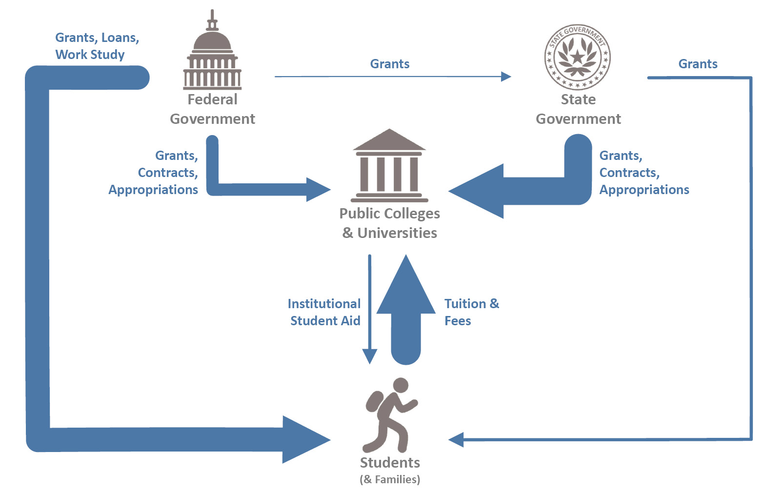
Figure 4.1. Public higher education funding flows with arrow thickness scaled to FY2012. State funding includes appropriations as well as grants and contracts for research. Federal and state flows represent aid to undergraduates. Federal grants to states include only higher education programs related to affordability. Land-grant appropriations and federally funded research projects are included as part of the funding from the Federal Government. Benefits from tax credits and deductions for higher education are not included. Source: redrafted from GAO (US Government Accountability Office 2014), Public domain, https://www.gao.gov/products/GAO-15-151.
The institutional aid arrow looks narrower here than you might think from the pie charts of school types in Chapter 3—that’s because there are thousands of small four-year and two-year colleges in the overall higher education sector that sway the average to look more like their profile. Government grants and contracts made directly to the institutions are the other main flows in the diagram, and we’ll cover those in more detail when we discuss Research in Chapter 8. For the private institution version of Figure 4.1, one could simply omit state appropriations to universities (keeping grants and contracts), thereby switching that arrow from broad to narrow, and the overall result would be approximately correct. It would be even closer to correct if one made the federal arrow to students somewhat narrower to reflect the smaller proportion of Pell Grant students attending private institutions. In terms of the budgets from which these expenditures come, federal spending on higher education is about 2% of all federal spending, while higher education averages about 9% of state spending (The Pew Charitable Trusts 2015).
To provide a relative sense of the public funding numbers, Figure 4.2 illustrates the major categories of aid and loan amounts for all undergraduate and graduate students. We see that federal grants exceed state and private grants while institutional grants top them all (as seen in Sections 2.8 and 3.6). In contrast, federal loans greatly exceed non-federal loans from banks, credit unions, private lenders, some states, and institutions. It is notable how small the Federal Work-Study Program is in comparison to the grant and loan programs, and at almost $1B (that’s Billion with a “B”) it also provides a scale reference for the staggeringly large numbers in the figure. All these federal funds are accessed by the student who must submit a FAFSA (Free Application for Federal Student Aid) form that includes information on student and family income. And, just so it’s been said, grants do not need to be repaid and they lower the price paid, whereas loans do need to be repaid but they enable the costs to be spread out over time.
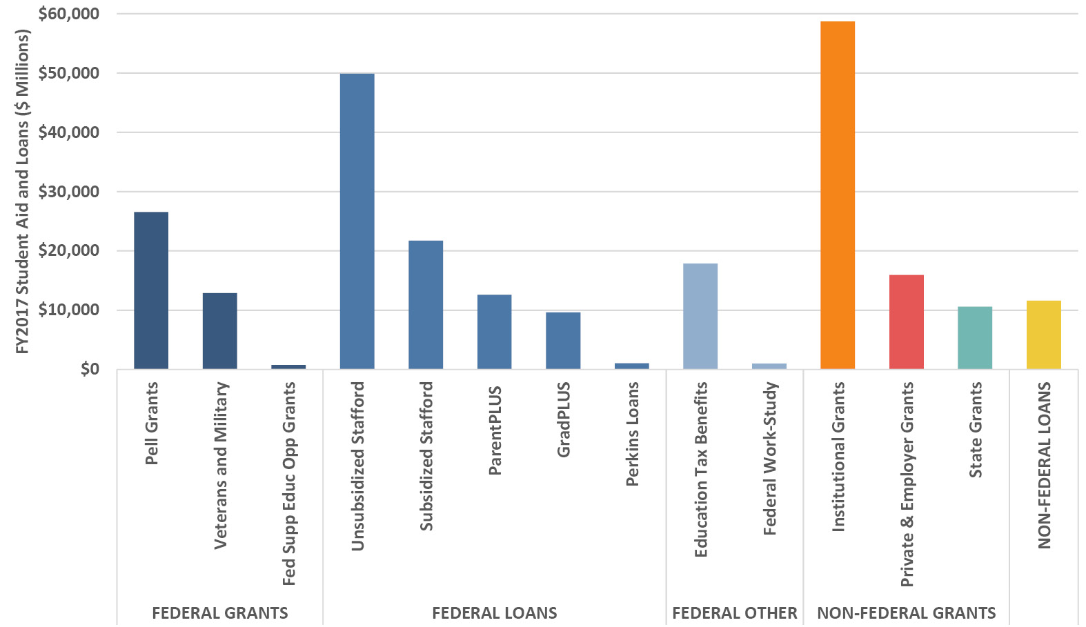
Figure 4.2. Student financial aid and loans for FY2017. Source: College Board (Baum et al. 2017).
4.2 How does aid add up on a per-student basis?
The total national investments in various forms of aid can be expressed in per-student FTE terms, making it easier to see the mix of aid for the average student. Figure 4.3 illustrates trends in aid mix separately for undergraduates and graduate students because their aid profiles are different. In the academic year 2016–17 (AY2017) undergraduates received an average of $14,400 mostly made up of federal grants and loans, proportionally about 2:1, with much smaller amounts from other federal sources and non-federal loans. In contrast, graduate students received about double that aid at $27,950 with the federal grant to loan proportion reversed at roughly 1:2. Put another way, federal grant aid per student was similar at roughly $9,000, but graduate students received almost four times more in loans than undergraduates ($17,710 versus $4,620). There are multiple reasons involved in that difference, including prior years as a student with loans and, in some cases, anticipated higher subsequent earnings from pricier professional programs potentially justifying a higher loan. We’ll take a closer look at student indebtedness in Section 7.11.
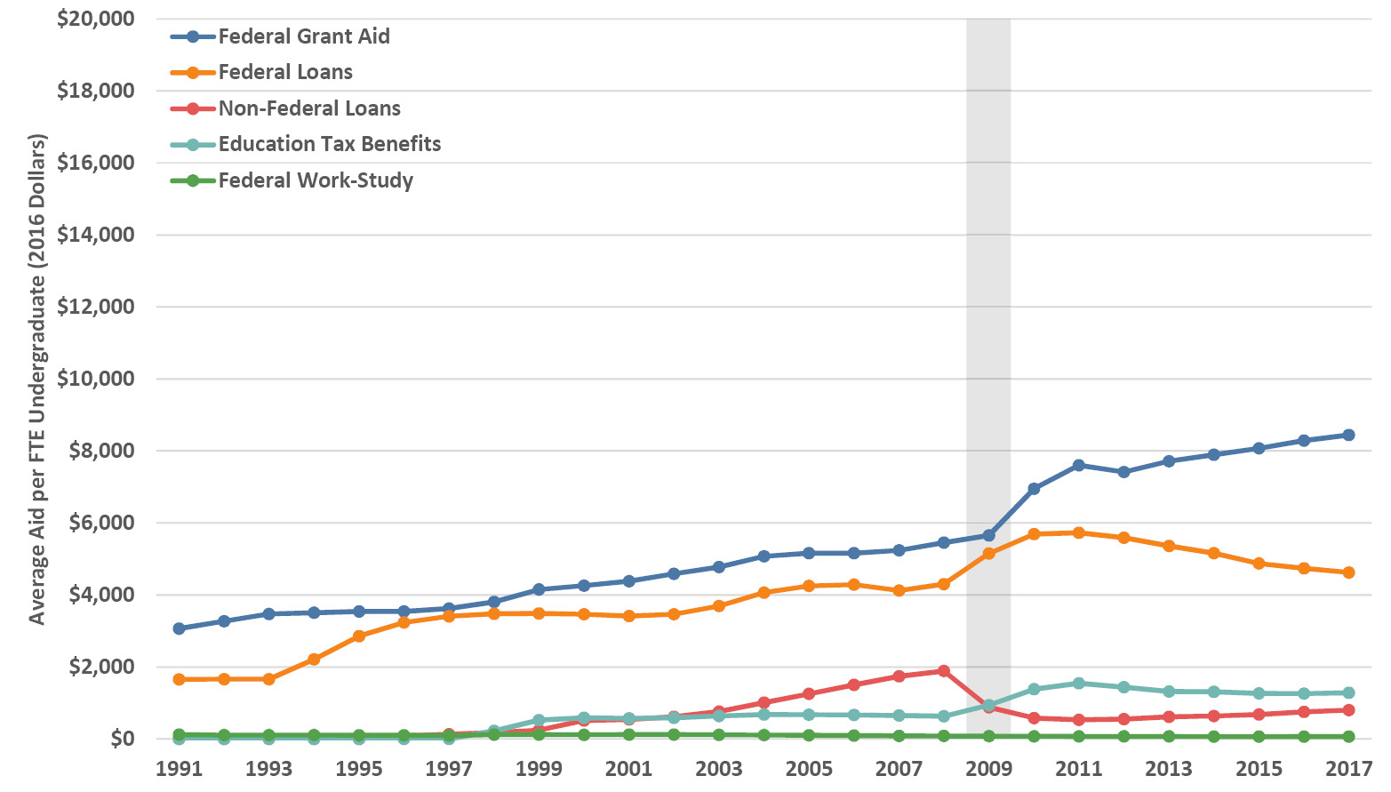
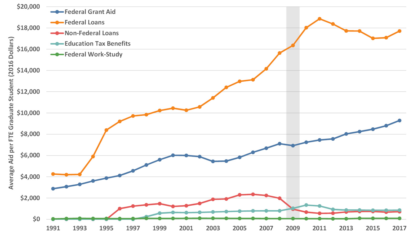
Figure 4.3. Average federal aid and non-federal loans per FTE undergraduate (upper panel) and graduate student (lower panel) in 2016 dollars by academic year. The shaded vertical bar indicates the onset of the Great Recession. Source: College Board (Baum et al. 2017).
Looking at trends in Figure 4.3, federal grant aid (mostly Pell Grants) has essentially tripled in nearly three decades, with a rapid post-recession acceleration for undergraduate aid. The growth in federal loans for undergraduates paralleled grant aid but has declined substantially (by about one third) since the recession. Graduate federal loans grew dramatically (almost five-fold) in the 1990s and 2000s, before dropping back a little. The grant to loan ratio for undergraduates was near 1:1 until after the Great Recession when federal and non-federal loans began a steady decrease. For graduate students, despite the overall upward trends and higher amounts, the 1:2 grant-to-loan ratio has been roughly consistent since the mid-1990s.
Virtually all states provide grant aid to selected students, although the average amounts per student FTE are a lot smaller, at about 10% of federal aid grants (but remember that states also make appropriations that are often large—we’ll examine them in subsequent sections). Figure 4.4 shows the average amount of state aid per student over time for all states, averaging $790 per student in AY2016, with a range from $0 in New Hampshire to $2,100 in South Carolina (Baum et al. 2017). Just as for the federal data above, the denominator here for the state data is all students, to enable direct comparison. Note therefore that the denominator is not limited to eligible in-state students, and thus dollar amounts averaged across only in-state students would be a bit higher. However, the trends and proportions are unaffected by this quirk. Think of these numbers as aid for the average student across all students. We’ll look at aid per awarded student in the next section.
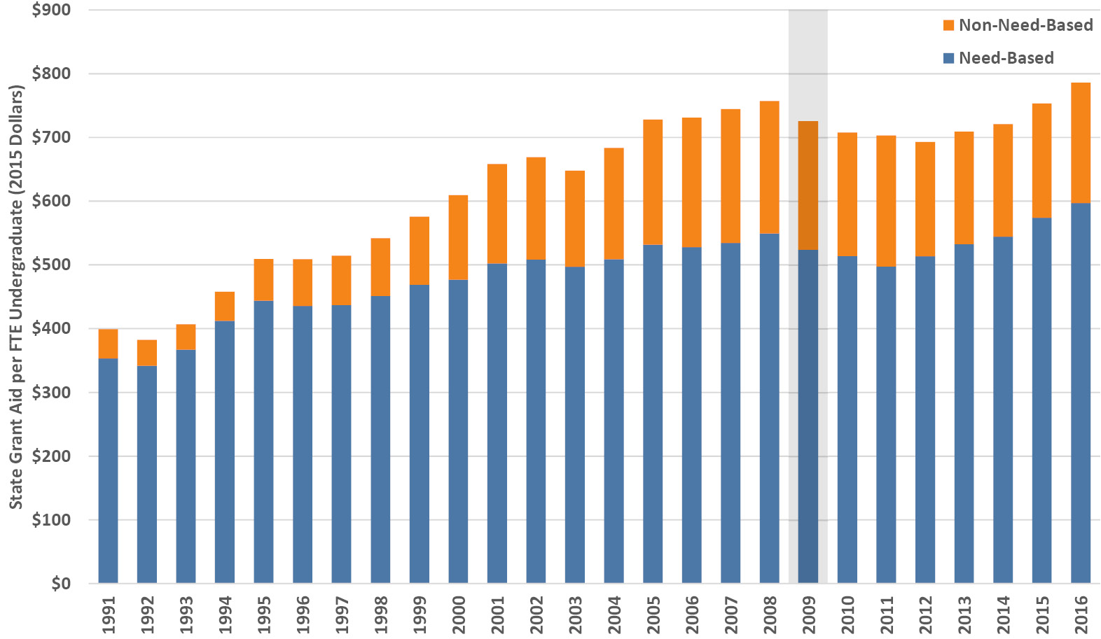
Figure 4.4. State grant aid per FTE (in-state and out-of-state) undergraduate in 2015 dollars by academic year. The wider shaded bar indicates the onset of the Great Recession. Source: College Board (Baum et al. 2017).
As with other aid and loans, a substantial part of these state aid amounts will flow to institutions via tuition (in addition to state appropriations for public universities). Be aware that, rather than using tax revenues, some states fund their aid programs through so-called tuition set-asides where all students contribute a small amount to the state aid pool. As we can see in Figure 4.4, the proportion of need-based awards has held at about 75% since the turn of the millennium. The relative role of state aid has shrunk over time, with the twenty-five-year trends in Figure 4.3 and Figure 4.4 exhibiting a 4% annual average increase in federal grant aid per student compared to the overall state aid trend, which exhibits about a 2.5% annual average increase per student. In this chapter we are focused on the macro supply of public funding—we’ll examine the student perspective related to indebtedness and affordability in Chapter 7.
4.3 What proportion of students get state aid,
and how much do they get?
Figure 4.5 is a scatterplot of FY2016 state grant aid by award amount and the percentage of students awarded, for all fifty states plus Puerto Rico and the District of Columbia, as well as the national averages. Figure 4.6 provides the matching percentages of need-based versus non-need-based aid. Note that graduate students are included in the data behind these figures, but their effect is negligible because over 98% of state aid goes to undergraduates (NASSGAP 2017). Overall, looking at both figures, the national average shows that just under 30% of students were awarded state aid of about $2,400 in FY2016, about three-quarters of which was need-based. There are extremely wide ranges by state: Washington, DC awarded just 6% percent of students with large non-need-based grants of almost $7,000, Nebraska awarded over 70% of students an average award of just a few hundred dollars in mostly need-based aid, and Alabama awarded under 5% of students with less than $1,000 split about equally into need-based and non-need-based aid.
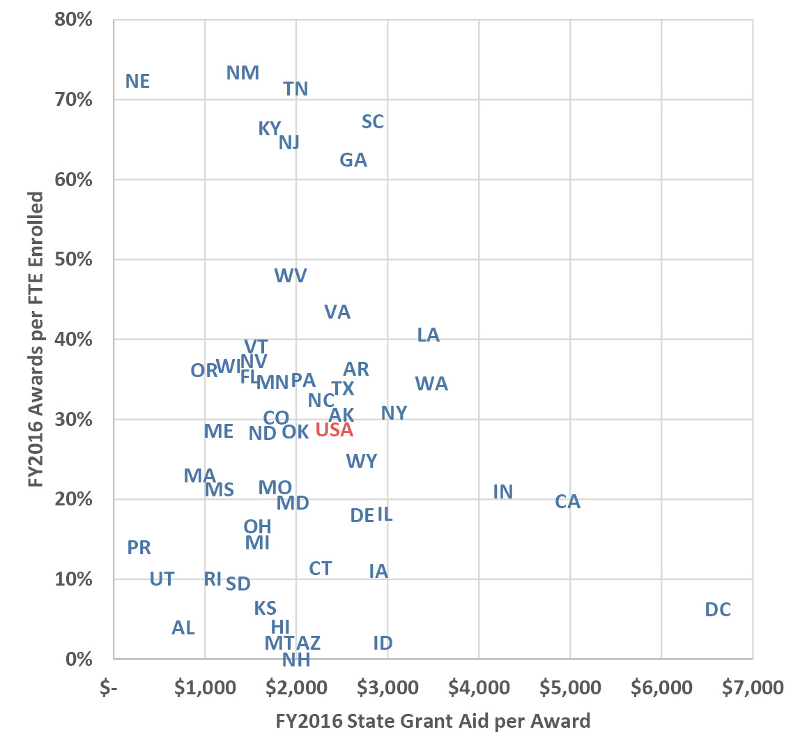
Figure 4.5. FY2016 average grant aid per award and percentage of enrolled FTE awarded by state, including the District of Columbia (DC), Puerto Rico (PR), and the national average (USA). Source: NASSGAP (2017).
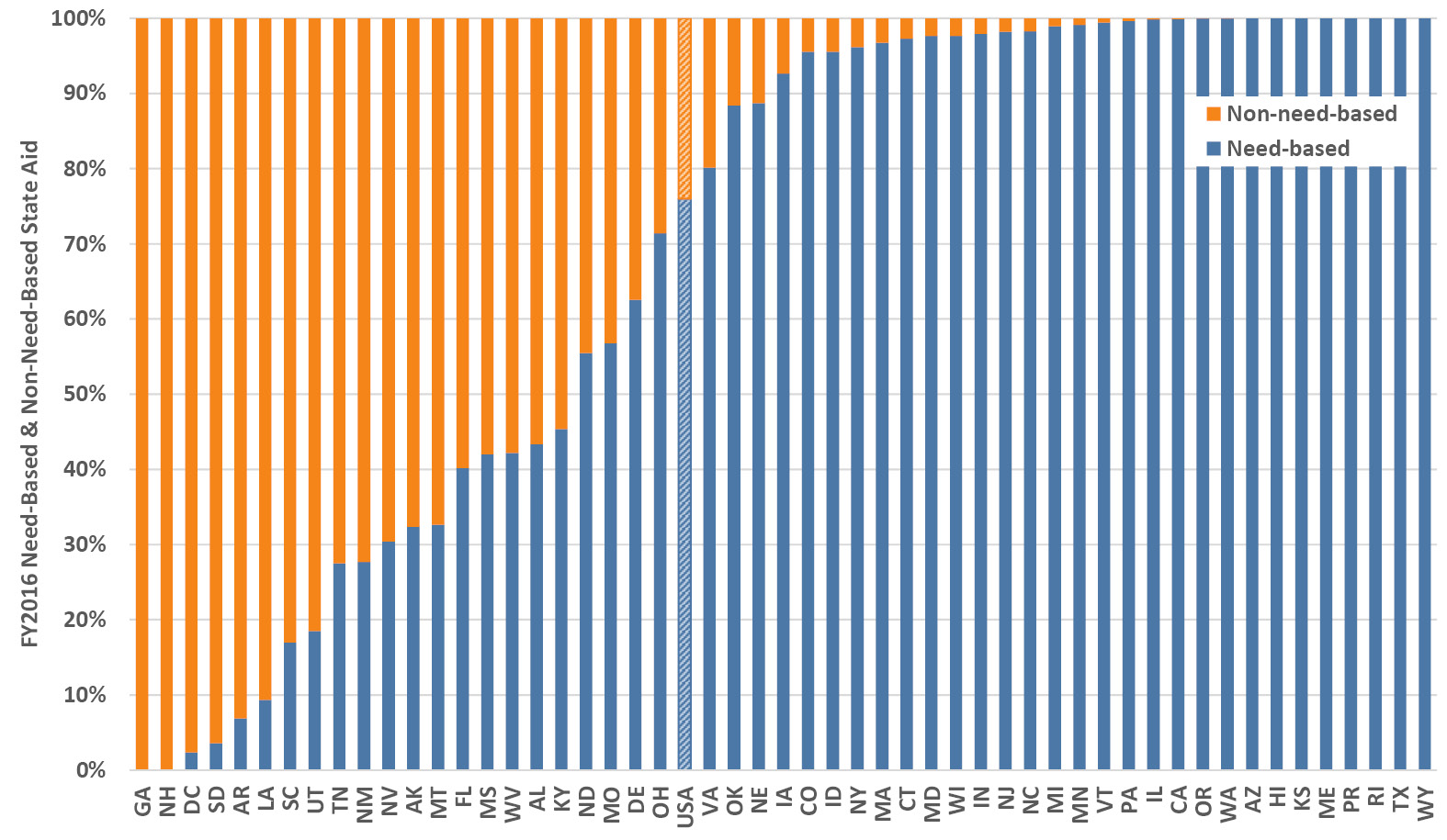
Figure 4.6. FY2016 average percentage of need-based and non-need-based state grant aid per award, including the District of Columbia (DC), Puerto Rico (PR), and the national average (USA). Source: NASSGAP (2017).
In addition to the obvious implications for students, there are consequences for institutions resulting from this broad range in state aid for students. Depending on their home state, and all else being equal, institutions will increase or decrease institutional aid to offset lower or higher state aid respectively, for total costs to the student to remain similar. This effect is amplified because in high-aid states, that aid effectively supplements institutional tuition revenue, whereas not only do institutions in low-aid states not receive that aid revenue, but they also must subtract the compensating institutional aid from their relatively lower revenue.
4.4 How does public financial aid vary by institution?
In the previous sections on public financial aid we have looked nationally and at the states and, sure enough, aid plays out differently across various types of institutions too. Figure 4.7 plots aid per award versus percentage of students receiving awards, averaged by category of institution. Government financial aid is primarily based on need and, because the mix of students with need varies by type of institution, we see the effect of that pattern in these data. Generally, students with greater need tend to enroll in relatively higher proportions at smaller rather than larger schools, and at publics more than privates, even though many schools go to great lengths to broaden the financial diversity of their student body and promote accessibility.
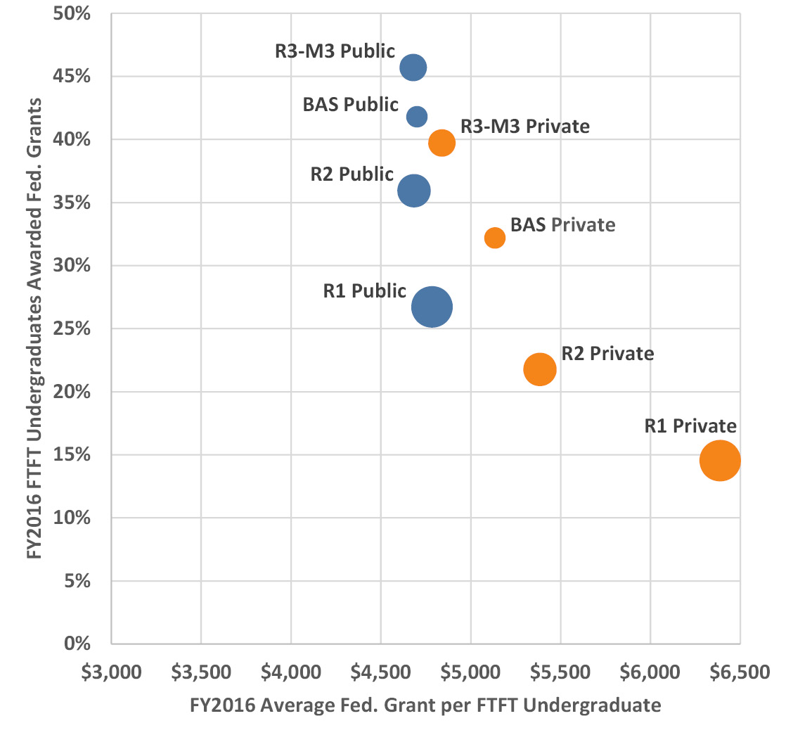
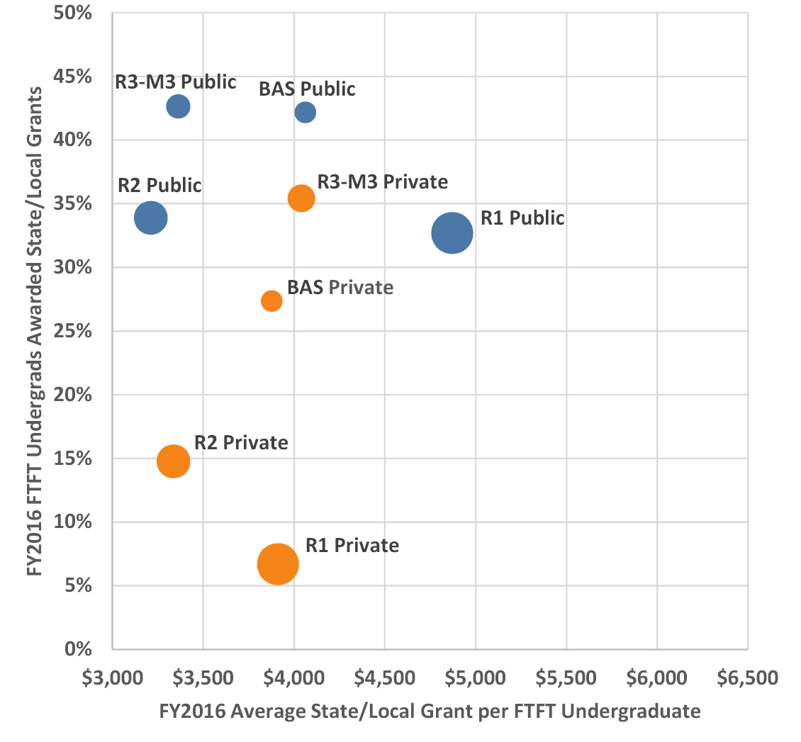
Figure 4.7. FY2016 government grant aid to first-time full-time (FTFT) undergraduates by average amount per student awarded and by percentage of students awarded from federal (upper panel) and state and local sources (lower panel), averaged by Carnegie classification and control. Categories are differentiated by circle size and color for easier comparison. Source: IPEDS (2020).
The two key patterns in federal aid in Figure 4.7 are firstly that students at private institutions receive higher aid awards than at the publics (likely to cover higher tuition) with a narrow award range close to $4,700 at the publics and, secondly, that, as expected, there is a greater proportion of students receiving federal aid at smaller regional schools, public and private. The state and local panel in Figure 4.7 shows a completely different pattern: the public-private contrast is evident in the higher percentage of students receiving aid at the publics (this is partly because many states do not provide aid to private institutions), which in this case also have the broader award range across different institution types compared to the privates. Looking across both sources of government financial aid, a similar percentage of students are awarded federal and state/local aid. However, federal aid awards are greater than state/local aid awards: the amount of federal aid per award is about $1,000 more than the state/local award at the publics, and roughly $1,500 more at the privates.
Figure 4.8 illustrates the trends in government grant aid for public and private institutions (the Carnegie groups track similarly to their relative positions in Figure 4.7, so I’ve plotted just public and private summary data to show the key trends and keep the charts legible). At both types of school, the percentage of students awarded federal grant aid gradually declined from the late 1990s until the recession and then jumped immediately post-recession to about 1.3 times the pre-recession level, before again commencing a gradual decline. Looking at the amount of federal aid awarded per student, there was a similar post-recession jump with sizable increases in award amounts before they dropped back down to the longer upward trend. Yet, the steep drops of over $1,000 immediately post-recession did not occur without consequence (especially when federal loans were flat at the same time, as we’ll see in the next section)—in partial compensation, institutional support rose during this period (as we saw in Chapter 3).
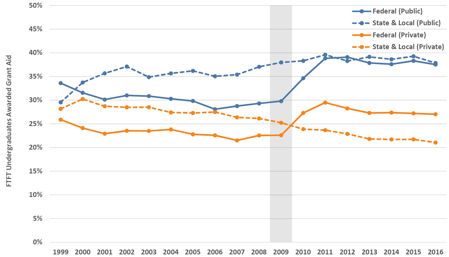
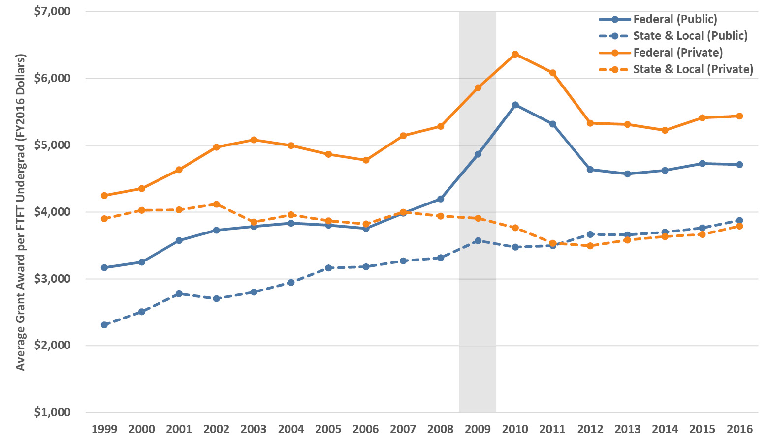
Figure 4.8. Trends in grant aid (by fiscal years in 2016 dollars) awarded to first-time full-time (FTFT) undergraduates by percentage of students awarded (upper panel) and by average amount per student receiving an award (lower panel) from federal and state and local sources, averaged for public and private universities. Source: IPEDS (2020).
State aid trends are stark in their contrast, with the percentage of students receiving awards at the publics essentially flat since a period of rapid growth at the turn of the millennium, although state award amounts at those schools have steadily increased and almost doubled over the period in the chart. However, at the privates, the percentage of students receiving state aid awards has decreased steadily while award amounts have also decreased slightly. The net result, on an inflation-adjusted per student basis, has been a distinct shift in state aid dollars from private to public institutions over the last decade and a half.
4.5 What are the amounts and trends in student loans?
Previously, in Section 4.2, we saw how student loan aid compared to grant aid across all students. How do student loans look when we examine them on a per-awarded student basis as we’ve just done for financial aid? Figure 4.9 illustrates student loans by award amount and percentage of students awarded, for all loans and for federal loans (which account for the vast bulk of all loans) for first-time full-time students. The average federal loan amount is similar across all types of institutions, in a narrow range between $5,000 and $6,000 in FY2016. In contrast, the percentage of students with federal loans varies widely across types of institutions with roughly 40–60% across the publics and a remarkable range from about 25–70% across the privates. The R1 privates likely have low percentages of students with loans due to a high capacity to offer institutional aid and lower relative enrollments of financially needy students, as compared to the R3-M3 privates where most students are borrowing, likely because those institutions have a low capacity to offer institutional aid and have higher relative enrollments of financially needy students. As we saw in Chapter 2, these latter institutions are also those with the greatest tuition dependency—the student loan situation is yet another example of the serious challenges facing such schools.
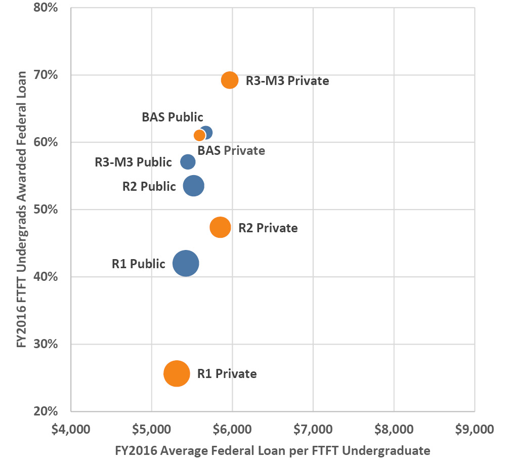
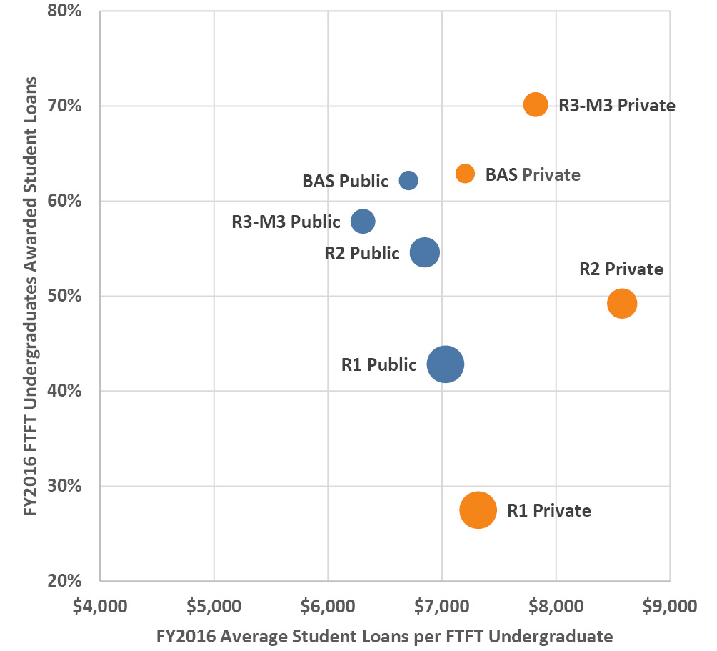
Figure 4.9. FY2016 loan aid to first-time full-time (FTFT) undergraduates by average amount per student awarded and by percentage of students awarded from federal (upper panel) and all sources (lower panel), averaged by Carnegie classification and control. Categories are differentiated by circle size and color for easier comparison. Source: IPEDS (2020).
There is an increment of about $1,000 to $3,000 above the federal amount when we consider all loans averaged across students with loans. Notice how carefully I phrased that—the data for remaining non-federal loans are distributed differently and these overall averages can be deceiving because “students with loans” includes those with just federal loans, those with just other loans, and those with both. The matching data for other non-federal loans are shown in Figure 4.10. Some first-time students are borrowing on average two to three times the amount of federal loans in other loans, more at the privates than at the publics and as much as $18,000 at R2 private schools. Fortunately, only a small fraction of students takes out these large other loans, about 6% at the publics and about 10% at the privates (except R1 privates where it’s 4%).
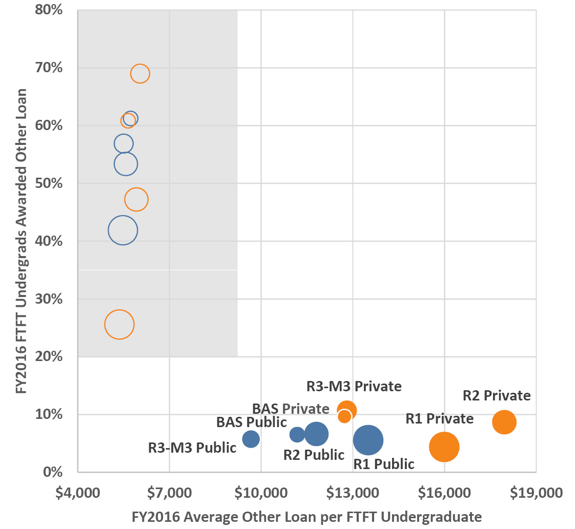
Figure 4.10. FY2016 other non-federal student loan aid to first-time full-time (FTFT) undergraduates by average amount per student awarded and by percentage of students awarded, averaged by Carnegie classification and control. Categories are differentiated by circle size and color for easier comparison. As a reference to highlight the different scales of these other loan data, the federal loan data from Figure 4.9 are plotted in the gray rectangle corresponding to the axis ranges used in that figure. Source: IPEDS (2020).
That takes us back to the lower panel in Figure 4.9—it’s the small proportion of students with high other loans that raise the all-sources average above the federal amount. I’ve included the all-sources number because we have much longer trend data for this amount than for the subcategory amounts. Given the media hype about student loans (warranted hype when applied to the for-profit sector in particular), it is instructive to note that averaged across all types of institution, 53% of students have loans and for those who do, their loans average $7,228 in FY2016. For these students, that’s about $30,000 over four years of study. If we average that number across all students for the “average student debt”, it is about half: approximately $15,000. Unquestionably, we’d like that number to be as close to zero as possible, but this amount of debt for the average student compared to a lifetime of increased earnings is still an unbeatable deal. On the other hand, there is a tiny percentage of students who borrow immense amounts into the hundreds of thousands, many of whom will struggle with that debt for years or decades. We’ll return to student indebtedness in Section 7.11.
Trends in student loans by institution type generally track their relative positions in Figure 4.9 and Figure 4.10, so I’ve plotted summaries of the trends by public and private institution in Figure 4.11 to keep the charts uncluttered as I did for financial aid. At the publics, we see a flat percentage of students with loans in the mid-40% range that rises in the pre- and post-recession years and then levels off in the mid-50% range. At the privates there has been variability in the mid-50% range for a long time, and this dropped slightly post-recession. In the shorter period we have for the breakout data, we see almost identical patterns in the federal loan percentages and a decrease in other non-federal loans by as much as one third at the privates. The one pattern that is masked in these summary trends is the dramatic decrease in the percentage of students with loans at R1 privates, from 48% in FY1999 down to 28% in FY2016—as mentioned before, these institutions are best-positioned to use institutional aid in offsetting costs to students.
Moving on to loan amounts, most of the jump of about $2,000 across all student loans occurred from FY2007–FY2009 and they have been essentially flat since then (in real dollars adjusted for inflation). The loan amounts of federal loans have decreased slightly in recent years, but other non-federal loan amounts have continued a steep, steady increase of almost $3,000 since the recession for that small percentage of students who take out these loans. Clearly, with the amounts for federal loans staying relatively flat over that period, the market has stepped in for a certain category of student.
A final point on trends in student borrowing: the share who borrow and the amounts borrowed also vary by income level. Comparing changes from FY1996 to FY2016, both shares and amounts have risen, especially in the upper two quintiles (income greater than $69,000) where the share of bachelor’s degree completers borrowing doubled and the amounts more than doubled (Delisle 2019). High-income families borrow more than low-income families and they do so at rates that now approach those of low-income families. Importantly, though, for high-income families the loan amounts at graduation are a much smaller proportion of family income (less than half), while for the lower-income quintiles the amounts can be equivalent to double the annual income (Delisle 2019; Seltzer 2019a).
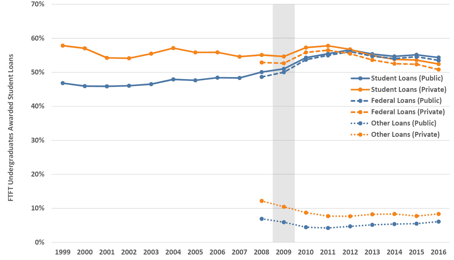
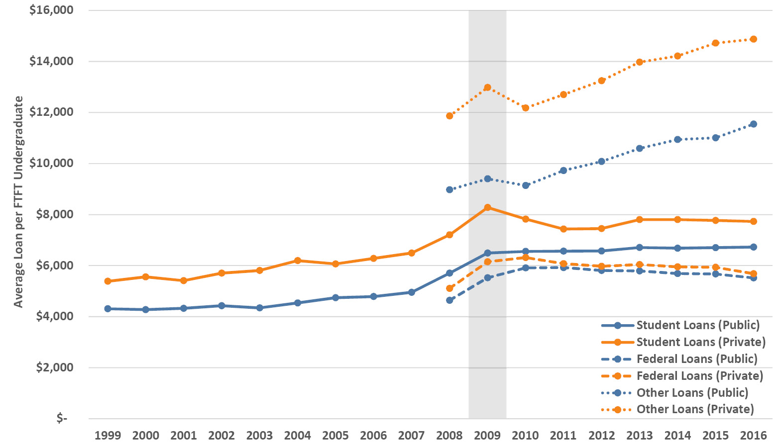
Figure 4.11. Trends in student loan aid (by fiscal years in 2016 dollars) awarded to first-time full-time (FTFT) undergraduates by percentage of students awarded (upper panel) and by average amount per student receiving an award (lower panel) from all, federal and other sources, averaged for public and private universities. Loan data broken out by category are only available from FY2008 onwards. Source: IPEDS (2020).
4.6 What is the history of state investment in higher education?
If there is a topic in higher education funding that gets as much press as tuition or student loans, it might be state appropriations. On public university campuses, state funding (or the lack thereof) has been the leading funding topic for decades. As a result, there is plenty of myth and misunderstanding on this subject. So, let’s shed some light by looking at the numbers, starting with the long view. By combining data from multiple sources, I have managed to assemble a unique almost century-long data set on state funding and associated variables, which we’ll examine in this section.
State investments in higher education take place in the context of broader economic conditions, illustrated in Figure 4.12. Important macroeconomic dynamics and policies undergird these trends—I’ll briefly review the major features, but I’ll leave further explanation to the economists. The classic national economic indicator is Gross Domestic Product (GDP), known as real GDP in its inflation-adjusted form. The historical trend in real GDP shows the Great Depression, a spending surge in World War II (WWII), the postwar expansion of the 1950s and 1960s, a slowdown in the 1970s followed by continued overall growth with expansion/recession every five to ten years through the 1980s, 1990s and early 2000s, and most recently the Great Recession that began in 2008–09 and lasted several years.
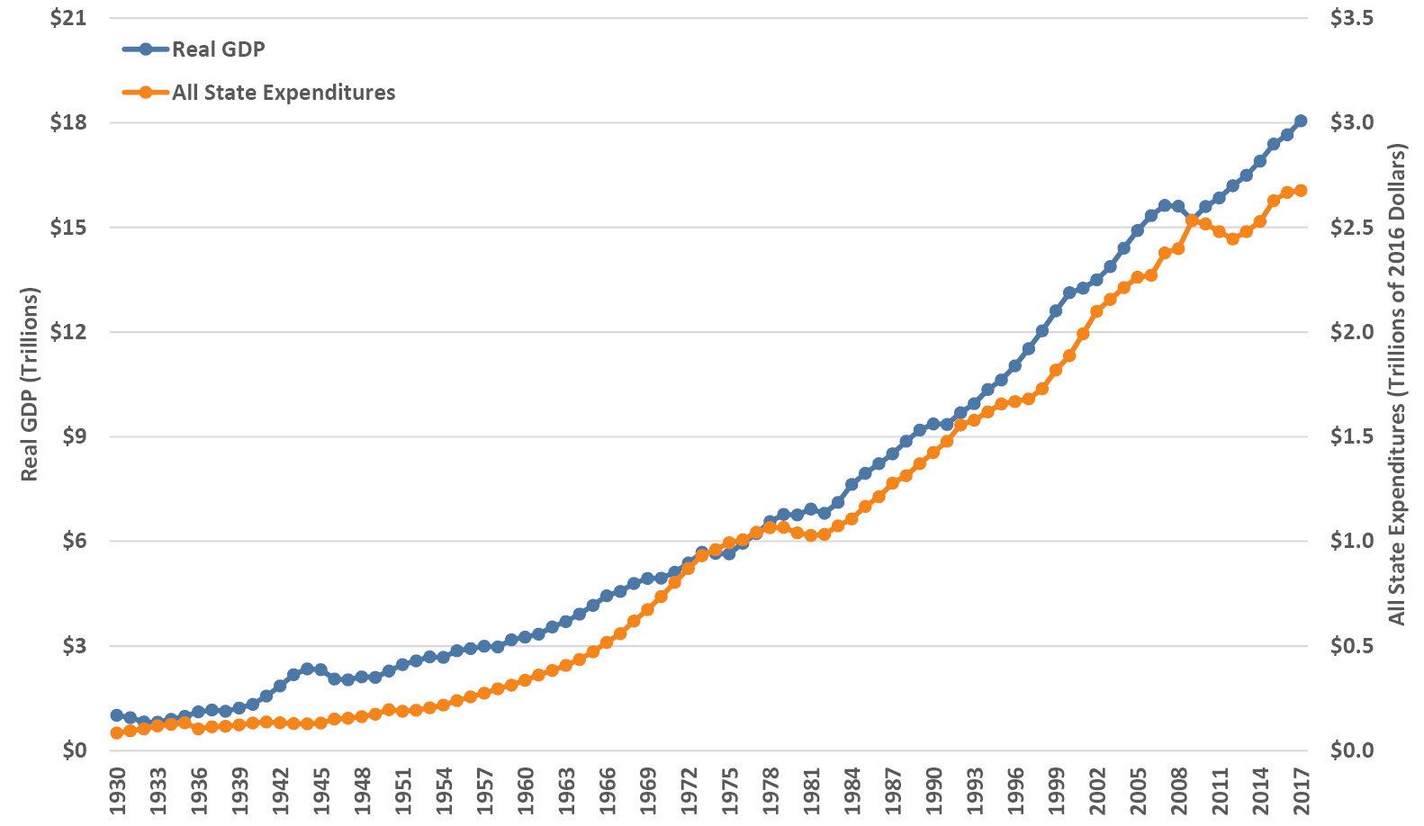
Figure 4.12. Historic trends in real (inflation-adjusted) GDP (calendar years) and all state expenditures (fiscal years, 2016 dollars). Sources: Bureau of Economic Analysis (2018a; 2018b).
Looking at the total expenditures of all the states (i.e., on everything, not just higher education, and adjusted for inflation) in Figure 4.12, not surprisingly we see the same broad growth over the century, but with some notable variations. State spending expanded dramatically during the 1960s, slowed down in the 1970s and then decreased into the early 1980s recession. State budgets grew modestly in the late 1980s, slowed in the 1990s, and as they accelerated again in the early 2000s they also became more volatile. The Great Recession saw the largest and longest decrease in state spending and has been followed by a modest recovery with slower growth than in GDP.
State appropriations for public higher education (also inflation-adjusted and including four-year and two-year institutions) roughly track the general economic trends over the last century (Figure 4.13). Two broad eras are discernable: first, a relatively smooth and remarkably steep expansion that occurred without interruption from the postwar years until 1979 and, second, a subsequent period of great volatility through to the present, characterized by numerous surges and cuts in appropriations (the Great Recession being the largest). We’ll compare these state higher education expenditures to all state spending below, but first let’s include enrollment.
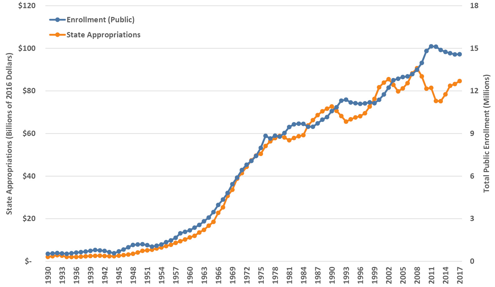
Figure 4.13. Historic trends in all state higher education appropriations (2016 dollars) and total enrollment in all public degree-granting postsecondary institutions (four-year and two-year). Sources for appropriations: Snyder (1993) for FY1930–1959, odd years interpolated from even years; Grapevine for FY1960–1999 (Illinois State University, Center for the Study of Education Policy 2018); SHEEO-SHEF (2017) for FY2000–2017. Sources for enrollment: Snyder (1993) for FY1930–1947, odd years interpolated from even years; NCES (National Center for Education Statistics 2017) for FY1948–2017.
It turns out that state appropriations have broadly tracked student enrollment in public institutions over the last century (Figure 4.13), although again the story is in the fluctuations. For the enrollment data, while FTE enrollment would be more precise, it has a much shorter data record than total enrollment, which I’ve shown instead—fortunately, their trend patterns are similar (and likewise, these enrollment data cover four-year and two-year institutions, matching the state funding). State funding variations don’t align directly with enrollment fluctuations for at least a couple of reasons. The main reason is that annual state higher education budgets are strongly influenced by political and economic forces that shape the entire state budget. The needs of, and political attitudes towards, higher education are of consequence in some years, but at other times alternate factors will dominate such as changes in tax revenue and spending on other rising costs like health. We’ll return to this topic in several ensuing sections. The other reason for state appropriation and enrollment fluctuations to be out of sync is that, while a little inconsistent, it’s not uncommon for enrollments to increase during economic downturns when jobs are harder to come by and people return to school to upgrade their education credentials.
Returning to enrollment trends, we can see the decrease in WWII followed by the increase associated with the GI Bill. Enrollments increased steadily from the early 1950s onwards, increasing even more steeply during the 1960s. This was when the baby boomers went to college, as well as many more women and people of color. The ideas of equality and access slowly made their way into policy during this time, some reflected in the recommendations of the 1947 Truman Commission (Gilbert and Heller 2010). At the national level there was a substantial expansion of federal aid. At the state level, community colleges also underwent huge growth in this period, opening at a rate of one per week in the late 1960s. After peaking in 1976, enrollments entered an era of approximately decade-long variations around a slower overall growth trend, which has continued through to the present day.
So, now that we’ve reviewed the context, what are the historical trends in state appropriations per student? Figure 4.14 illustrates the history of state investment per student in public higher education, using the same data as above including all postsecondary institutions (four-year and two-year) and adjusted for inflation. After some volatility before and during WWII, we see the characteristic steep postwar rise in state appropriations per student through the 1950s and 1960s into the mid-1970s, from about $3,500 to about $6,500. From that point onwards through to the late 2000s, per-student state appropriations went through a volatile period with several quasi-cyclical periods of 5–10% variations. The Great Recession was a signal event, with average state investment per student dropping from $6,722 in 2008 to $4,981 in 2012 (a 26% cut). This recent drop mirrors the one in the Great Depression of the 1930s and is about half the size of the postwar rise. For the record, that 2012 number was last seen in 1959! It has bounced back a little in the last few years, but contemporary state investment per student is the same as in the 1960s.
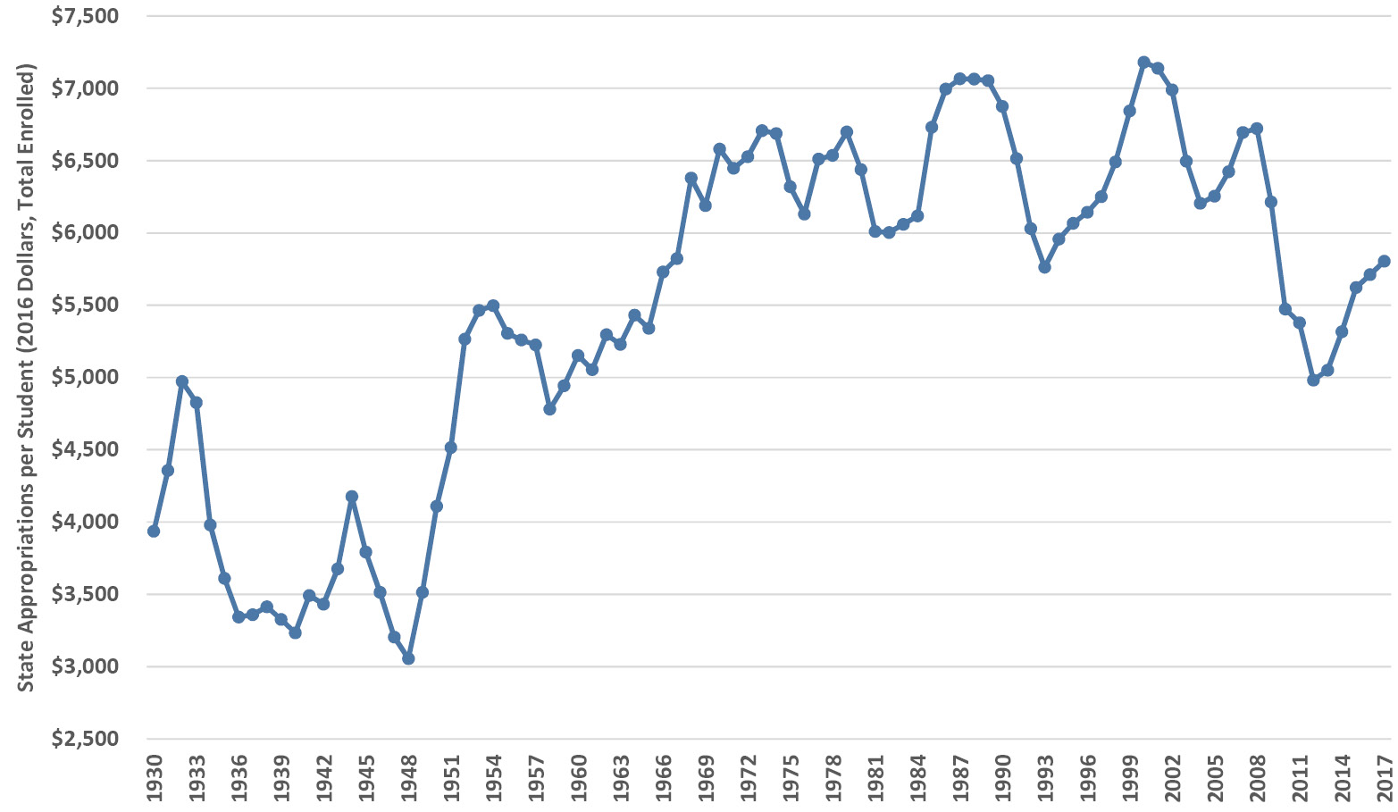
Figure 4.14. Historic trend in all state higher education appropriations per student in all degree-granting postsecondary institutions (four-year and two-year), in 2016 dollars using total enrollment. Sources for appropriations: Snyder (1993) for FY1930–1959, odd years interpolated from even years; Grapevine for FY1960–1999 (Illinois State University, Center for the Study of Education Policy 2018); SHEEO-SHEF (2017) for FY2000–2017. Sources for enrollment: Snyder (1993) for FY1930–1947, odd years interpolated from even years; NCES (National Center for Education Statistics 2017) for FY1948–2017.
Early in Chapter 2 we saw that our institutional budgets have doubled in the last fifteen years, and yet, as I mentioned, that fact didn’t align with the lived experience on campus. Now we see why—those increases went to inflation, and especially to enrollment growth. If we calculate the year-to-year percentage changes in state appropriations per student, the result is a chart that illustrates how state appropriations were felt by institutional budgets (Figure 4.15). The long, uninterrupted period of state funding increases from 1945 to 1979 is clear, followed by almost four decades of alternating increases and decreases.
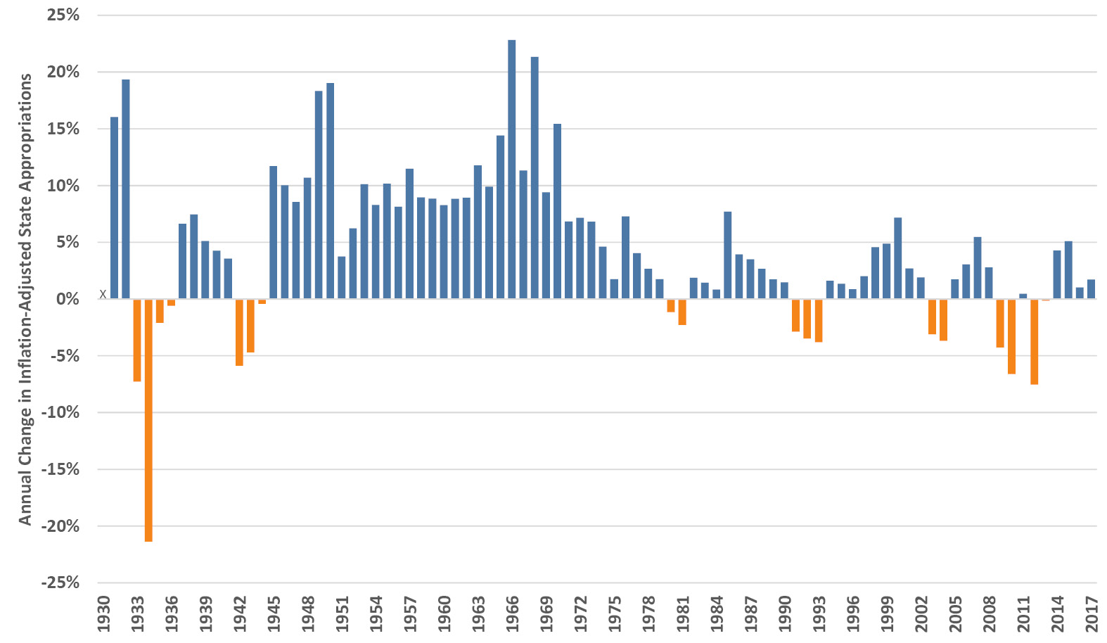
Figure 4.15. Historic annual percentage change in all state higher education appropriations (2016 dollars). Sources: Snyder (1993) for FY1930–1959, odd years interpolated from even years; Grapevine for FY1960–1999 (Illinois State University, Center for the Study of Education Policy 2018); SHEEO-SHEF (2017) for FY2000–2017.
We can do a related calculation and express state higher education appropriations in relation to the economy, or more specifically to overall state budgets. Those values are illustrated in Figure 4.16 as a percentage of GDP and as a percentage of overall state expenditures. The two measures show similar patterns, with the recognizable postwar growth through to the highpoint in 1975 for the GDP curve and to the early 1980s for the state budget curve. The post-1980s plunge, however, is stark and dramatic. Relative to the overall economy and to state budgets, state appropriations to higher education have dropped by almost half over the last three decades. States have not invested this small a percentage of their budgets (slightly over 3%) in higher education since the late 1950s.
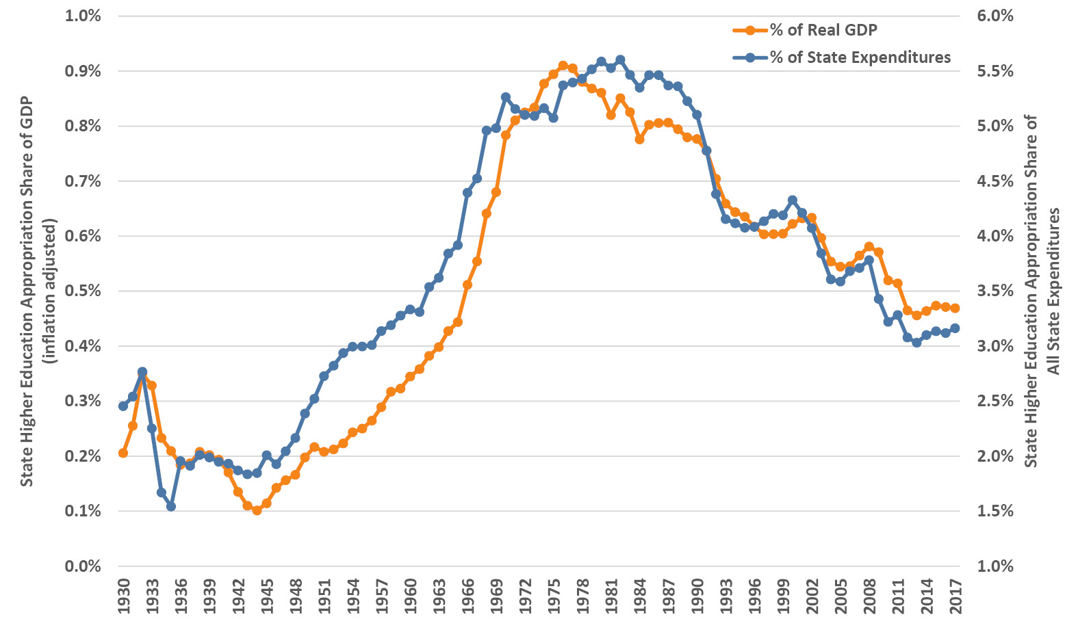
Figure 4.16. Historic trends in all state higher education appropriations as a percentage of real (inflation-adjusted) GDP and of all state expenditures (2016 dollars). Sources for appropriations: Snyder (1993) for FY1930–1959, odd years interpolated from even years; Grapevine for FY1960–1999 (Illinois State University, Center for the Study of Education Policy 2018); SHEEO-SHEF (2017) for FY2000–2017. Sources for state expenditures and GDP: Bureau of Economic Analysis (2018a; 2018b).
Not surprisingly, many in public higher education view this as a travesty. Despite being a fundamental shift that has been underway for decades, universities were in denial and throughout the 1990s and the early 2000s they (we!) clung to hopes of a return to the halcyon days of long ago. Looking at the swings of recent decades in Figure 4.14, such hopes weren’t without reason, but the structural decline in state higher education spending seen in Figure 4.16 is the deeper trend. Only with the shock of the Great Recession did public higher education lift its head out of the sand and acknowledge that the old days of growth and high state investment were not coming back anytime soon.
There are plenty of questions about all of this. Depending on their political bent, policy advocates wring their hands about massive state defunding of higher education or about the upward spiraling costs of attending college. Others worry about the underlying shift in higher education from a public to a private good. Some believe that state legislatures “have it in” for higher education and will continue to cut, and yet others wonder where all those state expenditures have gone instead. We’ll return to those questions, but first we will take a closer look to see how this plays out across types of institutions and states.
4.7 How have state appropriations changed by type of institution?
Using a shorter data record, we can disaggregate the nationwide trends of the previous section and examine them for four-year schools by type of institution. Figure 4.17 shows the average state appropriations and enrollment across all the four-year public institutions in our data set. State appropriations (in 2016 dollars) had some large swings of 5–10% during the last thirty years, but have ended up essentially flat over that time, about $115M at the average institution. In contrast, average enrollments over the same period have grown by about 40%, currently about 15,000 students at the average institution. The one exception in enrollment trends is the group of 20 small public baccalaureate colleges—their enrollments (not shown) were mostly flat over this period, averaging about 2,200 until after the Great Recession; since then they have declined by almost 10% and were down to about 2,000 students at the average college in 2017, a worrying trend for those schools.
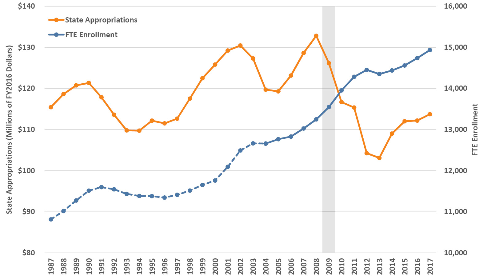
Figure 4.17. Trends in state appropriations and enrollment at public institutions, averaged within and then across the four Carnegie classification groups. Amounts are in 2016 dollars by fiscal year and twelve-month full-time equivalent enrollment by academic year. To provide long-term trends prior to 2004 (dashed line), twelve-month FTE enrollment is estimated from total Fall enrollment (full-time plus part-time) by using the average 2004–2006 ratio of the two for each Carnegie group. Source: IPEDS (2020).
Figure 4.18 illustrates state appropriations per student (now as FTE rather than total enrollment that was necessary for the historical trends in the previous section) for the four Carnegie groups of public institutions. We see the same overall patterns with several pre-recession cycles followed by the post-recession decrease in per-FTE state funding. The R1 schools saw the largest absolute and relative decreases, about $4,000 per student or roughly one third. The R2 and R3-M3 schools saw decreases of around $1,500 per student, about 15–20%. The baccalaureates have seen fluctuations in per-student funding but have trended flat overall because of their post-recession enrollment declines mentioned above, which occurred concurrently with the decrease in funding. A recent study found that a 10% decrease in state appropriations at public research universities led to a 3.6% decrease in bachelor’s degrees awarded and a 7.2% decrease in PhD degrees completed; non-research publics had fewer alternative revenue sources that necessitated lower spending and higher in-state tuition (Bound et al. 2019).
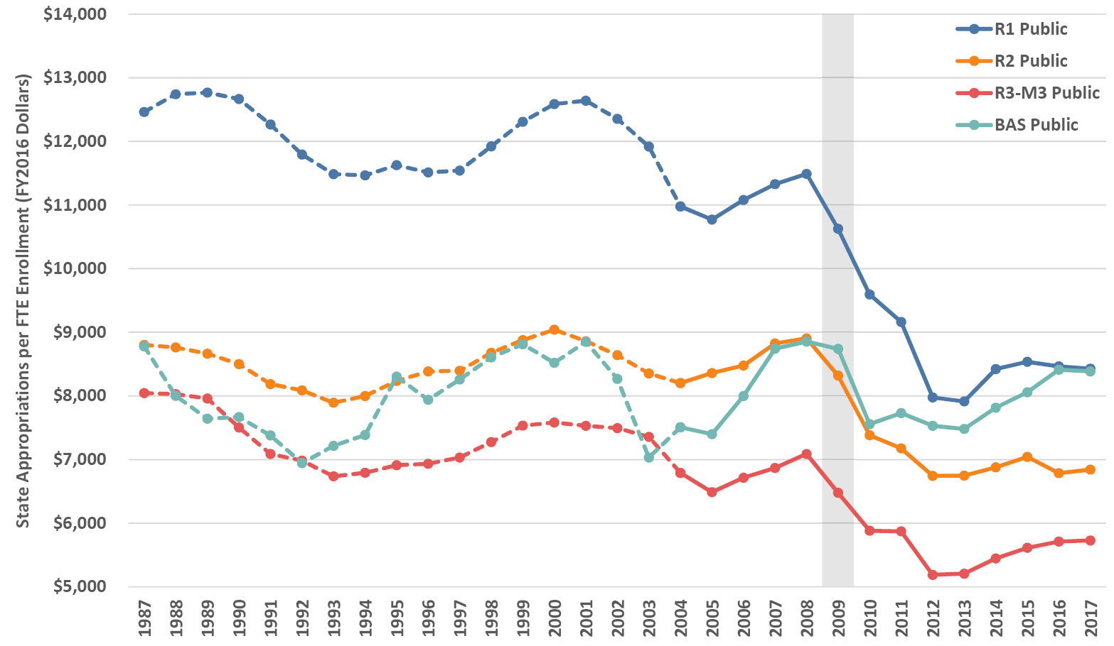
Figure 4.18. Trends in state appropriations per student at public institutions, averaged by Carnegie classification. Amounts are in 2016 dollars per twelve-month full-time equivalent enrollment by fiscal and academic year. To provide long-term trends prior to 2004 (dashed lines), twelve-month FTE enrollment is estimated from total Fall enrollment (full-time plus part-time) by using the average 2004–2006 ratio of the two for each Carnegie group. Source: IPEDS (2020).
We can compare these changes in state investment per student to total institutional spending on each student, using the E&R expenditures per FTE we examined in Section 3.4. Figure 4.19 shows state appropriations per FTE as a percentage of E&R expenditures per FTE for FY2006–2016 by Carnegie group for public institutions. There was a post-recession plunge from covering about 60% of education-related spending down to about 35% at most institutions, with the baccalaureate colleges showing much the same pattern but shifted about 5% higher. These dramatic changes represent a fundamental shift in society’s support of public higher education. More candidly, the states are no longer majority stakeholders in public higher education.
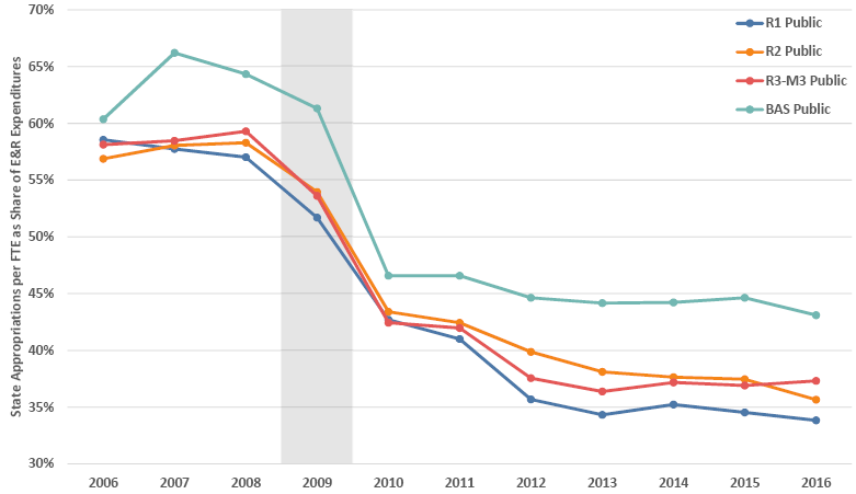
Figure 4.19. Recent trends in state appropriations per FTE enrolled at public institutions as a percentage of Education and Related (E&R) expenditures, averaged by Carnegie classification and based on amounts in 2016 dollars per twelve-month full-time equivalent enrollment by fiscal and academic year. Source: IPEDS (2020).
4.8 How much does each state spend per student?
There is an extensive range in annual spending per student across the 50 states (see Figure 4.20), from about $3,000 in Vermont and New Hampshire to over $15,000 in Alaska, Wyoming, Illinois and Hawaii, with the US average slightly over $7,600 and the median slightly over $6,500 in FY2017. The reasons for the varying amounts are as different as the states themselves, depending variously on their revenues, enrollments, policy environment, other demands on appropriations, etc. Note that these figures are for all postsecondary schools, two-year and four-year, and while the underlying data and analyses are similar to those in preceding sections, they are not identical.
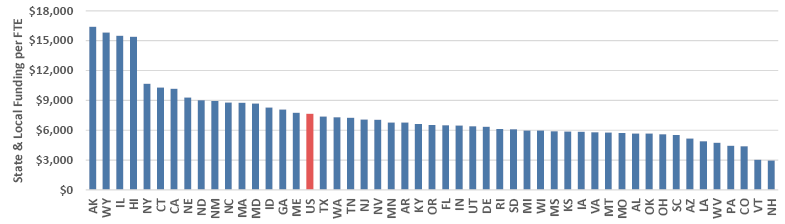
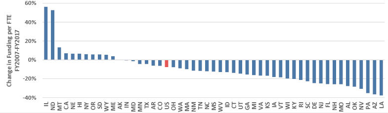
Figure 4.20. FY2017 state and local funding for post-secondary education per student (upper panel) and ten-year change (FY2007–FY2017) in funding per student (lower panel), by state, in 2017 dollars. Source: College Board (Ma et al. 2018).
The ten-year percentage change in state funding per student from FY2007–FY2017 spans the period preceding and following the recession (Figure 4.20). The percentages on the left axis are substantial—with a median of negative 12%, the majority of states are still considerably below their pre-recession investments in higher education, with Arizona (that also had increasing enrollments) and Louisiana down almost 40% over the decade. A handful of states’ investments are up over the decade, by 5–10%, with Montana at 13% and North Dakota at 53% (both with high oil revenues and low enrollments). The 56% increase for Illinois was a dramatic change aimed mostly at under-funded pensions (Ma et al. 2018), in contrast to the negative 23% for the five years FY2008–2013 in the heart of the recession (Weisman 2013). These data provide yet more evidence of how state higher education spending per student was slashed during the recession, and how it has not yet recovered (Mitchell et al. 2017).
4.9 Where has state spending gone instead of higher education?
The largest expenditures in state budgets go to elementary and secondary education, followed by Medicaid, then higher education, and then corrections (Figure 4.21). Smaller amounts go to public assistance and transportation, with all other spending including, for example, budgets of state agencies. Higher education accounted for 9.7% of state general fund expenditures in FY2018—roughly one quarter of K-12 education spending and one half of Medicaid spending.
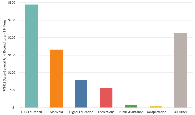
Figure 4.21. FY2018 general fund expenditures by category totaled for all states. Source: NASBO (2018).
With these proportions as context, the real story is in the trends (Figure 4.22). As we know from the preceding sections, state funding per FTE student has been in decline for some time, and we see that pattern when looking at higher education expenditures as a share of all state general fund expenditures, where it dropped from 15.5% in FY1987 to the 9.7% in FY2018 mentioned above. This systematic decrease can be viewed, perhaps simplistically, as part of a concerted policy to defund higher education. While there may be an argument to be made in that regard, the reality is more complicated: decreases in state support also reflect tough choices that states have had to make in reaction to compulsory Medicaid spending, escalating pension contributions, and wanting to sustain K–12 education (The Lincoln Project: Excellence and Access in Public Higher Education 2015). The main culprit is the rising cost of mandatory contributions to health services through Medicaid, which has increased 1.5 times since FY1987, from 8.1% to 20.2% of state general fund expenditures. Therefore, limiting the growth of healthcare costs is essential not only for healthcare reform but also for the public-higher-education landscape (Webber 2018). Interestingly, although corrections are sometimes blamed for “receiving” the higher education dollars, the share spent on corrections has been essentially flat since the mid-1990s.
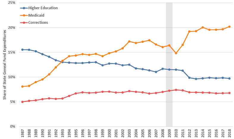
Figure 4.22. Trends in percentage share of state general fund expenditures for higher education, Medicaid and corrections, FY1987–2018. Source: NASBO (2018).
4.10 When did tuition revenue overtake state revenue?
In FY2010, for the first time, four-year public colleges and universities depended more on net tuition revenue than on state appropriations for funding support. We saw this in Section 4.7, where we broke out state appropriations as a share of E&R expenses by type of institution (Figure 4.19). Figure 4.23 illustrates state appropriations and net tuition revenue explicitly, where we can plainly see the FY2010 transition when the student share of educational cost first exceeded the state share. The two trends have diverged further since then, and in FY2016 the student share was almost 50% higher than the state share.
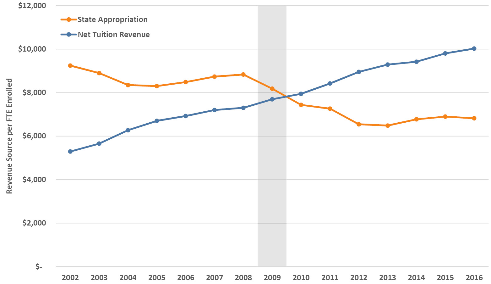
Figure 4.23. Recent trends in state appropriations and net tuition revenue in 2016 dollars per FTE student at public institutions. Source: IPEDS (2020).
At the state level, for all postsecondary institutions (four-year and two-year), FY2017 marked the first time that over half of all states relied more on the student share than on the state share to fund public higher education (SHEEO-SHEF 2017). In other words, the median state share dropped below 50% for the first time in FY2017 (for the average it was FY2012). Figure 4.24 shows the FY2017 state share of public higher education funding relative to the student share on a state-by-state basis, with 28 states now below the 50% mark. As we’ve seen in related state comparisons, the states vary widely in per-FTE support of higher education, from 80% and more in California and Wyoming, to 21% and 13% respectively in New Hampshire and Vermont. Since the Great Recession, the state share has decreased in all but two states (North Dakota and Wyoming) although most states’ relative ranking does not shift markedly from year to year (SHEEO-SHEF 2017).
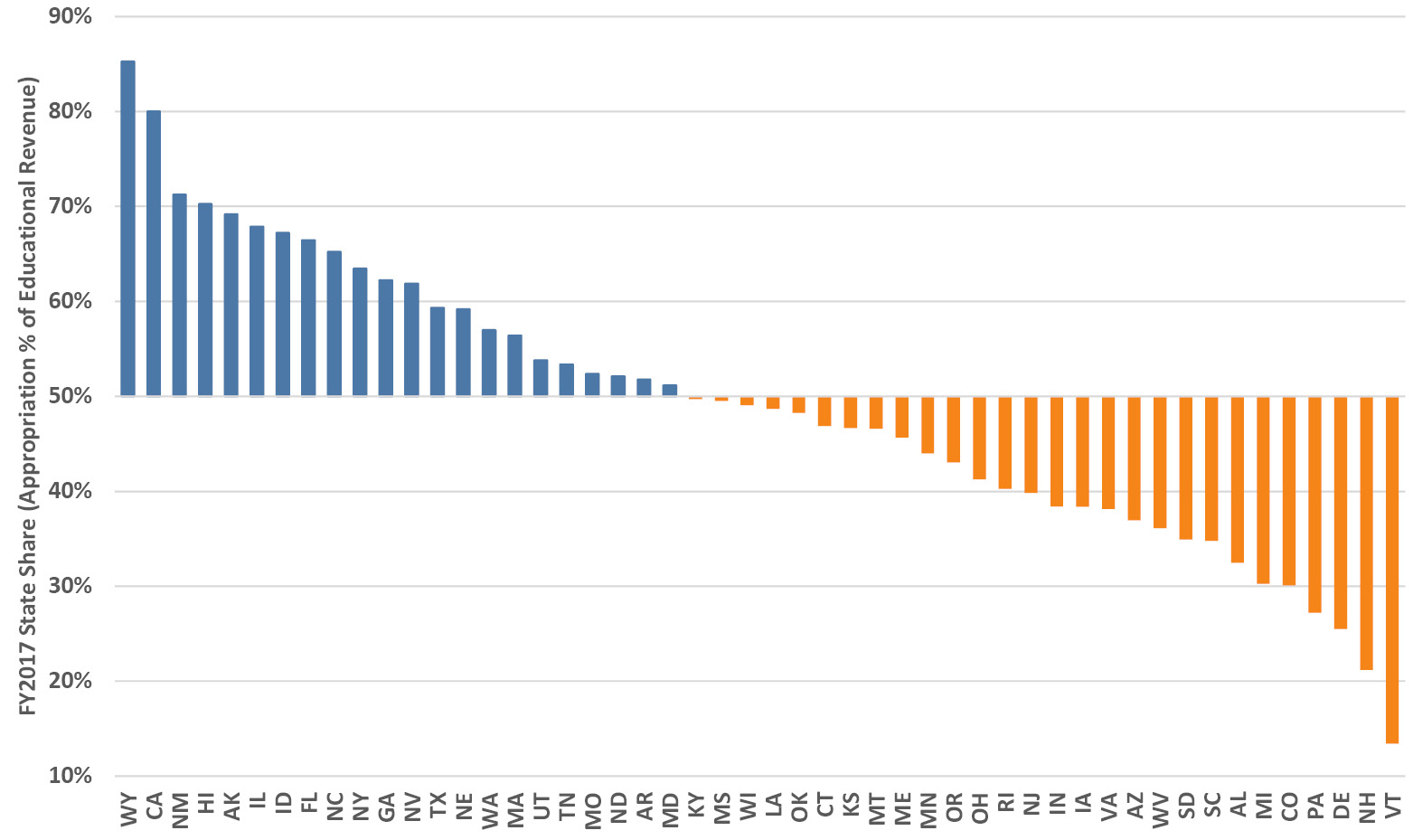
Figure 4.24. FY2017 state higher education appropriations as a percentage share of combined educational revenues (state higher education appropriation per FTE plus net tuition revenue per FTE). Source: SHEEO-SHEF (2017).
4.11 Do state funding cuts increase tuition?
Yes, cuts in state appropriations to public universities do increase tuition, but not in a 1:1 relationship. Figure 4.25 illustrates the relationship over three decades as annual percentage changes and, generally, tuition rises more when state appropriations fall and vice-versa (FYI, the correlation between these data series is a bit over 0.4). Given the analyses in previous sections this question may seem like a no-brainer, although in politically-tilted debates on state higher education funding the effect is claimed to range from near zero to 100% (Seltzer 2017). We know from previous sections that when state appropriations decrease, institutions take a variety of actions to decrease expenditures and increase other revenues (e.g., cutting labor costs, enrolling more out-of-state students if the institution has market access to them) while increasing tuition as a partial offset. Using advanced analyses to adjust for extraneous effects (e.g., state limitations on tuition increases, political bias in appropriations) rather than simple correlation, the pass-through rate has averaged about 26% since the late 1980s, although before 2000 it was about 10% and since then it has been 32% (Webber 2017). Multiple analyses have come to similar conclusions, that state funding cuts explain a significant and likely growing portion of tuition hikes and, furthermore, beyond the debate between advocates for greater support of higher education or advocates for restraint in government spending, the reactions of an institution to decreased state investment depend on its market position (Baum et al. 2018b).
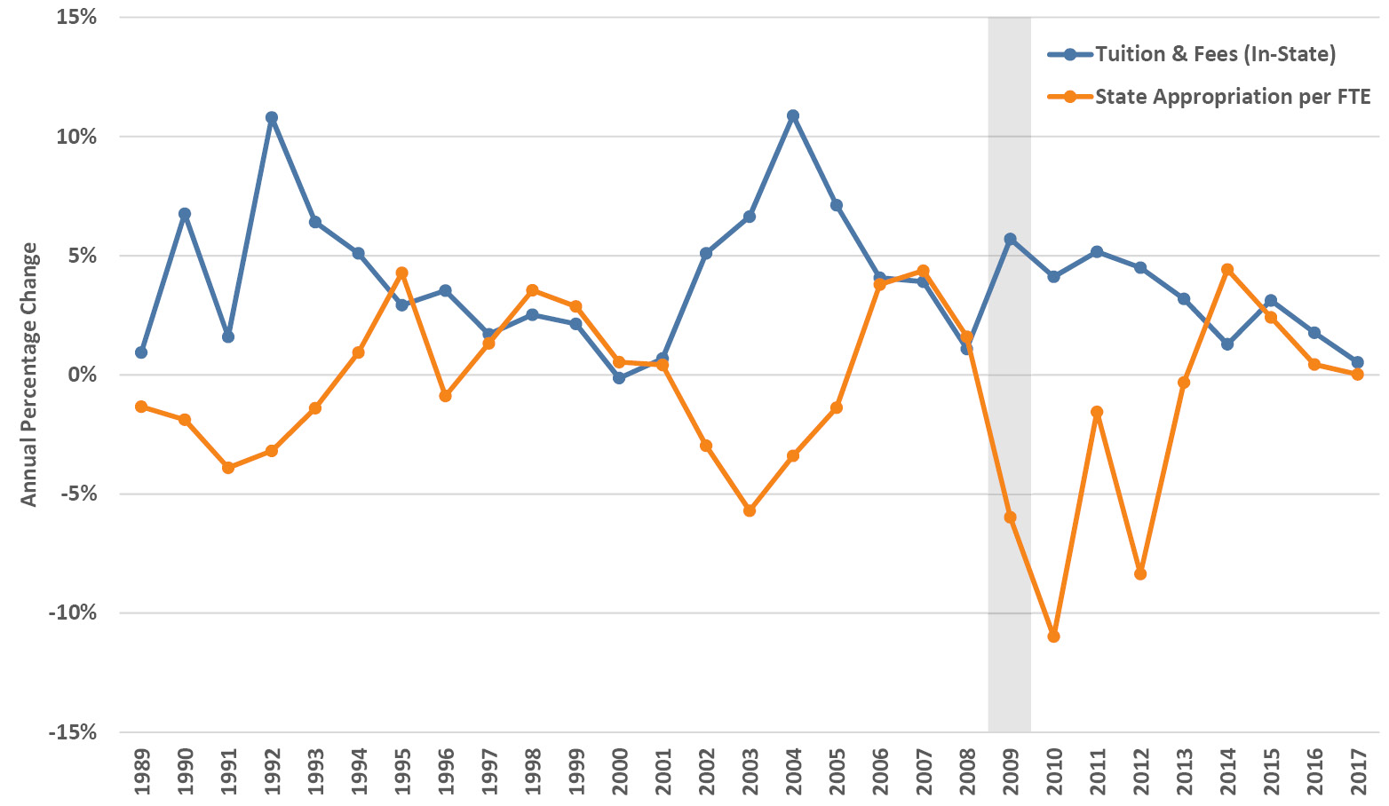
Figure 4.25. Annual percentage change in inflation-adjusted published tuition and fees (in-state) and state appropriations per FTE student enrolled at public institutions, by fiscal year. Source: IPEDS (2020).
4.12 Does performance funding work?
No, but that may be okay. Let’s review some background before returning to this question. The appeal of performance funding, sometimes called performance-based funding or outcomes-based funding, is that it supposedly incentivizes public institutions to pursue improved student outcomes based on specified metrics (e.g., graduation rates). Historically, state higher education funding was made through block appropriations or based on enrollment. Tennessee adopted the first performance funding program in 1979, followed by several more states in the following years, growing to 21 states in 2001, but dropping to almost half that number in the subsequent decade before rising again (McLendon and Hearn 2013). The most recent total, which includes states with performance funding for both two-year and four-year schools, was as high as 35 states in 2015 and 29 states in FY2020, depending on how one counts (Li 2018; Rosinger et al. 2020). Many programs have been reformulated to add or subtract accountability measures and to address challenges such as year-to-year volatility and avoiding unintended consequences for student equity. Furthermore, designing these programs for mission-differentiated institutions and sustaining them over time has proven difficult in ever-changing fiscal and political environments (McLendon and Hearn 2013; Obergfell 2018). Beyond the inherent attractiveness of the targeted quality-assurance element, the accountability aspects of performance funding in the face of tight state budgets, rising tuition and greater attention to oversight would seem to ensure that it will be around for the foreseeable future (Obergfell 2018).
Performance funding programs vary a lot, even across the 21 states that currently have them for four-year institutions (Figure 4.26). In 5 states, 80% to 100% of the state appropriation is tied to performance funding while it is 10% or less of the state appropriation in about a dozen states. Depending on the state, these amounts are determined via 1 to 10 or more metrics that fall into typical categories, frequently including those related to degree completion as well as job placement, critical fields (e.g., STEM, health professions), equity and diversity measures, and other metrics such as financial efficiency (Li 2018). Thus in North Dakota, for example, 100% of the state allocation is determined solely by credits earned (a completion-related metric) versus, say, Florida, where metrics in all five categories (credits earned, undergraduate and graduate degrees awarded, time-to-degree, graduation rates, employment outcomes, critical fields, Pell Grant/low-income student rates, and instructional costs) determine 22% of the state appropriation (Li 2018).
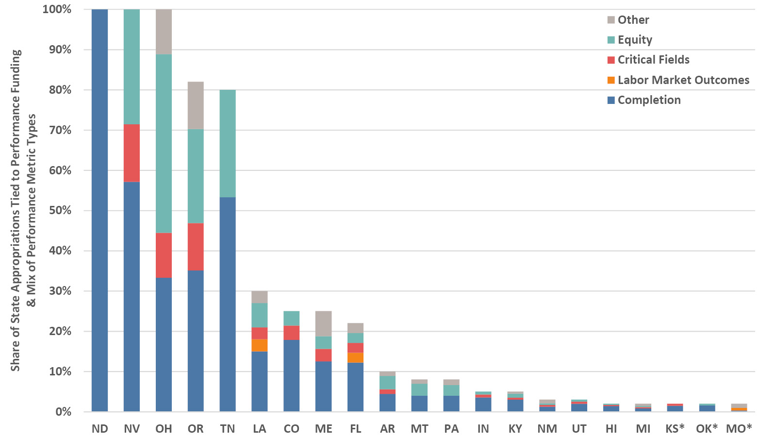
Figure 4.26. The 21 states with performance funding for four-year public colleges and universities in FY2018, showing percentage share of state appropriations tied to performance funding and the mix of performance metric types (unweighted proportional count) within each share. Performance funding in Kansas, Oklahoma and Missouri applies to new state appropriations only and no new funds were allocated in FY2018. Source: Li (2018).
Coming back to whether performance funding works as intended, most but not all empirical research studies have found that degree completions and graduation rates have not improved as a direct result of performance funding (Dougherty et al. 2014; Hillman 2016; Callahan et al. 2017; Hillman et al. 2018; Li 2018). There are several possible reasons for this: performance funding assumes that institutions will respond to the incentive, that the effect of performance dollars in the face of state divestment in higher education will be felt, and that the institution has the capacity to implement completion strategies above and beyond those already in place before the incentive. Additional confounding effects include the inverse cyclical relationship between enrollments and economic conditions, and that attention to completion, diversity, and other measures in higher education has been increasing independently of performance funding. Even if the evidence for an empirical link is weak, performance funding policies continue to enjoy political and foundation support (Fain 2015). While outcomes haven’t clearly shifted, some equity concerns such as shifts in low-income enrollment and funding disparities across different types of institutions have been raised (Rosinger et al. 2020). Performance funding has undoubtedly drawn campus and stakeholder attention to completion and other important outcome metrics, resulting in a silver lining of constructive changes in institutional practices such as developmental pre-college courses, accelerated programs, supplementary instruction, and tutoring (Li 2018).
4.13 Can’t we simply privatize a public university?
From time to time, especially after reductions in state support such as during the Great Recession, and often in tandem with frustrations about regulatory constraints, public campus leaders and others raise the idea of “going private.” Alas, the dream of complete autonomy with minimal budgetary impact doesn’t stand up to the cold facts of reality. There is no question that state disinvestment, coupled with increased tuition dependence, the necessity for fundraising, and more private sector partnerships, have led public universities (the R1 flagships in particular) to appear more like private institutions in those respects. However, the leap from there to total privatization is sufficiently far that virtually no institutions have done so, apart from a few that were set up with a special situation or independent funding from the start (Ebersole 2014).
There are at least a half-dozen financial reasons, and numerous non-financial reasons, as to why total privatization is impracticable (Chapter 10 covers several of these topics in more breadth):
- Annual Revenue Flow: We saw in Chapter 2 and in several earlier sections of this chapter that in some states, especially those with the lowest shares of state revenue on the right of Figure 4.24 such as Vermont, the low levels of state appropriations mean that total elimination of those funds from an institution’s budget could be a survivable event. For the average public institution, however, the state slice of the revenue pie is critical for at least two reasons: (i) it funds core activities that leverage others (see Section 2.12), thereby amplifying the loss, and (ii) the size of endowment necessary to replace it is out of reach in most cases. Consider a large university that receives $200M each year in state appropriations—it would need a new endowment of roughly $4B to supply a similar annual income stream. Yet, a smaller school that receives only $20M in annual state support could conceivably raise $400M to provide a similarly sized stream of annual endowment proceeds.
- Facilities: A major sticking point, buildings, grounds and other physical infrastructure are owned by the state and would have to be purchased, because states cannot give public property away to private entities. The biggest public campuses comprise hundreds of acres and hundreds of buildings that together would cost billions of dollars while smaller campuses would total in the hundreds of millions.
- Employee Benefits: Pensions, retirement plans, and healthcare contributions are handled differently across the states, and in those with large commitments to past or current employees the state is unlikely to assume those costs, so they would need to be covered by the privatized institution. These costs are hard to generalize but would likely be in the tens of millions of dollars annually at bigger institutions.
- Bonds and Ratings: Most campuses have debt payments on buildings, often funded directly or indirectly through bonds that were issued based on their being a public entity. Furthermore, the interest rate on any new bonds is strongly influenced by the rating of the institution’s perceived future ability to pay for them. Again, these costs are hard to generalize, but could total a few percent of the annual institutional budget.
- Alumni and Donor Contributions: with a major identity change, an institution will need to consider the implications for income from philanthropic gifts. There would without doubt be a concerted effort to rally support for the evolving new identity, and to use it as a fundraising opportunity. Still, the privatization move would minimally raise questions about past donations that were made based on the institution having a public mission, and there may be current donors who decide to withdraw their support.
- Charter and Name: Public universities receive their charter and public mission, as well as their name, by constitution or law. A privatized institution could finesse a modified public service mission, but if a name change was required by the state it would have significant implications for marketing and branding, and therefore enrollment, all else being equal. Universities and colleges are built on reputation and brand, so a name change would be a serious business risk and would need both a comprehensive rebranding plan and a long-term marketing investment to mitigate potential losses.
The upshot of these considerable impediments is that institutions contemplating significant privatization are likely to maintain their core public status and instead select hybrid solutions that enable them to partially address their challenge. The state with perhaps the most notable examples of hybrid shifts in recent years is Oregon, whose major universities have evolved towards greater autonomy with new regulatory and financial structures while retaining their public status (Wang 2013). Complete privatization was subsequently suggested by a state task force as one option to cut a huge shortfall in the public pension system, although implementation seems unlikely for all the reasons discussed above (Lehman 2017).
Privatization is more often seen in less dramatic but wider-reaching ways. There are countless public-private partnerships across the US higher education landscape and virtually every campus has something of that sort that fits under a wider banner of privatization: typical examples include spinning off or subcontracting dining services, bookstores, conference centers, and parking, as well as some non-auxiliary services like online enrollment recruiting and collaborative research space with companies (see Section 10.7). There is a lively discussion surrounding this broader notion of privatization, ranging from support to condemnation, and an accompanying set of structural dynamics related to declining public support and a neoliberal economic environment (Berdahl 2000; Morphew and Eckel 2009; Tierney 2012; Lambert 2014; Newfield 2018).
4.14 How are universities funded in other countries?
The higher education system in most countries is typically overseen by the national education ministry, often with substantial funding coming from the national government for public higher education. The US is unusual in having non-governmental regional accreditors provide oversight in place of the US Department of Education and, moreover, our public higher education institutions are funded and administrated primarily by the states with the Federal Government providing student aid and research investment. There is plenty of variation around the world and in some countries the states (or their equivalent) and cities may also fund public higher education. Many, but not all, countries also allow private institutions—globally, about 33% of higher education enrollment is at private institutions (Levy 2018). In some countries they are predominant, such as South Korea, Japan, and Brazil with between 70% and 80% enrollment in private higher education; India has the largest total private enrollments, with 58% of higher education enrollments being at private institutions (Levy 2018).
To understand public higher education funding internationally, it is useful to appreciate the other ways in which US higher education can be different. The tradition of going away to college is a part of US culture, but it is far less common in other countries where students typically attend an institution in their home city, which means that residence halls can have a decreased role. The whole concept of high-visibility college sports is American to the core—while there are club sports at many universities around the world, none of them have television contracts! Research is handled differently in some countries and may take place at government laboratories rather than on teaching-focused campuses. In most countries a smaller proportion of high school graduates goes on to university, and technical and vocational colleges play a relatively larger role. And, compared to the United States, tuition and fees at public institutions are generally lower (or even zero) in other countries.
It is hard to account for all these differences, but somewhat dated and limited national-level summary data enable some broad comparisons of investment in public higher education (combined for all levels of government in Figure 4.27). It is interesting that, in relative terms as a percentage of GDP, higher and lower income countries have similarly wide ranges in the amount they invest in higher education, and that the US ranks in the middle of high-income countries by this measure. The pattern changes when expressed in absolute dollars per student, and unsurprisingly it generally scales with the income level of the countries. Remarkably, the US also falls in the middle of the high-income countries by this measure of government spending on public higher education. Naturally, government spending is only part of the picture and it is worth noting that the US is among the countries with the highest household contribution to total higher education expenses (United Nations Children’s Fund [UNICEF] 2015).
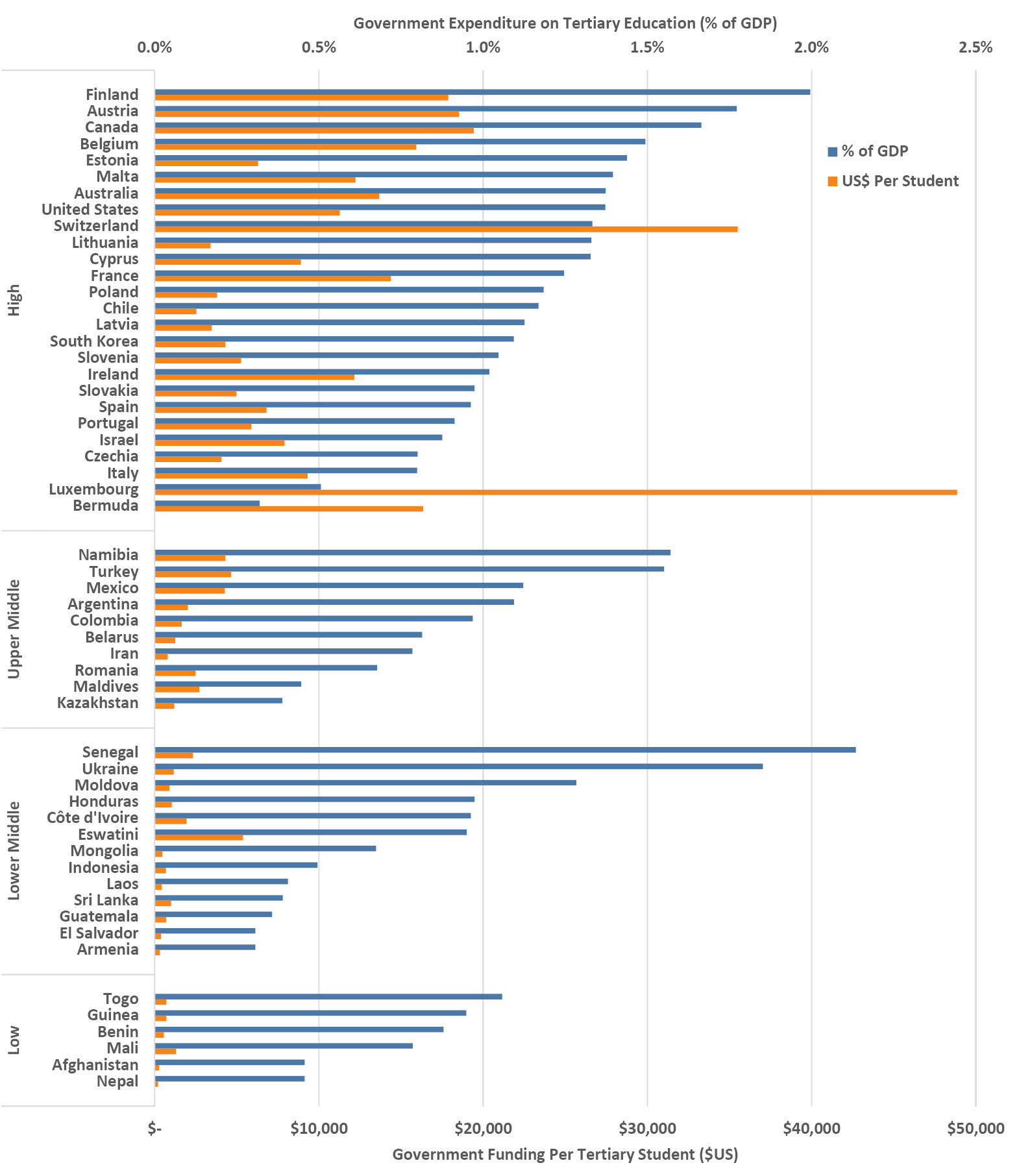
Figure 4.27. Government expenditures on public higher education as a percentage of GDP and per student in US$, both for 2014 and grouped by World Bank country income classification. Sources: UNESCO (2019) and The World Bank (2019)
1 The last decade saw a widening student aid scandal at for-profit colleges, where in many cases federal grants and loans accounted for over 90% of revenue, repeating a pattern that was seen in the past, such as with the GI Bill (Shireman 2017).