
2. Colour Contrasts,
Culture and Perception
©2025 Bregt Lameris, CC BY-NC 4.0 https://doi.org/10.11647/OBP.0380.03
Quasi-Immobile Physiognomy of the Perception of
Colour Contrasts
I wish to start the debate on how colour contrasts were and are believed to stir up the human organism, by laying out the physiognomy of the retina in relation to the perception of colour contrasts. In this way I wish to give an insight in the temporal layer of quasi-immobility, hence, colour perception from a biological point of view. Since I am not specialised in this field, I will heavily rely on more or less recent textbook explanations.
Current physiological literature alerts us to the biological complexity of the retina, with its multi-layered structure, covering more than half of the eye’s inner surface. It consists of various different kinds of neurons and fibres, which can be divided into three layers: (1) the layer of photoreceptor cells; (2) the layer of intermediate neurons; and (3) the layer of ganglion cells. The cells of the three layers are connected to each other through synaptic layers (Wyszecki and Stiles, 2001 [1982]: 86). Figure 2.1 shows a drawing of the physiology of the eye. The layer of photoreceptor cells (1) contains the so-called rods and cones, and is represented in the top section of this drawing. It is positioned on the outer part of the retina, which means that the photons that activate them have to pass through all the other layers of cells first. The rods and cones are connected to so-called bipolar cells in the first synaptic layer. These form the layer of intermediate neurons (2) and are connected to other cells on both sides. The bipolar cells (indicated by ‘RB’ in the diagram) are rod bipolar cells, where the information supplied by the rods is collected and transmitted (Müller et al., 2019: 611). ‘MB’ stands for midget bipolar cells, which collect and transmit the information gathered in the cones. The rods show converging patterns of up to 130 connecting to one rod-bipolar cell. Conversely, cone signals remain separated, and each cone is connected to its own midget bipolar cell (Wyszecki and Stiles, 2001 [1982]: 87). In the second synaptic layer, bipolar cells transmit the collected signals to the layer of ganglion cells (3). Ganglion cells are divided into two types: midget ganglion cells, collecting the signals of the cones via the midget bipolar cells, and diffuse ganglion cells that receive the collected rod signals as transmitted by the rod bipolar cells.
Fig. 2.1 Schematic representation of the retina (Dowling and Boycott 1966: 104).
Used as illustration in Wyszecki and Stiles, 1982: 86
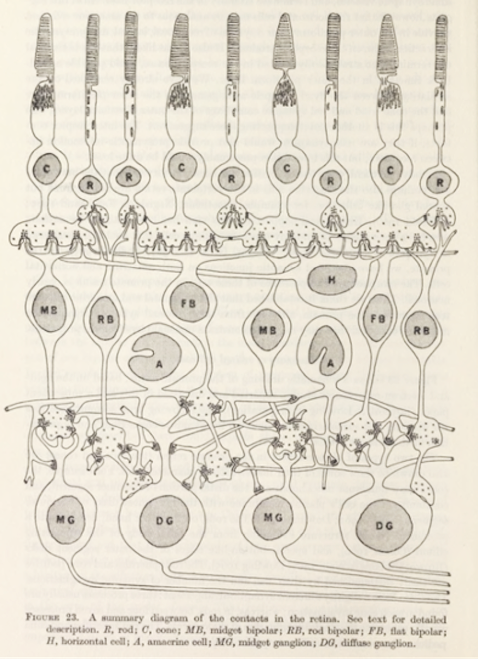
Interestingly, the retina is a developmental derivative of the brain and performs similar operations (Frings, 2012: 14). This means that it already processes a large amount of the information before the neural signals are sent to the brain. For example, in the first synaptic layer, where photoreceptor cells (1) are connected to bipolar cells (2), so-called horizontal cells connect rods and cones of all types to one another. These horizontal cells enable lateral processes between photoreceptors through this first synaptic layer. This indicates that rods and cones do not function separately but interact and communicate with each other. Furthermore, rods are also directly linked to cones through connections at the level of the synaptic bodies of both types of cells. In the second synaptic layer, amacrine cells have a similar function to horizontal cells in that they allow for lateral processes to occur in this part of the retina. Gunther Wyszecki and W.S. Stiles (2001 [1982]: 88) summarise the potential interactions between rods and cones, thus:
- direct contact between rod spherules and cone pedicles;
- indirect connections between rods and cones through horizontal cells;
- indirect connections between rod-bipolars and cone-bipolars through amacrine and ganglion cells.
This suggests that there are connections between cells in both the first and second synaptic layers, meaning that information can be exchanged between rods and cones, between rod-bipolars and midget-bipolars, and between various ganglion cells.
In the layer of photoreceptors, this direct and indirect contact between cones and rods creates a process called ‘lateral inhibition’, which increases the perception of contrast. Practically speaking, this means that ‘the activated photoreceptors send an inhibitory signal to the less active ones in their vicinity, suppressing their residual activity and, hence, increase the perception of contrast’ (Frings, 2012: 15). This increase of contrast occurs on both the levels of dark-light and colour contrasts. These processes of lateral inhibition are the biologically defined starting point of what is recognised as simultaneous colour contrasts:
The cone responses at any one point in the retina, at any one time, are also influenced by the responses of surrounding cones and by their preceding responses. These spatial and temporal interactions, which are only the first of similar modulations that occur at further stages of neural processing, underpin the core phenomena of color perception: simultaneous color contrast. (Hurlbert, 2013: 372)
Another possible result is that the layer of ganglion cells processes not three but four different signals, corresponding to green, red, blue and yellow, whereas colour-sensitive photoreceptors usually exist as short, middle and long wavelength cones (loosely related to blue, green and red). Since there is no knowledge of yellow-sensitive cones, the question arises of whether and how the yellow signals are constructed and increased through lateral inhibition, or otherwise. An explanation might be that a neural signal of yellow is produced by combining readings of the activation of M (green) and L (red) cones. ‘When LW- and MW-sensors are being activated equally, we see yellow’ (Müller et al., 2019: 627).1 Instead of a direct activity of ‘yellow’ in the photoreceptors, a yellow signal is read out of red and green signals. This explanation of the creation of a yellow signal indicates that the eye mixes colours in an additive way.
In addition to this, Müller et al. (2019: 640) explain that the perception of colour contrasts is not only produced in the layer of the photoreceptors, but also in the layer of ganglion cells. These are complex information-processing systems—for example, they analyse information signals concerning local differences in luminance, and communicate this to the brain. Furthermore, they also process information on colour differences: ‘Some retinal ganglion cells are particularly activated by small spots of red, of green or of blue light. [...] Some retinal ganglion cells compare locally the relative amounts of red and green light or blue and yellow light’ (Krug, 2012: 46).
There are four types of ganglion cells, all answering in their own way to the information that comes from the photoreceptor layer. Interestingly, they react in different ways: type 1 increases its firing frequency with red and decreases with green; type 2 increases with green and decreases with red; type 3 increases with yellow and decreases with blue; and type 4 increases with blue and decreases with yellow. This means that ganglion cells process and increase the contrasts between the four different colour signals, which are then sent to the brain, where they are further processed into the coloured images we perceive (Müller et al., 2019: 640).
In a way, this means that Hering’s opponent colour theory—as explained later in this introduction, in which he hypothesised that colour vision is based on four colours instead of three—might also find physiological and biological substantiation in the working of the ganglion cells. However, according to Barry B. Lee (2008: 13), these four colours as produced in the eye deviate from Hering’s opponent axes. Kuehni and Schwarz (2008: 101) confirm this, saying that, although psychological and neurophysiological support for Hering’s system has been attempted, ‘to date, there is no generally accepted neurophysiological mechanism for unique hues’.
In summary, when light enters the eye, it is processed, broken up and transformed into neural signals that are caused by—but differ materially from—light waves. The colours we see when we view an object are the result of the relationship between stimuli in the form of physical light spectra (that are not themselves colours) and the embodied way in which our neural responses and visual perceptions are created.2 This implies that colours as we see them are pure perception, created inside the eye and the nervous system. Light waves prompt the eye to start this activity, and the body then processes and digests these stimuli. Since one of the retina’s main activities is to increase or decrease the intensity of some of these signals in order to strengthen or abate the effect of colour contrasts, this can also be seen as the result of neural activity in the human eye.
This quasi-immobile biological hardware of the eye and retina, explain the existence of simultaneous contrasts and colour constancy as physiologically produced phenomena. This suggests there is a physiological, quasi-immobile biological basis for our centuries-long tendency to focus on contrasts when studying colour perception, and for the importance they appear to hold for us when regulating the use of colour in art and design.
Colour Systems for Colour Harmony
Traditionally, the perception of colour and colour contrasts has been studied from a variety of perspectives—optical, aesthetical, psychological or phenomenological, and physiological. Although they all have different starting points and fundaments, they often get mixed up. In this chapter I will lay out the history of colour contrasts from these various perspectives, explaining the importance of colour contrasts in human perception and in the way we use colour.
The aesthetic or artistic tradition adopted a normative approach, prescribing which colour contrasts were in good taste and which were not. These norms and regulations were rooted in, but did not necessarily contribute to, theories of perception; rather, they were used to explain what was known as ‘colour harmony’ or ‘colour consciousness’. Phillip Otto Runge, Wilhelm Ostwald, Adolf Hölzel, Faber Birren, Johannes Itten and Hans Albers are all examples of authors who wished to educate the general public on how colours should be, for example, positioned in relation to one another—and this list should of course include Goethe, the polymath. Some ‘colour specialists’, following in Goethe’s footsteps, connected this prescriptive discourse to more spiritual ways of thinking, using the discourses of colour therapy and psychological theories to substantiate the need for ‘colour harmony’, which will be the topic of Part II.
These different types of knowledge were illustrated with colour circles, spheres and trees to help visualise how colours related to and contrasted with each other. The circles and spheres would vary according to the system they were intended to represent. I will elaborate later on these various perspectives, and explain how colour theories, norms and standards concerned with the function and use of colour contrasts in the 1950s and 1960s were the result of a specific form of knowledge production (which included ideas, rules and regulations regarding the use of colour) that developed within the modernist episteme.
Although it is almost impossible to systematise such a fluid and elusive topic as colour, it has been studied and described from a wide variety of disciplinary perspectives, which have given rise to an equally wide variety of systems, codes, categories, and other attempts to control or organise the phenomenon. In ancient Greece, for example, colours were schematically categorised in a two-dimensional, linear way. These linear systems—which were transmitted in writing and contained sometimes five, sometimes seven names for hues—persisted into the seventeenth century.
During the seventeenth century, however, other ideas began to take root, based on the colour-mixing experiments of artists over the preceding 50 years of the Baroque period. Scientist Robert Boyle, in his 1664 Experiments and Considerations Touching Colours, determined that the basic colours of an artist’s palette were black, white, yellow, red and blue (Boyle, 1664; Gage, 1999: 26 and 136; Kuehni and Schwarz, 2006: 54). In response to Boyle’s ideas, a number of systems of primary and secondary colours were created that visualised how these colours could be related to one another in a logical way. In 1776, entomologist and engraver Moses Harris invented his ‘colour wheel’, a circular representation of a symmetrical, complementary colour system, displaying the primary colours (red, blue and yellow) and the results of their combinations (green, orange and purple) (Gage, 1999: 137), as well as their chromatic grades. Harris’s circle represented what became known as the subtractive system. Most colour circles created around this period corresponded to the subtractive colour system, offering a visualisation of how various colours could be created by mixing pigments and dyes (Spillmann, 2009: 20–23, 36–43).
Earlier in the eighteenth century, Newton conducted his extensive studies of light—and consequently of colour. His scientific work on colour and light is of an empirical nature, observing and describing light and colours (and the way they produce contrasts) as phenomena that take place outside the human body. However, although Newton was mainly interested in light and colour stimuli, he was also aware that colour was, in the final analysis, a phenomenon of perception. He published the results of his experiments in Opticks in 1704, describing how white light can be prismatically decomposed into various wavelengths that appear to us as different colours. Newton illustrated his findings with a circular diagram ‘in which he graphically represented the results of the mixture of spectral lights’ (Kuehni and Schwarz, 2008: 54). He further noticed that some colours appeared as each other’s opposite or complementary colour (Gage, 1999: 142). Following these findings, Newton hypothesised that if these colours were re-combined, they should turn back into white light, and (logically) combinations of opposite or complementary colours should yield the same result. This is what we know as the ‘additive colour system’. As a result, Newton’s colour circle, representing the refraction of white light into colours and back again, related to additive colour mixing, which was different from the circles representing the effect of pigments and dyes mixed together as in the subtractive system.
We now understand the significance of the difference between additive and subtractive colour systems. However, it took some time before the implications of this distinction were generally known or accepted: for example, although the practice of painting and mixing pigments is rooted in subtractive systems, artists adopted Newton’s theories of colour, finding in them a theoretical basis for what they were already doing in practice—that is, working with colour and colour contrasts. It would take until the mid-nineteenth century before the confusion over the difference between light mixtures and colourant mixtures was clarified by Hermann von Helmholtz. Helmholtz explained that just as the combination of colours ultimately results in white light, so pigments absorb (or subtract) part of that white light and reflect what remains, resulting in colour stimuli (Kuehni and Schwartz, 2008: 133; Gage, 1999: 219).
One factor that had an extremely important bearing on colour systems of the time was the availability of pigments and dyes. Harris and others had difficulties representing the ‘ideal’ colours they wished to make visible through their systems because they lacked the right pigments. A solution appeared in the nineteenth century with the ‘invention’ of synthetic dyes, which transformed the dye industry. These dyes enabled post-impressionist painter Georges Seurat, for example, to use a palette that came very close to representing the colours of the spectrum. It also enabled the standardisation of hues according to their colorimetric measurements, decreasing the reliance on language and interpretative association. Nevertheless, these pigments still were not entirely stable, and could not be relied upon for future use (Gage, 1999: 244).
During the second half of the nineteenth century, physiologist Ewald Hering introduced an interesting third system of so-called ‘opponent colours’. Rolf Kuehni and Andreas Schwarz (2008: 98) call Hering’s work a ‘paradigm shift in color order’ because ‘Hering recognized that perceptual color order was a world unto itself, complexly related to physical stimulus description’. The result was a system with four fundamental perceptions of colour (which Hering called ‘Urfarben’), representing yellow, red, blue and green. Since he observed that ‘a color perception cannot simultaneously be yellowish and blueish, or reddish and greenish’, he called these colours ‘opponent color pairs’ (Kuehni and Schwarz, 2008: 100) and illustrated his ideas by means of a colour circle, in which they were represented as opposites. The closest to a biological explanation of the perceptual phenomenon that Hering described as ‘opponent’ colours can be seen in the way stimuli are processed as colour signals transmitted by the eye’s ganglion cells as explained at the beginning of this chapter.
These two-dimensional colour circles proved very effective in illustrating colour theories such as those of Newton and Hering. However, to visualise the more complicated ways we perceive the world around us in colour, colour had to be systematised in three dimensions: hue, saturation/chroma and lightness. Hence, the continuing search for other potential models, such as triangles combined into three-dimensional cones which painter Phillip Otto Runge then integrated into a colour sphere in 1810 (Kuehni and Schwarz, 2008: 70–80). The equator of Runge’s sphere represented the hues organized as primary and secondary colours, as in the Harris colour circle. White was placed on the top of the sphere, black on the bottom, turning the vertical meridian into a scale of lightness. At the centre of the sphere was grey, obtained by mixing not only black and white, but also red and green, blue and orange, and yellow and purple. As a result, the horizontal axes of the sphere represented a colour’s degree of chroma or ‘purity’ (Kuehni and Schwarz, 2008: 79).
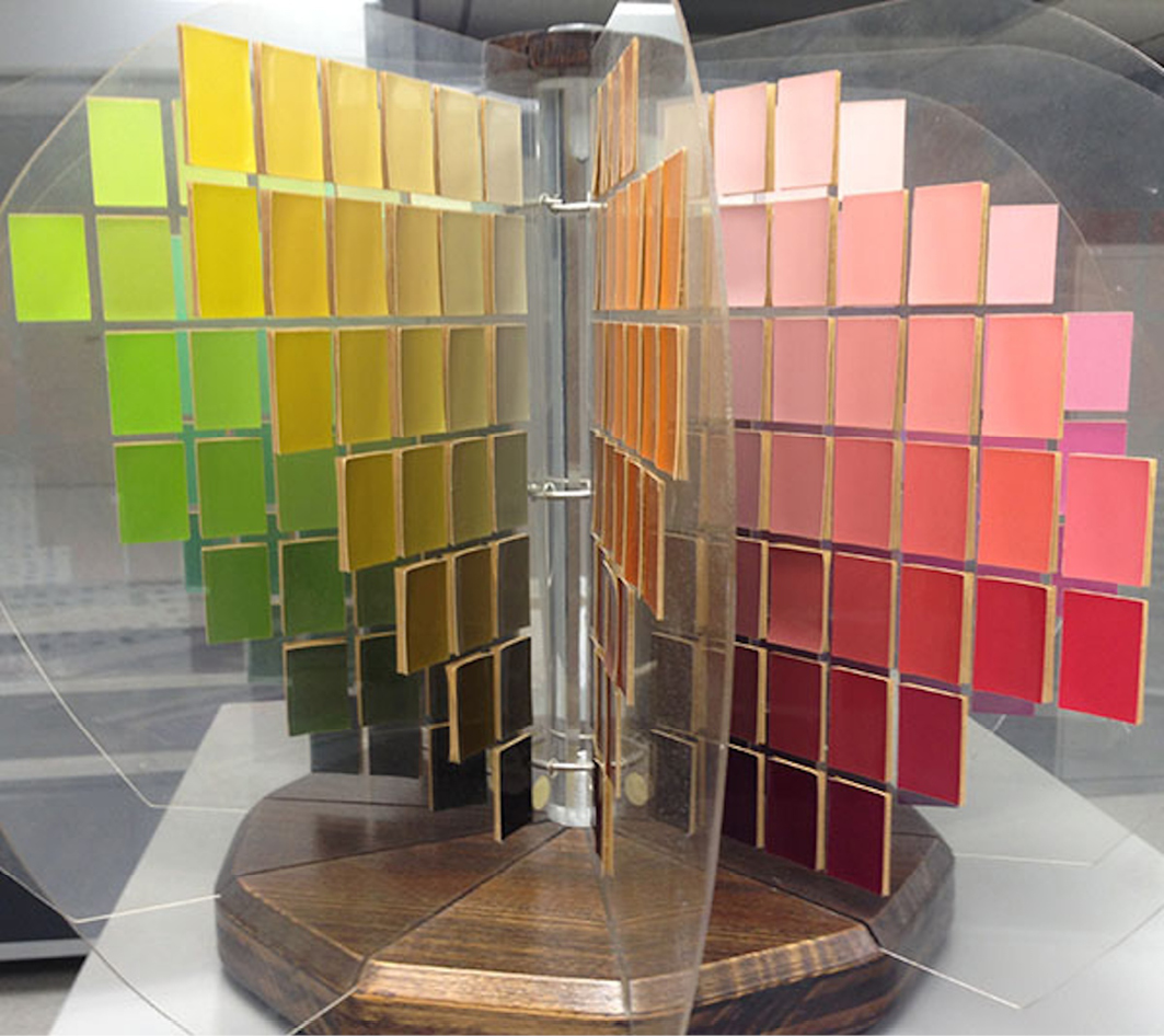
In 1919, Alfred Henry Munsell developed a system that followed this idea to symbolise three dimensions of colour—hue, value and chroma. In addition, Munsell tried to represent all the colours as we perceive them, not as a sphere but in the form of a ‘colour tree’. As such, he visualised that a purple or blue at its highest saturation level had to be located close to the black at the bottom of the tree, whereas a saturated yellow would be close to the white at the top. In this way, he tilted the equator of the sphere, while stretching and turning it into a tree-shaped form [Fig. 2.2]. In all, ‘[i]ts open-ended scale brought an end to the idea that a perceptually uniform color solid can fit into a simple geometric solid’ (Kuehni and Schwarz, 2008: 115).
Currently one of the main standards of colour representation is the CIE L*a*b colour space. This system was introduced in 1931 and was standardised by using colorimetric measurements, the accepted definition of a ‘standard observer’, and by taking into account object reflectance and the spectral differences of light sources such as tungsten and daylight. The result is ‘a technological system for accurately defining color stimuli in three dimensions, related to average human cone sensitivities’ (Kuehni and Schwarz, 2008: 126).3
Fig. 2.2 Example of a vintage Munsell Colour Tree.
https://munsell.com/color-blog/color-tree/
What is interesting now is that a tension exists between scientific and artistic colour schemes. The twentieth century saw artists returning to older systems, such as circles, spheres and trees, that were not (yet) considered reliable models in more scientific circles. Wilhelm Ostwald, for example, who collaborated closely with the dye industry, relied on Hering’s four Urfarben, which he built into a system of colour mixtures, even creating a ‘colour organ’ for painters. His ideas were adopted by the artists from De Stijl, Mondrian, van Doesburg, Rietveld and Huszár (Gage, 1999: 244).
Itten, as a representative of the Bauhaus, however, refuted Ostwald’s ideas and returned to Runge’s colour circle as the reference point for his system of colour contrasts:
[This sphere is] the elementary shape of universal symmetry. It serves to visualize the rule of complementaries, illustrates all fundamental relationships among colors, and between chromatic colors and black and white. If we imagine the sphere to be a transparent body, each point within which corresponds to a particular value, then all conceivable colors have a place. (Itten, 1970b: 66)
Clearly, Itten chose Runge’s circle as it allowed him to explain his ideas on the use of colour in art and how to work with colour contrasts in a more explicit way than, for example, Munsell’s colour tree. To make his point even more explicit, Itten (1970b: 66) projected the circle onto a flat surface, turning it into a ‘colour star’.
Thus, colour circles and colour systems were developed to define and visualise ideas on how colour values were related in systems of colour contrasts. Colour contrasts, such as complementary contrasts, contrasts of hue and saturation, and light-dark contrasts, all found their place in the systematic value systems (circles, spheres and trees) described above. The fact that they play such a big role in almost all these systems, shows the importance of contrasts in our interpretation, systematisation, and use of colours over centuries.
Studying the Physiology of the Eye
From 1800 onwards, an increased focus on the perceiver entailed a heightened interest in the physiology of the eye and the retina. This was encouraged by the emergence of scientific technologies such as the microscope. As early as the seventeenth century, a well-known pioneer in microscopy, Anthonie van Leeuwenhoek, had managed to enlarge the view of the retina, enabling its detailed study. However, despite this breakthrough, the development and use of the microscope as a scientific and medical instrument stagnated (La Berge, 1999: 112) until the mid-nineteenth century ushered in a new era of scientific interest in microscopy. This coincided with an increased interest in the perceiving subject and in phenomena such as simultaneous colour contrasts, as I will discuss below. At this stage, however, the study of the eye moved more in the direction of investigating its physical ‘hardware’.
The developments in microscopic technology and the shift in focus towards the interiority of the perceiver prompted further investigations into the eye and the retina. During the eighteenth century, a start was made on constructing theories of the retina relating to human colour vision, challenging contemporary ideas of the retina as a simple extension of the optic nerve set in vibration by the direct stimulation of light (Polyak, 1941: 151). Thomas Young rethought these assumptions by referring to Newton’s theories on light. In his text ‘On the Theory of Light and Colors’ (1802), Young concluded:
[As it seems] almost impossible to conceive each sensitive point of the retina to contain an infinite number of particles, each capable of vibrating in perfect unison with every possible undulation, it becomes necessary to suppose the number limited, for instance, to the three principal colours, red, yellow, and blue. (Young, 1802: 21)
Young based his hypothesis that the sensitivity of the retina was limited to three colours on Newton’s experiments with prisms and his findings that three colours could be recombined to make white.4 This was in line with the early seventeenth-century discovery in painting that a similar law applied to the mixing of colours: ‘[A]ll colors could be made from just three, the painters’ primaries—red, yellow, and blue—together with white and black’ (Shapiro, 1994: 600–01). In short, Young fused his (limited) physiological knowledge of the eye with theories of colour mixing to form the hypothesis that the optic nerve might consist of three types of fibres corresponding to the three basic colours defined at that time—those of the subtractive system. As Clerk Maxwell (in Mollon, 2003: 14) later commented, Young was the first to search for a solution to the fact that there are three primary colours ‘not in the nature of light, but in the constitution of man’.
In the 1850s, Young’s ideas on the existence of the optic nerve’s three fibres would become the starting point for Maxwell’s and Helmholtz’s theories of colour vision.5 As Helmholtz’s Handbuch der physiologischen Optik (1867) became a classic textbook, the theory suggesting the existence of three different colour receptors in the retina soon became relatively well known. Nevertheless, for a long period of time, the idea that the retina was only sensitive to a limited number of colours remained open to debate. Schopenhauer, for example, considered the retina to be one large sensory organ that was activated as a whole even after Young, Maxwell and Helmholtz had introduced their theories on trichromatic vision and the three types of photoreceptors.6 Even in 1941, Stephen Polyak was still querying if cones (the photoreceptor cells in the retina) could be of one type or several:
[T]here may be perhaps several [cones]—for example, three different kinds of cones—existing side by side, in which case the perception of colors could easily be explained, particularly in accordance with the three-component theory of Young and Helmholtz. (Polyak, 1941: 250)
Nevertheless, Polyak subsequently decided that there was no palpable anatomical evidence to support this assumption.
Indeed, the still-limited capacities of microscopes made it difficult to truly distinguish between the various layers of the retina. However, as mentioned above, microscopes began to improve during the nineteenth century. Even more revolutionary was the way in which specimens were prepared for microscopic investigation. Around 1830, Adolph Hannover started experimenting with the use of chromic acid to harden tissue (of the retina, for example), enabling him to cut it into sections, making observations far easier (Shepherd, 2015: 20). As a result, the following decade was characterised by extensive studies of the structure of the retina and the search for the exact location of the photoreceptors. In 1850, Heinrich Müller and Rudolph Kölliker, for instance, suggested a new conceptualisation of the retinal structure, in which the photoreceptors were placed on the outside of the retina, not—as it was commonly believed until then—on the inside (Polyak, 1941: 161–64).
It would take until well into the 1960s, however, for conclusive evidence to be produced establishing that the retina was indeed sensitive to a limited number of colours. W.A.H. Rushton achieved measurements for the M and L opsins (photoreceptor molecules), based on the light spectra reflected back from the retina after bleaching a cone pigment. Investigations into the differences between the measurements of normal and colour-blind eyes allowed him to calculate the spectra of the opsins of the various cones. However, these results were not yet accepted as physiological evidence. As Barry Lee explains:
[Gathering real evidence] first became possible with measurement technique[s] that permitted estimation of light absorption (Bowmaker and Darnall 1980) or electrical responses (Baylor, Nunn and Schnapf 1987) of single cones. The Young-Helmholtz view received final confirmation. (Lee, 2008: 13–20)
Physiological investigations began to emerge, with a shift in focus from outside to inside the body, as we saw in Chapter One with regard to Goethe and the modernist episteme. Already, at the beginning of the nineteenth century, Thomas Young (1802) was adopting this line of enquiry in his study of the eye and the retina. Indeed, throughout the nineteenth and twentieth centuries, physiological biologists and neurologists continued to study the biological hardware of the eye and the physiological functions of its wide variety of cells.
Experimental Psychology and Early Phenomenology
Experimental psychology represented another approach to investigating the perception of colour and colour contrasts. Experimental psychologists—or, as some of them called themselves, ‘phenomenologists’7—explored how the subjects in their experiments perceived colours and colour contrasts, and how the manipulation of stimuli could influence these perceptions. In some respects, Johann Wolfgang von Goethe could be considered an experimental phenomenologist avant la lettre; taking himself as a test subject, he started to investigate and describe the subjective phenomena of colour perception, such as the after-image. In 1810 Goethe published his findings and ideas on colour in the book Farbenlehre. This work marked an important moment in the colour debate, pushing it towards the study of how colour stimuli and colour perception interact. Goethe was already famed as the author of the wildly successful novel, Die Leiden des jungen Werthers (2006 [1774]), and his romantic disposition is discernible in Farbenlehre’s highly subjective form. For example, he uses a personal anecdote to explain the subjectivity of colour perception: he describes himself watching a beautiful girl in a scarlet dress, which leaves him with an impression of sea-green after she disappears from view (Goethe, 1840: V.52).8 The green image is one that, as he phrased it, ‘belongs to the eye’. Thus, Goethe used a very personal experience to position the production of perceived colours inside the body of the observer.9
Of course, Goethe was not a natural scientist, but an amateur at best, and his method to do an introspective investigation of his own experiences was critiqued a century later. Wilhelm Wundt, known as the father of experimental psychology, would explain why this approach is problematic:
The only form of introspection which experimental psychology seeks to banish from the science is that professing self-observation which thinks it can arrive directly, without further assistance, at an exact characterization of mental facts, and which is therefore inevitably exposed to the grossest self-deception. (Wundt, 1910: 7)
Wundt characterized this type of introspection as unscientific, even resulting on occasion in metaphysical hypotheses. He stated that introspection can only be scientific if used with an experimental method, which implies that the object of observation—the ‘psychical process’—should be disconnected from and independent of the observer. He dismissed self-observation as a method (in the way that Goethe applied it) since the act of observation would automatically influence the psychic process under observation. As he observed, ‘[t]he endeavor to observe oneself must inevitably introduce changes into the course of mental events’ (Wundt, 1910: 5).10
The epistemic shift around the beginning of the nineteenth century towards an increased interest in the perceiver also saw the emergence of several somewhat more hypothetical theories on the physiological workings of the eye and the retina. An interesting and fairly influential discourse described the activity of the retina when excited by light stimuli. For example, Arthur Schopenhauer, who was Goethe’s pupil at the time, used the idea of light activating the retina as the basis of the argument he laid out in his treatise on vision and colour, Ueber das Sehn und die Farben (1816). Schopenhauer’s aim was to gain an understanding of visual perception and colour vision with the help of philosophical hypotheses on what might take place inside the eye when stimulated by light. He speculated on the role of what he called ‘ergänzende’ (complementary) colours (so actually a type of colour contrast) in colour vision, and not only referred to the after-image as a perceived phenomenon, but also tried to explain it by hypothesising about the type of activity light provoked in the retina. For example, he stated that if white light activated spots on the retina, these would afterwards be ‘exhausted’ or suffer from ‘fatigue’, meaning they would be less functional for a while, creating only the colour black (Schopenhauer, 2010 [1816]: 62). According to Schopenhauer, something similar also happens with the various colours, albeit at different energy levels and with variations in the amount of activity.
After explaining why yellow and violet complement each other, and if combined together form white (as in Newton’s theory), Schopenhauer (2010 [1816]: 64–65) immediately added that they were not, however, equal parts of the full retinal activity. In his opinion, ‘the yellow color is a much larger qualitative part of that activity than is its complement, violet’. As an explanation, he referred to Runge’s colour sphere,11 which positioned colours of maximum saturation on the equator, indicating that they do not contain any black or white. Schopenhauer stated that these colours were full of ‘energy’, which supposedly decreased with the addition of more black or white. In order to build his theory, he focused on the hues of maximum saturation, but despite the saturation levels, he explained that they did not all have the same levels of energy: for example, as violet is the darkest and yellow the lightest colour, violet has a lower level of energy. In a simple way, Schopenhauer described what Munsell introduced into his colour system by tilting the equator in 1913, moving the saturated yellow closer to white and the saturated blue closer to black. As I will explain below, Munsell based his system on how colour is experienced, dividing and classifying colours in a way that correlates to the experience of the similarities or differences between them.
Schopenhauer called his theoretical hypothesis the ‘intensive divisibility of the activity of the retina’. He was of the opinion that the full activity of the retina (white) equalled a whole. This was reflected in his more or less mathematical analysis of the eye’s activity when excited by light: he gave white the numerical symbol ‘1’ (signifying the full presence of light and activity), and its opposite, black, ‘0’ (signifying the total absence of light and activity), embedding these ideas in his philosophical system and formulating hypotheses on how the eye worked and the way light activated the retina (Stahl, 2010: 13). Schopenhauer (2010 [1816]: 58–59) explained that ‘[i]t follows from my previous observations that brightness, darkness, and color are conditions in the strictest sense: modifications of the eye which are experienced instantaneously’. This implied that in addition to the function of transforming light stimuli into visual perceptions, he was convinced that modifications in the eye provoked an immediate experience, directly creating embodied activities and stimulating energy in the retina. Interestingly, the differences in retinal energy and activity aligned with various colour contrasts, such as complementary contrasts, contrast of saturation and dark-light contrast.
How to (Not) Move the Eye with Colour
After accepting the idea that colour and the eye interacted, the hypothesis that light and colour might even violate the eye was not far away. For example, Goethe (1840 [1810]: V.55) commented that ‘[e]very decided color does a certain violence to the eye, and forces the organ to opposition’, as well as describing the role of ‘pathological colours’ and the ways in which they could damage the eye in extreme situations. We later find these ideas echoed in the work of colour consultant Faber Birren (1950, 1956, 1961a), who approached it as a pathological problem in his writings in the 1950s and 1960s. As many researchers have pointed out, the danger of eyestrain was considered an important factor in both colour and cinema cultures (Yumibe, 2012: 20).
Despite the widespread criticism of Goethe’s Farbenlehre during the nineteenth century, and the relative obscurity of Schopenhauer’s work, their ideas nevertheless became fundamental to the thinking on colour in the twentieth century. This was partly due to a rekindled interest in their studies in Germany during the century’s first decades. Goethe’s Farbenlehre became popular across a broad field of colour specialists, from the more academic circle around natural scientist Arnold Brass to the expressionist painter Ernst Ludwig Kirchner (Gage, 1999: 194) and Adolf Hölzel, a professor at the art academy in Stuttgart from 1905 until 1919, where he taught future Bauhaus teachers and theorists Johannes Itten and Oskar Schlemmer. During a lecture at the first German ‘colour day’, held in Stuttgart on 9 September 1919, Hölzel explained that he and his students stood on ‘Goetheschem Fundamente’, claiming that ‘Goethe is eternal to us, at least as long as human eyes exist’ (my translation).12
Hölzel also referred to Schopenhauer, especially his theory of the bipartition of the retina. As a result, even though his treatise was not nearly as well known as Goethe’s, Schopenhauer’s ideas also found their way into twentieth-century normative discourses on colour. Hölzel (1919) described how ‘[t]he bipartition, as Schopenhauer calls the required division with regard to colour in the eye, has to be taken into account continuously for images’ (my translation).13 He fully embraced Schopenhauer’s theory that light stimuli produce both ‘strain’ and ‘relaxation’, regarding it as a little-known fact that has a disproportionately large influence on daily life. Hölzel even pushed this idea to its limits: in his opinion, colour harmony and complementary colours were not based on mathematical science but on the way perception and after-images functioned, and he claimed that the human eye was perfectly capable of judging the accuracy of this type of contrast.
Of course, Hölzel and Itten leaned towards a more occult and spiritual way of thinking about colour, as instigated by Goethe and continued in the tradition of colour psychology and colour therapy that I discuss further in Part II. However, those figures who had a more scientific, mathematical and psychophysical perspective on colour, such as Helmholtz, Munsell, Ostwald, and artists such as Delaunay, Moholy-Nagy and Mondrian, also considered contrast in an embodied way. Helmholtz (1995 [1881]: 298), for example, discussed partial fatigue of the retina, which—even though he did not refer to it—closely resembled Schopenhauer’s ‘division of the activity of the retina’.
Artists of the time also took up the aesthetic theory of ‘Einfühlung’, which can be translated as ‘feeling into’. One element that was considered essential in this theoretical approach was ‘the affective, and more precisely qualitative (i.e. qualia-like), effects’ of colour (Ganczarek et al., 2018: 142). Even László Moholy-Nagy, who was not known as a fan of emotionalism, interpreted the notion of Einfühlung as the ‘primal’ states of tension created by colour perception, which he considered crucial to any artist. In his book Malerei, Photography, Film (1925), he commented:
We must assume that there are conditions of colour relationships and tensions, light values, forms, positions, directions which are common to all men and determined by our physiological mechanisms. [...] [T]he paintings of every age must have been formed from these primal states of tension grounded in man. The observable variations between the painting of different periods can be explained only as periodic formal variations of the same phenomenon. (Moholy-Nagy, 1967 [1925]: 13)
Moholy-Nagy considered these elements to be biological, slow to change and fundamental to the art of (abstract) painting. The way these tensions were made visible in artworks was subject to variation, but the ‘biological’ principle was the same. That principle was precisely the notion of tension that Goethe and Schopenhauer described as a need for balance.
During the 1950s and 1960s, colour contrasts again were at the centre of attention in the field of colour theory. In 1954 perceptual psychologist Rudolf Arnheim published Kunst und Sehen—translated as Art and Visual Perception (1956)—which contained a chapter discussing how colour contrasts and perceptions of colour interact. Later, in 1961, colour theorist and former Bauhaus teacher Johannes Itten published Kunst der Farbe, a systematic study of colour contrasts and their influence on the perceiver, and followed this in 1970 with a shortened version, a ‘Studienausgabe’ (‘study guide’), that was translated into several languages and is still in print today. This text contained Itten’s ideas on the different colour contrasts and how they could be used to create ‘colour harmony’. He defined seven types of contrast: (1) contrasts of hue; (2) light-dark contrasts; (3) cold-warm contrasts; (4) complementary contrasts; (5) simultaneous contrasts; (6) contrasts of saturation; and (7) contrasts of extension (Itten, 1970).14 These contrasts also formed the basis of Hans Albers’ later work (see Chapter Four). Itten was building on the ideas of his former tutor, Adolf Hölzel, who had already systematized various types of colour contrast in 1904 (Röthke, 2013: 7).15 The added value of Itten’s work lay in the fact that he systematically worked through the seven contrasts, providing a practical introduction to each and suggesting ways in which artists could use them. For Itten, colour contrasts could not appear without the active eye and mind of the perceiver:
The color agent is the physically or chemically definable and analyzable pigment, the colorant. It acquires human meaning and content by optic and cerebral perception. The eye and the mind achieve distinct perception through comparison and contrast. (Itten, 1973 [1961]: 19)
Thus, from the nineteenth century until deep into the twentieth, the discourse on colour was interspersed with an understanding of colour perception as an embodied phenomenon, based on the presumption that the eye and the nervous system played a crucial role in its creation, most noticeable in the perception of colour contrasts. This implies that, from the very beginning, the idea that colour contrasts were determined by embodied processes formed part of the cultural context of colour film, also determining ideas and discourses of the 1950s and the 1960s.
1 ‘Werden LW- und MW-Sensor gleich stark aktiviert, sehen wir Gelb’.
2 The body also creates the experience of colours deviating from or independent of the stimuli of light spectra in the form of after-images and hallucinations.
3 CIA l*a*b is the colour space used for the FilmColors project’s annotation tool VIAN.
4 ‘Auf der Newtonschen Farbenlehre und dem darin enthaltenen additiven Mischungssystem beruht die Young-Helmholtz-Theorie des menschlichen Farbsehvermögens’ (Welsch and Liebmann, 2004: 129).
5 Helmholtz, who clearly was the cannier of the two, launched the theory as his own in the Handbuch der physiologischen Optik (1860), ‘forgetting’ to recognise the work Maxwell had published five years earlier (Heesen, 2015: 10).
6 As explained above, it would take until the 1960s for scientists to find anatomical evidence to support this idea. Until then, scientists clearly were not uniformly convinced its validity. Therefore, Schopenhauer should not be blamed for dismissing an assumption that was, at the time, still highly speculative.
7 The term was not yet exclusively linked to philosophy at that time.
8 Referring to the fact that he uses the example of seeing an attractive young woman when explaining the after-image, Joshua Yumibe (2012: 21) argues that Goethe not only added a subjective note to colour theory, but also directly connected it to feelings in another way.
9 However, as John Gage points out in ‘Colours Ordered and Disordered’ (2012), Goethe was not the first to study the effect of the after-image: the phenomenon had in fact been noted in antiquity, and it became the object of serious scientific study in the late eighteenth century when Robert Waring Darwin turned to a more systematic enquiry into its properties. Robert Waring Darwin was the father of Charles Darwin. Other subjective phenomena, such as simultaneous contrast and colour constancy, were also studied before 1800 (Gage, 2012: 302–303).
10 Large parts of Goethe’s Farbenlehre were also of a highly speculative nature, partly taking colour theory into the spiritual and esoteric domain. In addition to describing how he thought colour perception came about within the body, he also ascribed certain emotional effects to colours. These speculations have been, and still are, used in more spiritual ways, such as in colour psychology and colour therapy, practices that are the topic of Part II.
11 Like Goethe’s Farbenlehre, Runge’s sphere dates from 1810, and is based on the subtractive colour system. Nevertheless, Schopenhauer’s use of this sphere is effective since his concern is not the complementary hues but how a colour’s saturation is equal to the level of energy it produces in the retina.
12 ’Goethe ist für uns ewig, wenigstens so lange es menschliche Augen gibt.’ This return to Goethe implied the continuation of a more spiritual, occult discourse on colour’s supposed impact on the human organism.
13 ‘Der Bipartition, wie Schopenhauer die geforderte Zweiteilung hinsichtlich der Farbe im Auge nennt, ist im Bilde fortgesetzt Rechnung zu tragen. Der Spannung und Entspannung, jenem Geheimnis, das so sehr in unser Leben im allgemeinen eingreift’ (vergl. Goethe, Maximen und Reflexionen Nr. 1079).
14 Because Itten’s contrasts are still considered standard in colour theory, we used them for our film analyses in the FilmColors project, and integrated them into VIAN.
15 ‘In Bezug auf die Farbe haben wir folgende Gegensätze, die so wichtig sind, dass Sie sich dieselben sehr merken u. besonders notieren müssen. 1. Farbgegensätze an und für sich (etwa Gelb und Blau) 2. Kalt u. warm, 3. Hell u. dunkel (Dunkelbau u. Hellgelb) 4. Die complementären Gegensätze, 5. Quantitätsgegensätze (viel Blau, wenig Gelb u. umgekehrt) 6. Intensitätsgegensätze (scharfes Gelb zu mattem Blau) mit 7. der Steigerung des Satzes 6 in farbig u. neutral (gelb z.B. als Farbe auf blaugrauem Fond).’