
4. Oscillating Op Art
©2025 Bregt Lameris, CC BY-NC 4.0 https://doi.org/10.11647/OBP.0380.05
Fluctuations and Interactions
Simultaneous contrasts occur when two or more colours appearing in a single image start to affect each other and the way they are perceived. For example, if we stare at a piece of black paper positioned against a white background, after a time, the edges of the black shape start to appear darker, while those of the white background bordering it appear brighter and, as a result, the rest automatically appears more greyish. The eye is basically activated by change (of colour, light and dark, etc.). This implies that when an observer tries to focus on something, the eye has to make small movements of adjustment in order to function correctly, an effect called ‘tremor’ or ‘drifting’,1 which causes the emerging after-image to bleed over the edges of the perceived object. This is reinforced by the process of lateral inhibition that increases the effect of the contrast between colours and their intensity.
In all, the concept of ‘simultaneous contrast’ describes how each colour occurring in a single image influences and interferes with our perception of the others. As Goethe (1840 [1810]: 56) described it, ‘[i]f a coloured object impinges on one part of the retina, the remaining portion at the same moment has a tendency to produce the compensatory colour’.2 A few years later, chemist Michel Eugène Chevreul, who also was director of the dye works in the famous French tapestry factory, Gobelins, made this latter phenomenon the focus of his experiments, building on earlier work by Count Rumford and M. Prieur de la Côte-d’Or. After noticing how colours could interfere with each other in unappealing ways, spoiling the appearance of the Gobelins tapestries, he started to systematically study the way in which two or more colours influenced each other’s appearance when presented in a single image. In 1828 Chevreul published a lecture he gave at the Académie des Sciences, called ‘Mémoire sur l’influence que deux couleurs peuvent avoir l’une sur l’autre quand on les voit simultanément’, in which he introduced the concept ‘contrast simultané’ (simultaneous contrast). Chevreul’s work and his ‘laws’ of simultaneous contrast were to become the key to colour harmony and found their way into painting (Gage, 1999: 198). Although he circulated his ideas over the course of numerous lectures, it was the publication of his book De la loi du contraste simultané des couleurs (1839) that brought his work international recognition. It was published in English as The Principles of Harmony and Contrast of Colors and Their Applications to the Arts that same year (Gage, 1999: 198).
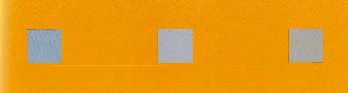
Johannes Itten followed Goethe and Schopenhauer and their theories of the retina’s craving for harmony and balance. In The Art of Color, for example, he explains simultaneous contrasts as arising from the fact that ‘for any given color the eye simultaneously requires the complementary color’, adding that ‘the fundamental principle of color harmony implies the rule of complementaries’ (Itten, 1973 [1961]: 87). Although he describes the eye as an organ with a will of its own—manifested in the need to create balance—Itten explains in his chapter on simultaneous contrasts how its urge for harmony can be controlled and used to the artist’s aesthetic advantage. He demonstrates this with the help of the following illustration [Fig. 4.1]. In the orange rectangle, we see three grey squares. However, if we look at them separately, each square appears to be a slightly different colour: the square on the left looks very blue, the one in the middle also appears blue, but less so than the one on the left, and the square on the right remains grey and does not seem to be influenced by simultaneous contrast. These distinct effects are due to the fact that a little blue has been mixed with the first grey and is thus combined with the simultaneous effect; the second grey is neutral and shows only the simultaneous effect; while the third grey square contains just enough orange to cancel out the simultaneous effect and therefore shows no modification. This experiment clearly shows how the effect of simultaneous contrast can be deliberately amplified or suppressed (Itten, 1970b [1961]: 54).
Fig. 4.1 Illustration from Itten’s Elements of Color with which one can experience the effect of simultaneous contrast.
Even though it seems most applicable to painting, filmmakers were also advised to consider this effect. For example, Adrien Cornwell-Clyne (1951 [1936]) turned to the issue of simultaneous contrast in the film immediately after discussing the after-image and eye fatigue. Referring to Michel Eugène Chevreul, he explained simultaneous contrast as an effect created in the areas neighbouring an activated part of the retina, stating that ‘[w]hen two colours are juxtaposed they modify each other both in brightness and in hue’ (Cornwell-Clyne, 1951 [1936]: 636), the effect being greatest at the edges, where the colours tend towards the complementary of the stimulus. He believed the phenomenon to be one of the major visual illusions, commenting on its extensive use by artists.3
Cornwell-Clyne was not the only cultural figure to advise filmmakers to pay attention to simultaneous contrasts: Jack Gieck wrote an article in 1952 targeted at amateur filmmakers, in which he also explained the effect of simultaneous contrast and the advantages it confers. Gieck specifically mentions the strengthening effect that occurs when using complementary colours in an image. Like Cornwell-Clyne, he explains this type of contrast with reference to Chevreul rather than Goethe. For Gieck (1952: 295, 305), the subsequent colours correspond to the complementary colours we know from painting and the subtractive system related to mixing red and green, blue and orange, and yellow and purple dyes.
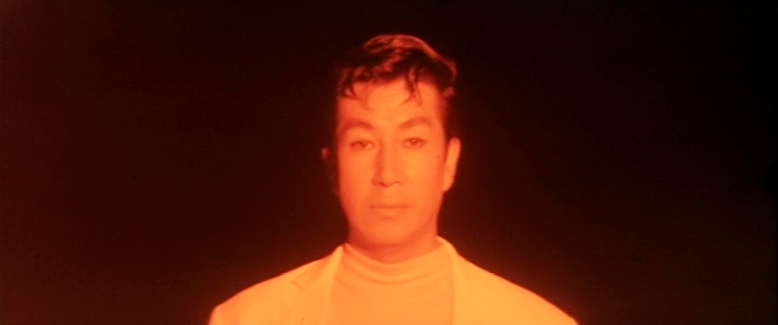
Indeed, simultaneous contrasts do occur from time to time in films, although they are rarely noticeable. The reason is that the eye has to be fixed on an object for a while before the effect starts to occur, so it seems logical that they happen less frequently when watching a medium comprising moving images than when contemplating a painting. However, there are some rare examples, such as Willem Bon’s Kleur en vormafwisseling op ‘Choo-choo’ jazz, the third film in the series that he made for Joris Ivens’ studio. In this film, we see various rather small shapes in bright colours placed in the middle of a black background; the shapes remain in the same location, but because we explore the shape with our eyes, the after-image easily bleeds into the black background. A similar effect occurs in the aforementioned Japanese horror film Kyuketsuki Gokemidoro (Goke, Body Snatcher from Hell), which follows a group of survivors from a plane that crashes near the dwelling-place of a body snatcher, who appears in the shape of a blob. When the blob attacks some of the passengers, they undergo a strange transformation: the site where the blob lives is characterised by an orange colour, and those survivors that fall into its power also turn orange. The first time the body snatcher attacks, for example, the entire process is shown in a slow, stretched-out sequence in which we see the first victim begin to succumb to the alien’s influence, reflected by their orange transformation. The sequence has a relatively slow rhythm, giving the viewer’s eyes enough time to produce an after-image that bleeds into the rest of the image as a result of eye tremor or drift [Fig. 4.2].
Fig. 4.2 Example of an after-image that bleeds into the rest of the image as a result of eye tremor or drift in the film Kyuketsuki Gokemidoro (JAP 1968, Hajime Sato), DVD The Criterion Collection 2012. Time code: 00:23:48
In both films, however, it is unclear whether the effect was intended or whether it accidentally slipped in as a consequence of the overall film effects. Indeed, these effects are far more difficult to control in film and other forms of moving images than they are in the production of still images such as paintings. For instance, the effect of simultaneous contrast can produce unwanted discontinuity in the editing. An example of this can be found in a scene in the Japanese monster film Konchu daisenso (Genocide), in which policemen discover an unconscious man, dressed in orange overalls, lying on a pebbly beach. First, we are given a wide, sweeping view of the scene: grey water, grey pebbles and grey policemen, with the unconscious figure a small orange dot on the left of the picture. The following shot is a medium close-up, with the orange man at the centre of the image, surrounded by pebbles that now look more bluish than grey. Showing the same situation and the same location but from different distances creates a discontinuity in the colour scheme of the two images [Figs 4.3–4.4].
Figs 4.3 and 4.4 Shift from grey to blue pebbles in Konchu daisenso (JAP 1968, Kazui Nihonmatsu). DVD The Criterion Collection, 2012.

|

|
|
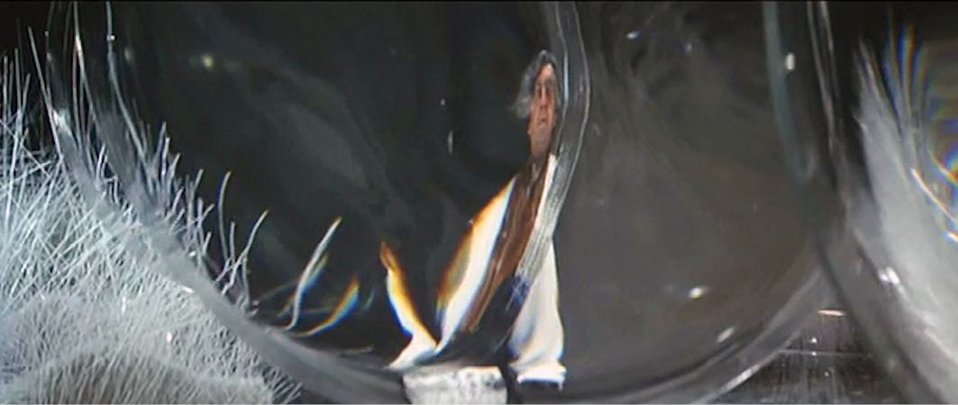
Another (probably unintended) example of unstable colour schemes resembling the effect of simultaneous contrast can be found in Fantastic Voyage (USA 1966, Richard Fleischer, Eastmancolor). In this science-fiction film, a medical team literally dives into a man’s body in order to execute a complex operation on his brain. They need to a shrink a submarine to a microscopic size so that it can enter a blood vessel—and fortunately they have the appropriate technology. The film creates the illusion of the ship shrinking by simply moving the camera back, similar to the way in which Georges Méliès altered the size of the head in his 1901 silent film, The Man with the Rubber Head. As the camera moves away, the background is kept stable with the help of matte colours, producing the impression that the submarine really is becoming smaller. What is remarkable is that on the Criterion DVD the ship changes colour from one shot to another. Before the shrinking process begins, it is filmed from a high-angle position. In this shot, the lower part appears yellowish, while the top of the ship appears greenish-white, and the platform it stands on is a soft yellow. However, in the top shot showing the ship during the shrinking process, both the platform and the ship appear in quite different colours: the ship is lavender, and the platform has turned more of a greenish-yellow. The change is in no way justified diegetically; rather, the colours appear to have been influenced by each other’s presence. The question is whether the filmmaker consciously implemented this colour shift, imitating the effect of simultaneous contrast, or whether it happened accidentally because of the complexity of the film’s special effects (Lightman, 1966). Either way, in terms of the narrative, the changing colour of the submarine and its platform resonates with the instability in the ship’s size and the transformation it undergoes [Figs 4.5–4.6].
Figs 4.5 and 4.6 Colour shift resembling simultaneous contrast resonating with instability of the scene in Fantastic Voyage (USA 1966, Richard Fleischer), DVD Twentieth Century Fox Home Entertainment, 2007.

|

|
|
Whereas Fantastic Voyage gives the impression that the simultaneous colour contrast might be a happy accident, Stanley Kubrick’s film 2001: A Space Odyssey (GBR / USA 1968, Stanley Kubrick, Metrocolor) appears to deliberately imitate the effect. We can see this if we refer to a rather short but important moment, around 45 minutes into the film, when a spaceship flies over the surface of the moon. A shot from behind the pilots allows the viewer to look through the ship’s front window. Since the interior of the cockpit is lit with a red light, the grey rocks on the surface of the moon appear green—apparently a typical case of simultaneous contrast. Three minutes later, this effect appears again, but this time from space. We see the spaceship flying against a black background with its windows glowing red (due to the lights inside the ship), and as the exterior of the ship, which was white in earlier scenes, now appears green, this image again seems to imitate the effect of simultaneous contrast [Figs 4.7–4.9].
Figs 4.7–4.9 Aesthetics of simultaneous contrast in 2001: A Space Odyssey (GBR / USA 1968, Stanley Kubrick), DVD The Criterion Collection, 2001.
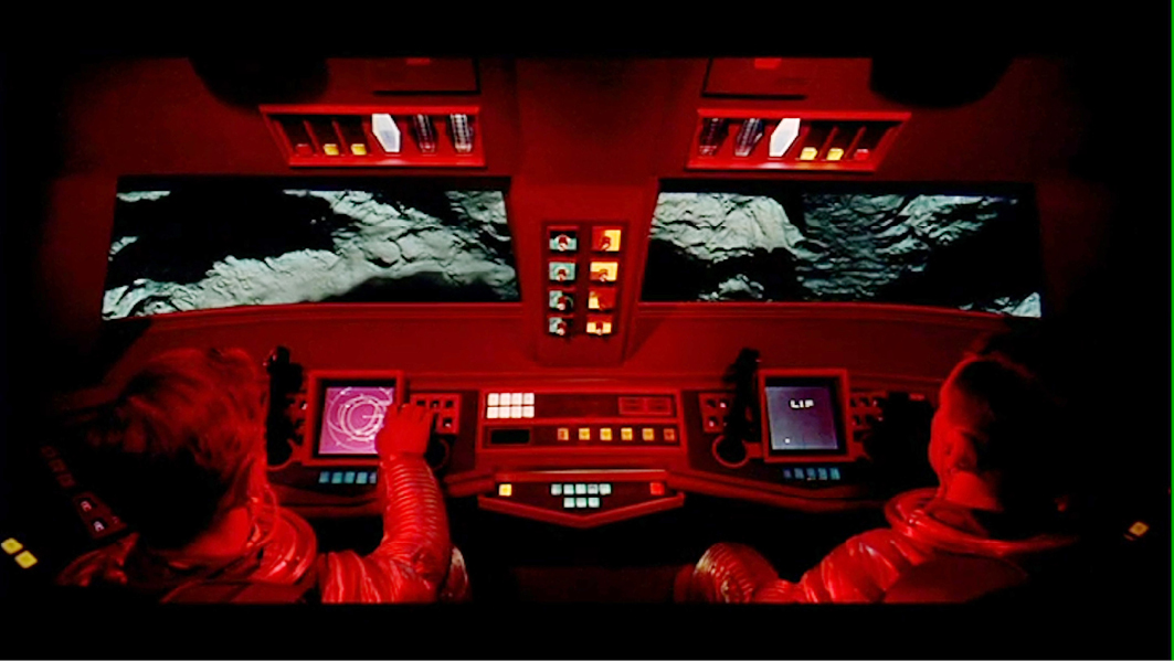
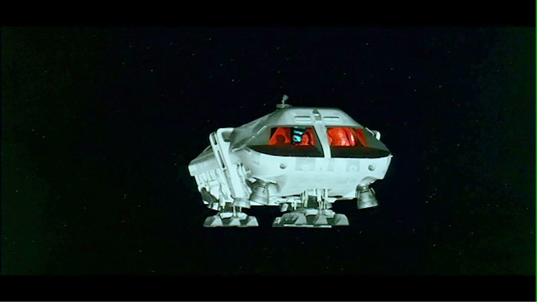
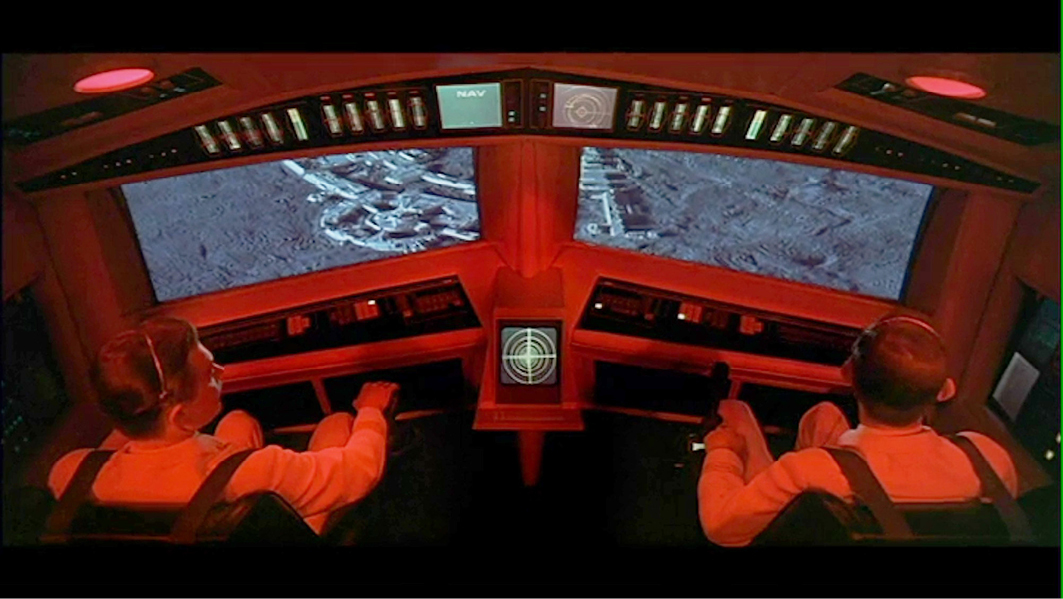
Interestingly, the shot from the cockpit echoes an image seen ten minutes earlier in the film. Another cockpit in another spaceship is presented from exactly the same angle and with a similar red-lit interior. Not only that, but the windows are of a similar shape and in the same position. In fact, the compositions of both images are very similar even though they show two different spaceships. The colour of the moon’s surface is the one thing that clearly differs in the two shots: in the earlier shot, the surface appears purplish, whereas in the later one, it looks greenish. And whereas in the second shot it might seem as if the green effect occurs accidentally due to the eye’s lateral inhibition, the first shot reveals that the colours of the moon’s surface are not accidental, but a controlled decision [Figs 4.7 and 4.9]. The variations in colour emphasise both the instability of colour perception and of the appearance of the moon’s surface. More poignantly, the instability of the moon’s colours reminds us of (and resonates with) the insecurity of an astronaut’s existence.
Simultaneous contrast therefore often dovetails with an oscillating, dynamic, unstable situation. Interestingly, Itten (1973 [1961]: 87) described the occurrence of simultaneous contrast as ‘a feeling of excitement and lively vibration of everchanging intensity’.4 A similar effect to simultaneous contrast, he claims, can be obtained when combining two colours that are ‘not precisely complementary’. Since each one will be pushed towards the complementary of the other, they will become ‘tinged with new effects’:
Under these conditions, colors give an appearance of dynamic activity. Their stability is disturbed, and they are set in changeable oscillation. They lose their objective character and move in an individual field of action of an unreal kind, as if in a new dimension. Color is as if dematerialized. (Itten, 1973 [1961]: 87)5
Instead of emphasising that colour should be controlled and eyestrain avoided, Itten advises us to make use of the dynamic activity they produce—that is, the instability, oscillations and new dimension they open up. I would argue that this ‘opening up’ to eyestrain and instability is directly connected to the cultural context of the 1960s, in which colour appeared to be unleashed from its former prescriptive norms and rules, and grew ever wilder. Ironically, as film is an unstable medium, it cannot rely on the occurrence of simultaneous contrast unless it is emphasised strongly. Thus, film has to imitate the effects of instability with the help of precisely these rules of colour control it seemed to have shaken off.
Feeling Colour in Op Art
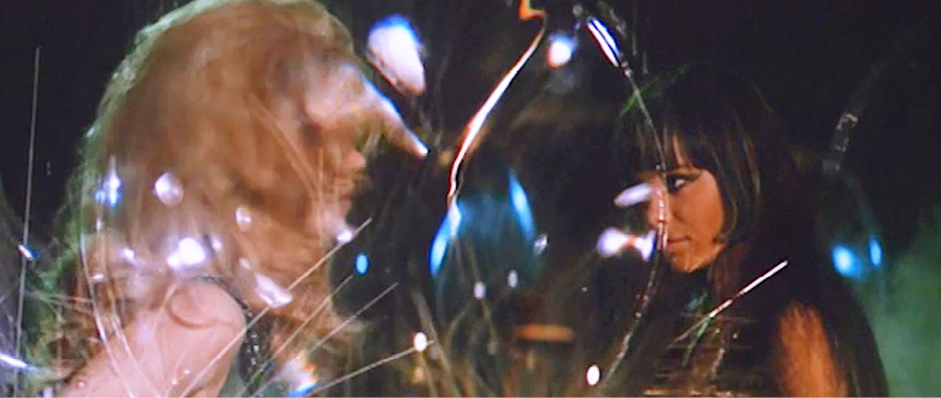
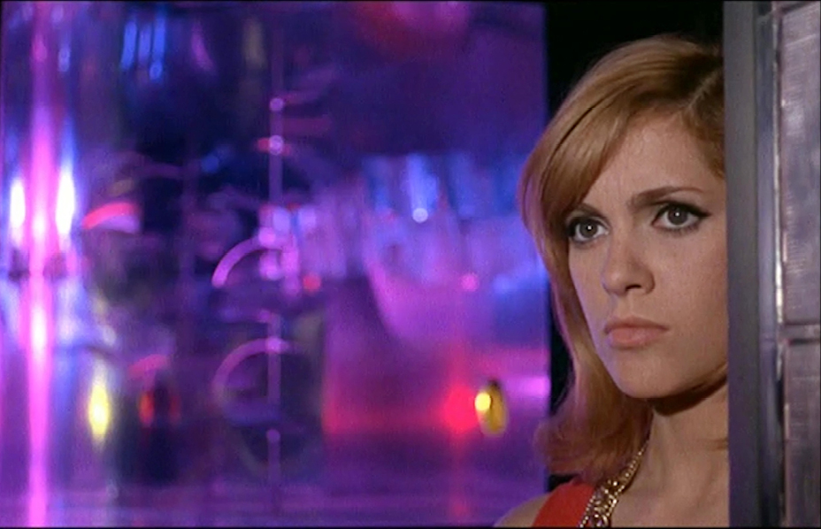
All these oscillations and instabilities have a direct connection to the art movement of the 1960s known as ‘op art’ or ‘kinetic art’ (‘art cinétique’). The label ‘op art’ is of course an abbreviation of ‘optical art’, a term that encapsulates the playful experimentation with optical illusions that characterises this form of art. One film that appears to be related to this movement more than most is Roger Vadim’s Barbarella: Queen of the Galaxy (1968). Space agent Barbarella travels the galaxy in her elaborately appointed spaceship to promote peace and love across the universe. The interior of the ship is entirely covered in a yellowish-brown furry material, except for a reproduction of Seurat’s painting, Un dimanche après-midi sur l’île de la Grande Jatte (1884–86), and a rectangular light box on the wall. The light box is covered with silver petals that move whenever the ship’s onboard computer speaks. Its panel is strongly reminiscent of op art aesthetics, with their recurring motif of metal petals; a well-known example of this style can be seen in Paco Rabanne’s metal dresses.
The light box also changes colour from yellow to red, and back again, while the silver petals simultaneously change from silver to grey or black. Yellow combined with silver appears to indicate a calm state, whereas red and black indicate unpleasant or stressful events such as conflict [Figs 4.10–4.11]. These shifts in colour reveal that the ship itself is—in a sense—vibrantly alive, and maybe even a little unstable, an assumption that becomes even stronger during a landing that is disrupted by magnetic disturbances. Through the ship’s window, we see an impressive colour show, dominated by the complementaries green and red; meanwhile, the petalled panel also alternates rapidly between green and red, as if panicking. When the spaceship hits the ground, the panel turns purple, again producing a complementary contrast, this time in relation to the yellowish furry walls. The combination of purple and yellow echoes the colour scheme in the left part of Seurat’s picture hanging on the ship’s wall [Figs 4.12–4.13]. All the movements and changes in colour not only give the scene an impression of oscillating instability, but they also appear to ‘dematerialise’ colour, to borrow Itten’s words.
Figs 4.10 and 4.11 Op-art panel moves and changes colour when Barbarella’s ship speaks with her in Barbarella: Queen of the Galaxy (FRA / ITA 1968, Roger Vadim). DVD Paramount Home Video, 1999.

|

|
|
Figs 4.12 and 4.13 Colour palet of the ship echoes those of the reproduction of the Seurat painting. Barbarella: Queen of the Galaxy (FRA / ITA 1968, Roger Vadim). DVD Paramount Home Video, 1999.

|

|
|
It is worth reflecting on this last image and the way it relates to Itten’s colour theory and his explanation of simultaneous contrast. First, the transition of the petals from silver-grey to purple visually echoes the illustration (mentioned above) that Itten used to explain simultaneous contrast, in which the grey rectangle placed in the centre of a dominant orange colour appears in the complementary hue of the surrounding colour [Fig. 4.1]. Secondly, in Kunst der Farbe, Itten (1961a: 112–13) uses a reproduction of a study for Dimanche à la Grande Jatte, housed in the Metropolitan Museum in New York, to explain pointillism and its relation to colour theory and physics.6 In short, this painting was not simply an example of the impressionist movement, but the example. Hence, its appearance in the film is clearly a reference to the way in which theories on the subjectivity of colour perception influenced art history. Nineteenth-century colour theory and its relationship to impressionism seems to have been a favourite topic among art historians and critics during the 1960s, especially those interested in op art. For example, William Seitz quoted poet and art critic Jules Laforgue (in Seitz, 1965: 5), who wrote that modernist painters were ‘endowed with an uncommon sensibility of the eye’. According to Seitz (1965: 7), Laforgue’s comments could equally be applied to perceptual artists in the 1960s. Finally, Itten’s former Bauhaus colleague, Josef Albers, also explained the phenomenon of ‘optical mixture’ in his book Interaction of Color (Albers, 1971 [1963]: 33). These various references to Dimanche à la Grande Jatte seem to confirm the above interpretation of the colours and shifts in colour in the scene in Barbarella that contains the painting.7
Albers’ Interaction of Color (1963), together with Itten’s Kunst der Farbe (1961a), is considered one of the foremost studies of the mid-twentieth century on how to work with colour. Interestingly, Albers did not focus on the explanation of colour systems and colour harmonies; in fact, he took quite an opposite approach: instead of explaining the rules of colour, he described a series of experiments that he used for his ‘teaching-by-doing’ method. He aimed to teach his students to ‘feel color relatedness’ (Albers, 1971 [1961]: 1). As a result, he dismissed all the ‘rules of thumb’ in the form of colour advice, as he believed they led to dull, uninspired work such as ‘interior and exterior, furniture and textile decoration following such colour schemes, as well as commercialised color “suggestions” for innumerable do-it-yourselves’ (42).
Thus, instead of learning rules about colour harmony, Albers advised his students to become like cooks, tasting the potential of colour combinations for themselves. He wanted them to search for colour tensions and find dynamic asymmetries. For example, when Albers (1971 [1963]: 53) let his students copy the ‘old masters’, he told them not to dwell on the details but on the ‘climate, temperature, aroma, or sound of their work’. He also encouraged them to find the (often unpleasant) ability of colours to vibrate:
This initially exciting effect also feels aggressive and often even uncomfortable to our eyes. One finds it rarely used except for a screaming effect in advertising, and as a result it is unpleasant, disliked, and avoided. (Albers, 1971 [1963]: 62)
Albers wanted his students to look for the ‘excitement [that] lies beyond rules and canons’. Consequently, he only refers to some of the ‘masters’ of colour theory, such as Goethe, Schopenhauer, Munsell, Ostwald and Birren,8 at the end of the book, without explaining what their theories actually implied (Albers, 1971 [1963]: 66–68). In all, Albers taught his students what was possible with colour combinations, including how they could be made to vibrate using simultaneous contrasts and other optical effects—precisely the theme that op art artists pursued in their work.
Albers was a teacher for almost his entire working life. He was a master at the Bauhaus, where he worked from 1923 until 1933 when the Nazis shut down what they called this school of ‘entartete Kunst’ (‘degenerate art’). In 1933 he and his wife Anni moved to North Carolina, where he taught at the Black Mountain College until 1946. Then in 1950 he was appointed chair of the department of design at Yale. If we add to this his many guest lectures at various institutions, Albers could rightly be said to have taught several generations of artists, not only in Germany but also in the US, and elsewhere.9 This might explain why his teaching and his artworks were considered an important prelude to what would become known as op art—or, as Albers himself stated during the exhibition ‘The Responsive Eye’, which exhibited some of the main pieces of the op art movement, ‘[y]ou see, I’m the father, and I’m not supposed to say something bad or good about my babies... I had to wait fifty years, until people finally looked to me as if they looked with my eyes’.10
Op art’s focus on movement and optical illusion brought it close to cinema as an art form. As Pauline Mari shows in Le voyeur et l’halluciné: Au cinéma avec l’op art (2018), several films were made during the 1960s that either directly or indirectly referred to this art movement. Mari discusses a number of interesting colour films, including Les demoiselles de Rochefort (FRA 1967, Jacques Demy, Eastmancolor), Les aventuriers (FRA 1967, Robert Enrico, Eastmancolor), and Les choses de la vie (FRA / JAP / CHE 1969, Claude Sautet, Eastmancolor). Many of these films refer to op art principally by including famous pieces of this art in their sets or by using the aesthetics of optical illusions in the film’s architecture or mise-en-scène. Other films such as La prisonnière (FRA 1968, Henri-Georges Clouzot, Eastmancolor), Modesty Blaise (UK 1966, Joseph Losey) and (again) Barbarella include op art aesthetics in their mise-en-scène and narrative in even more powerful ways, and the op art spaces in these films often resonate with—and even intensify—the inner states of one or more of the filmic characters.
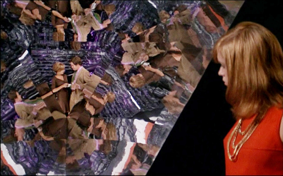
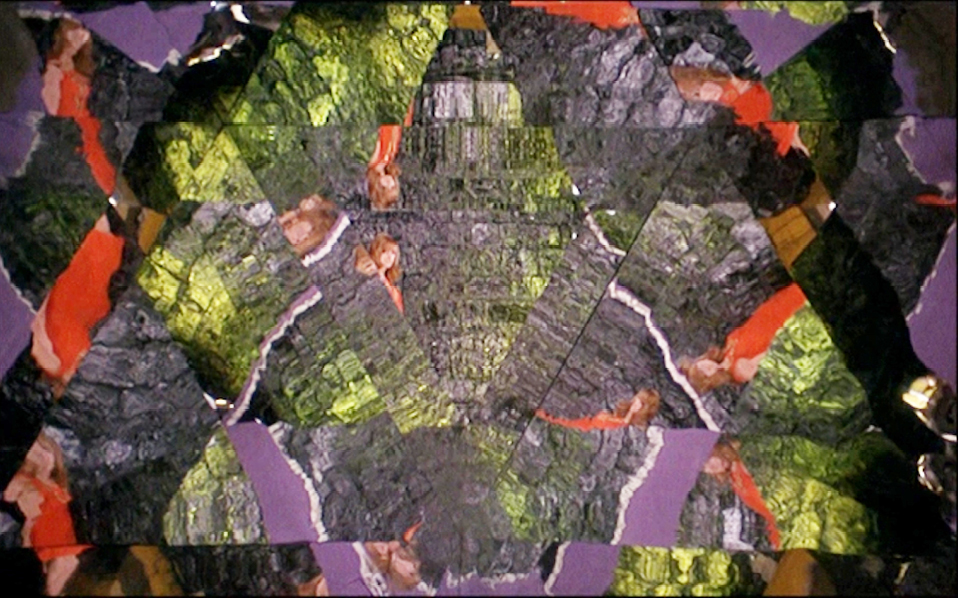
As mentioned above, the first scene in Barbarella contains numerous allusions to op art; however, it is in the film’s last scene, which takes place in the queen’s ‘dream chamber’, that op art returns in a much more all-embracing way that includes the mise-en-scène, decor, Barbarella’s costume and the scene’s psychological connotations. Barbarella, for example, is wearing her green petal dress—possibly the best-known op art reference in the film. Yet, although the title sequence mentions that Barbarella’s costume was inspired by the ideas of Paco Rabanne, there is a persistent misunderstanding that he actually designed it. Elizabeth Castaldo Lundén (2016), however, has made it clear, once and for all, that Jacques Fonteray designed not only the dress but also all the other space-costumes Barbarella wears in the film. It is interesting to note that the (final) scene in which she wears this dress takes place in a room whose decor appears to be a piece of op art in itself: the room’s distorting mirrors create optical illusions that refer to the dream state the queen enters once in the room;11 the distorting mirrors create confusion as people and objects constantly change shape; and the entrance to the room itself is located in an invisible wall and can only be opened with an invisible key. The room also has no logical structure and is divided only by projections of moving colours, and from the moment Barbarella enters, it appears to be at risk of collapse (and eventually does so at the end of the scene) [Figs 4.14–4.15]. Arguably, the room’s op art mise-en-scène reflects the liminal, unstable state of sleep and the unreliability of dreams (where nothing is what it seems), which are brought together in a precarious balance that is easily disturbed.
Figs 4.14 and 4.15 The ‘dream chamber’ in Barbarella has an op-art design. Barbarella: Queen of the Galaxy (FRA / ITA 1968, Roger Vadim). DVD Paramount Home Video, 1999.
Time code: 01:25:55
The film La prisonnière presents a similar scenario, this time in a scene set in an art gallery during the opening of a fictional exhibition of kinetic art. One of its displays is an op art labyrinth, a space full of optical illusions that create a sense of disorientation and confusion with the help, once again, of distorting mirrors. It is here that the protagonist witnesses her boyfriend kissing another woman. Her confusion immediately resonates with her surroundings in which she herself appears as a visual component due to its multiple mirrors. After leaving the labyrinth, she enters the gallery space again, where her inner state appears to be reflected in the shimmering, shining, multicoloured pieces of op art on display. Her attention, however, is not directed towards the artworks but falls upon the gallery owner, for whom she starts to develop amorous feelings [Figs 4.16–4.18]. Whereas in Barbarella, it is the character’s actions (Barbarella entering the dream room) that precipitates the op art environment’s collapse, the op art in this film seems to increase the confused and stressful feelings of the main character at the same time as these feelings resonate in her surroundings.12 It is the op art experience that seems to cause the inner stability of the protagonist to collapse, affecting her behaviour for the rest of the film.
Figs 4.16, 4.17 and 4.18 Colourful op-art reflects the mood of the main character in La prisonnière (FRA, 1968, Henri-Georges Clouzot). DVD Studio Canal, 2014.
Op art therefore can be used to create a space that amplifies stress and inner turmoil, and this reflects the physical pain that such pieces often cause to the viewer’s eyes. George Rickey describes the experience in Constructivism: Origins and Evolution:
Optical phenomena, with their no-aesthetic, dizzying, even nauseating, color situations, have been exploited for their direct impact on the spectator. […] [I]t is independent of ideas of harmonious order or any other kind of pleasure. (Rickey, 1967: 225)
The direct impact of ‘dizzying, even nauseating’ art can produce an effect of discomfort that resonates with inner instability and inner pain, as in La prisonnière.
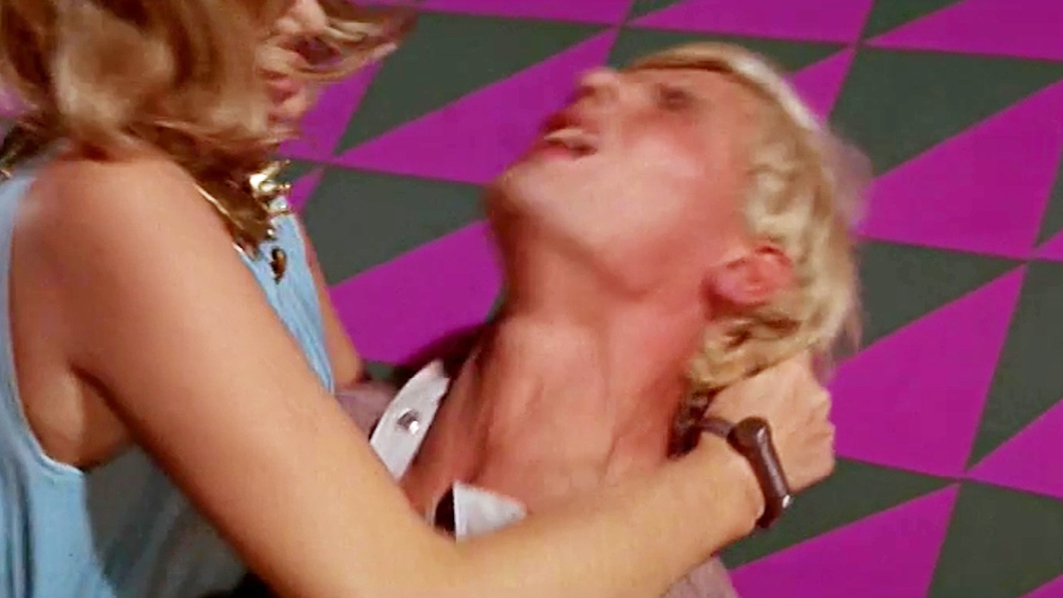
Other films directly connect the eyestrain induced by a confusion of colours to physical pain. An example of this is the prison-cell scene in Modesty Blaise.13 The interior of the prison is entirely covered in a pattern of magenta triangles of varying sizes on a dark grey surface, and it also contains a bright orange spiral staircase. The magenta and orange colours are split primaries. Simultaneous contrast gives the grey a tinge of green, while the inconsistent sizes of the triangular shapes create a forced perspective, rendering the location of the staircase uncertain. As a result, the entire space confuses the senses, and even causes eyestrain. When the main character, Modesty, enters the room, she looks around fearfully, then drops to the floor, revealing that these patterns hurt not only her eyes but affect her entire being [Fig. 4.19]. The effect gets even stronger when Modesty fights a prison guard in the room in a strange struggle pitched somewhere between love making and deadly violence. In the end, she kills the guard with two needles that she has hidden in her dress. The scene illustrates the piercing effect of pain that is created not only visually by the cell’s decor, but also physically by the needles as they penetrate the guard’s skin [Figs 4.20–4.21].
Figs 4.19, 4.20 and 4.21 Op-art patterns in Modesty Blaise (GBR 1965, Joseph Losey) create a pinching atmosphere, which resonates with her killing the guard with a hair pin. DVD Twentieth Century Fox Home Entertainment, 2002
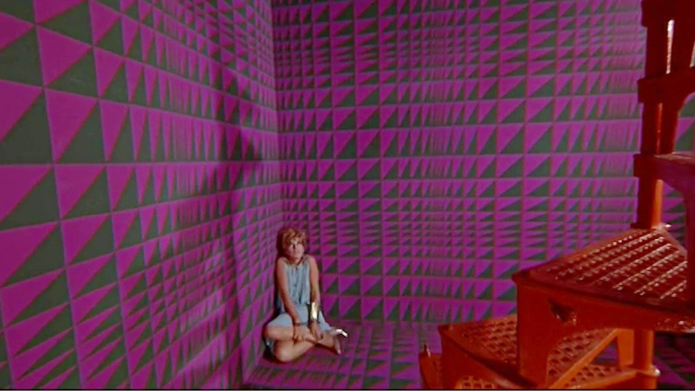
Time code: 01:34:48
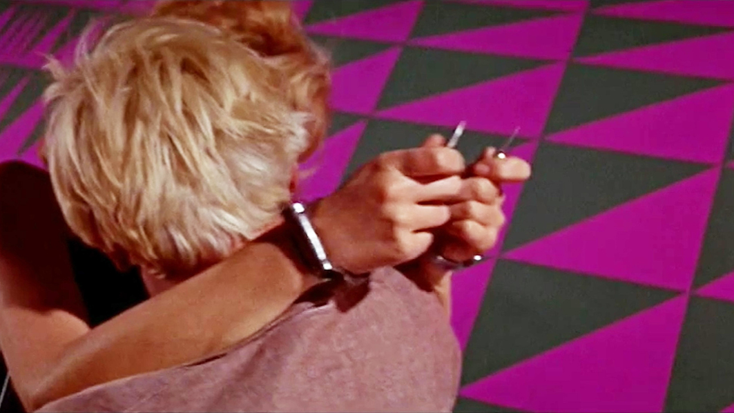
Time code: 01:37:37
In all, the analyses in this chapter add up to the conclusion that that eyestrain (which in the 1950s was considered an unwanted effect to be avoided in films) increasingly came to be regarded as an aesthetic asset during the 1960s.
1 See, for example, Ko et al. (2016). I would like to thank Miriam Loertscher for explaining this phenomenon.
2 ‘Malt sich auf einem Teile der Netzhaut ein farbiges Bild, so findet sich der übrige Teil sogleich in einer Disposition, die bemerkten korrespondierenden Farben hervorzubringen’ (English version: Goethe, J.W. v. (1840) Theory of Colours. John Murray).
3 Cornwell-Clyne added that, similar to the after-images, the simultaneously appearing colours did not exactly complement the stimuli. To support this argument, he referred to research by Sir William Abney in 1913, who measured the wavelengths of the colours produced by simultaneous contrasts.
4 ‘Weil die simultan entstehende Farbe nicht real vorhanden ist, sondern erst im Auge entsteht, erzeugt sie in uns ein Gefühl von Erregtheit und lebendiger Vibration von ständig wechselnder Stärke’ (Itten, 1961a: 87).
5 ‘Die Farben scheinen in höchster dynamischer Erregung zu sein. Ihre Stabilität ist aufgelöst, und sie kommen in ein wechselvolles Vibrieren. Sie verlieren ihren objektiven wirklichen Charakter und schwingen in einem individuellen Wirkungsfeld unwirklicher Art wie in einer neuen Dimension. Die Farbe wirkt entmaterialisiert’ (Itten, 1961a: 87).
6 Neo-impressionists did not mix dyes on their palettes but produced a visual effect of mixed colours by applying small dots of primary colours close together. As a result of the (subjective) simultaneous contrasts, the colours appear as if mixed.
7 The director of photography on Barbarella was Claude Renoir, the grandson of artist Pierre-Auguste Renoir, who was part of the neo-impressionist movement. Although it is unclear what his influence on the mise-en-scène of the film was, it is probable that he would have been very well informed about the neo-impressionists and the theory of simultaneous colour contrasts and their effects.
8 However, if we take into account the fact that Faber Birren was one of the main commercial ‘do-it-yourself’ colour consultants for interior design, it seems unlikely that Albers was a big fan.
9 See: https://albersfoundation.org/teaching/josef-albers/chronology/#1900
10 The Responsive Eye (USA 1965, Brian De Palma). Available at: https://www.youtube.com/watch?v=vaUme6DY8Lk. This is a documentary film de Palma made about the opening of the exhibition. Albers’ quote appears around 15 minutes into the film.
11 This space also refers to the dream-cinema analogy since Barbarella and the queen can see what is happening in other places with the help of a one-way screen without being seen themselves and without the ability to intervene.
12 In addition, some of the artworks are given a strong sexual connotation through the perceptive subjectivity created by point-of-view shots combined with what we know about the inner world of the main character.
13 Some versions of the film show a colour change in Modesty’s dress from white to blue as soon as she enters the cell, simulating the effect of simultaneous contrast comparable to the examples from 2001: A Space Odyssey and The Fantastic Voyage. However, since not all prints show this change, this effect seems to be more the result of a grading problem of the particular print than an effect that was deliberately included in the film.