
5. How Can Colours (Be) Control(led)
©2025 Bregt Lameris, CC BY-NC 4.0 https://doi.org/10.11647/OBP.0380.07
Colour Consultancy
During the 1950s and 1960s, colour psychologists or ‘colour consultants’ were rather popular, and their ideas were often followed. This chapter discusses these discourses, and how they related to cinema and film aesthetics.
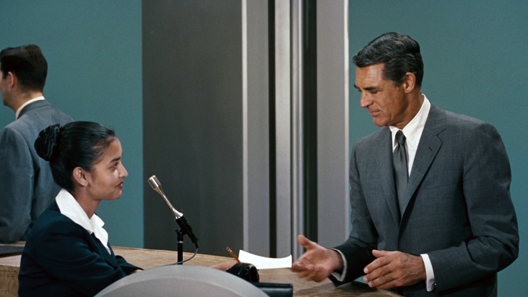
When colour consultancy is mentioned, film historians probably all think of Natalie Kalmus, who very directly introduced this activity into film culture through her work for the Technicolor company. However, she was not exceptional in consulting on colours, but can be positioned in an already existing practice of colour consultancy in consumer culture. In her important book The Color Revolution (2012), Regina Blaszczyk explains the history and importance of colour consciousness and consultancy in the (much broader than just film) Western colour culture. In a complex of consumer culture and good taste colour consultancy became an official task in colourful industries from the 1910s onward. In their book Chromatic Modernity (2019), Sarah Street and Joshua Yumibe agree that Kalmus’ concept of colour consciousness did not appear out of thin air: it already existed in the world of fashion, and in the dye and textile industries. They particularly mention Margaret Hayden Rorke of the Textile Color Card Association (TCCA), and her plea for the development of a colour consciousness in the USA that would help create an appreciation of colour in terms of expression and taste (Blaszczyk, 2012; Street and Yumibe, 2019: 75–76).1 Hence, we see the emergence of the cultural phenomenon of colour consultants, all trying to create colour consciousness through a greater knowledge of its application in such areas as film, interior design, fashion, textiles and art. Opinions on what constituted ‘good taste’ varied according to the norms of these various cultural industries.
In line with these historical developments in 1928 Natalie Kalmus joined her ex-husband’s company, Technicolor, as a self-styled ‘colour advisor’ to filmmakers working with the two-colour Technicolor III technology. Then, from 1933, she turned her attention to the three-strip Technicolor IV system and was credited as ‘Technicolor Color Director’ on a number of films [Fig. 5.4]. From the second half of the 1930s onward, anyone else advising on colour in Technicolor films was credited as Kalmus’s associate.
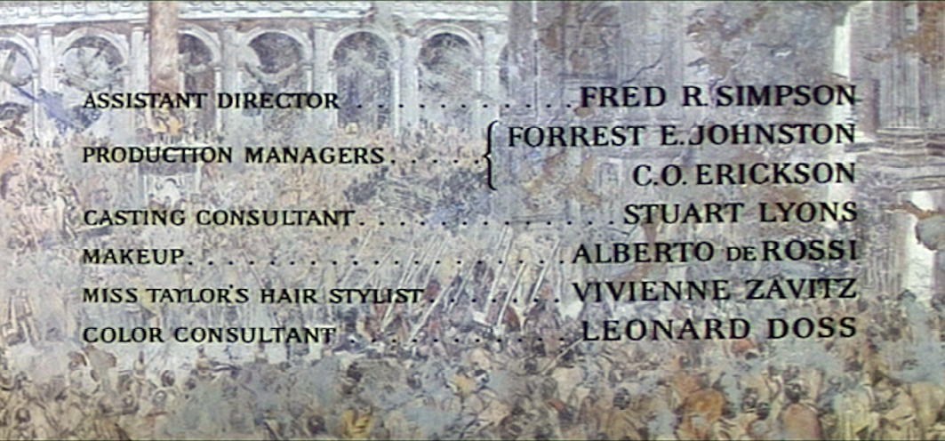
By 1949 these assistants had begun to work on films independently and were credited as Technicolor colour consultants in their own right.2 And whereas Technicolor seems to have stopped using colour consultants in the late 1950s, Agfa, Ansco and Metrocolor continued to employ them into the 1960s [Fig. 5.5].
Fig. 5.4 Natalie Kalmus credited as ‘Color Director’ for Technicolor for Lassie Come Home (USA 1943, Fred M. Wilcox). DVD Turner Entertainment. Warner Bros. 2006
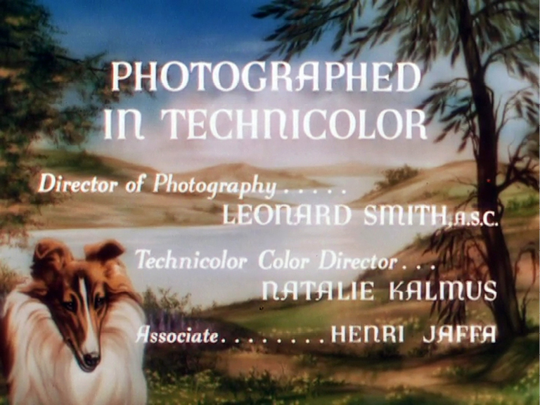
Fig. 5.5 Leonard Doss credited as ‘Color Consultant’ for the film Cleopatra (USA / SUI / GBR 1963, Joseph L. Mankiewicz) which was released on De Luxe (Eastmancolor). DVD Twentieth Century Fox Home Entertainment, 2002
As is well known, the Technicolor company sent technical staff along with its three-strip camera equipment to control the way colours were handled in films released using its (rather technically complicated) colour system. This control was further consolidated by the widely accepted idea that films made in Technicolor should follow the norms of ‘colour consciousness’, which in this context referred to Kalmus’s (1935) more or less prescriptive ideas on colour that were informed by her definitions of ‘colour awareness’ and ‘good taste’.
Most importantly, Kalmus used the idea of a connection between colours and emotions tactically, in line with the colour-context model that had gradually evolved in Western society from the beginning of the nineteenth century. This perception of colour, she believed, would help the film director whose ‘prime motive is to… control the thoughts and emotions of his audience’ (Kalmus, 1935: 142, my emphasis). With the help of Kalmus’s correspondence, along with other sources, Street (2011: 15) concludes that she not only wanted to control the colours used in Technicolor films, but also aimed to bring colour consciousness into everyday life: her aspiration was to produce an awareness of colour harmony amongst the cinema-going audience as part of a broader educative agenda.
Kalmus’s article ‘Color Consciousness’ has been much discussed in scholarly writings on colour film (Neupert, 1990; Street, 2009 and 2011; Coates, 2010; Higgins, 2007a; Misek, 2010; Pierotti, 2020). In her article, which started as a lecture for the members of the Academy in Hollywood, she attempts to provide practical advice on how to control colour in Technicolor films, arguing that costumes should preferably reflect the characters’ attributes and advising on the use of colour separation to enhance clarity—for example, preventing an actor’s face or costume from blending into the background by limiting background patterns to rather neutral colours. Indeed, this type of figure-ground separation, often applied in Technicolor films produced under her supervision, was not only limited to the films she was involved in, but was also used on numerous occasions before and after her reign at Technicolor (Flueckiger, 2020b). Another idea Kalmus (1935: 141) propagated was the avoidance of ‘unnatural’ colours, arguing that ‘[i]t is a psychological fact that the nervous system experiences a shock when it is forced to adapt itself to any degree of unnaturalness in the reception of external stimuli’. She considered that using colour psychology and colour harmony to understand what would appear unnatural to audiences was key to controlling their shifting moods and impressions.
Federico Pierotti positions Kalmus’s article in the context of colour psychology, colorimetry and psychotechnics developed throughout the second half of the nineteenth and early twentieth century. These discourses brought problems that uncontrolled use of colour could produce to the front. The first problem was eyestrain and fatigue, caused by shocking the eye through bad use of contrasts, sudden colour change, or unpleasant colour combinations. The second problem related to the idea that the spectator’s attention could be steered with colour, a technique used in advertising and publicities. As Pierotti explains, for publicity, colour should capture the observer’s attention. In cinema, however, colours drawing attention to them would only distract from the narrative. Both eyestrain and an unclear narrative due to distracting elements were unwanted in Hollywood filmmaking practice.
Kalmus’s article should be seen in this context, and was meant as a tool for: […] proving that colour [...] could [….] become a functional element in narration, if its presence would be adequately controlled. Kalmus’s discourse expressed the need for a change of strategy.3 (Pierotti, 2020: 97)
Scott Higgins also emphasises the importance of the moment the article was published. In 1935 the Technicolor IV films La Cucaracha (USA 1934, Lloyd Corrigan) and Becky Sharp (USA 1935, Mamoulian) started to become exemplary for what Technicolor IV was about. They are typical examples of what Higgins describes as the demonstrative mode for early Technicolor IV films showcasing what Technicolor IV could do. What Kalmus introduced in ‘Color consciousness’ Higgins defines as the ‘restrained mode’ which filmmakers used intensely during 1936–1938, using reduced contrasts and following the rules of colour harmony that dated from the nineteenth century (Higgins, 2007: 75–76). However, this does not mean that Technicolor IV was not used for other types of colour aesthetics.
For example, within the use of restrained Technicolor aesthetics, colour consultants, filmmakers, designers, cinematographers and other crew members also could influence the aesthetics of a film, to go against colour harmony, and use ‘unnatural’ colours to produce ‘shock’ effects as a way of heightening audience attention or indicating an intense emotional situation. In other words, the ‘rules’ of colour consciousness prescribing the use of ‘natural’ colours and a subdued environment made any deviation highly significant (Flueckiger, 2016: 150). Indeed, as the analyses of the FilmColors team have also shown, many of the Technicolor films made during the Kalmus period show marked deviations from what she described in her article.
Patrick Keating also analyses the use of deviating colour aesthetics in Technicolor IV films. In his book Hollywood Lighting from the Silent Era to Film Noir (2010), he writes that although many early-period Technicolor IV filmmakers indeed worked with restricted colour schemes, others experimented with different possibilities of the new material. This was especially the case with more independent cinematographers who already had a significant say in the lighting schemes of the films they worked on. They experimented with the system, ‘creating a bold new style of Technicolor pictorialism’ (Keating, 2010: 218). Keating mentions Leon Shamroy as a ‘case in point’, explaining that he often experimented with complex lighting effects—for example, in The Black Swan (USA 1942, Henry King, Technicolor IV), a film that credits Kalmus as Technicolor director. Although Shamroy still followed the strict rule of creating neutral backgrounds that would allow the actors to stand out, Keating points out:
[He] has followed the letter of this rule, but he has violated the spirit: even the colorful costumes cannot prevent the actors from getting lost in this maze of shadows. Rather than creating a balance of functions, Shamroy has prioritized pictorialism above all else. (Keating, 2010: 219)
In addition to unusual lighting and hard shadows, Shamroy also used coloured lights. In Leave Her to Heaven (USA 1945, John M. Stahl, Technicolor IV),4 he began to use coloured lighting without a direct diegetic motivation. And as Keating (2010: 220) shows, he even used coloured light on faces, breaking the convention that skin should always be represented in its ‘natural’ color. Shamroy won an Oscar for best colour cinematography for Leave Her to Heaven, and also for Wilson (USA 1944, Henri King, Technicolor IV). According to Keating, it was the competitive character of the film industry that encouraged Shamroy to push the limits of colour film:
[M]ost cinematographers began to think of Technicolor as an opportunity to exercise, even flaunt, their artistic talents. Some cinematographers did so by practicing [sic] the art of balance, carefully crafting a multifunctional style. Other cinematographers, like Shamroy, proved their artistic worth by pushing the limits of one particular aesthetic function. (Keating, 2010: 221)
Shamroy himself stated that he often came into conflict with Kalmus over his mannerist style, although she apparently did not prevent him from following his instincts—and subsequently winning an Oscar.
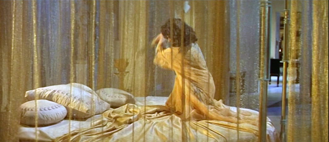
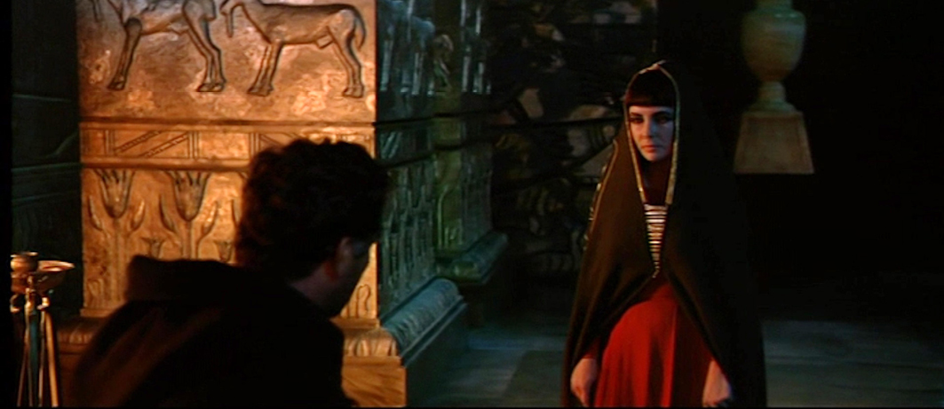
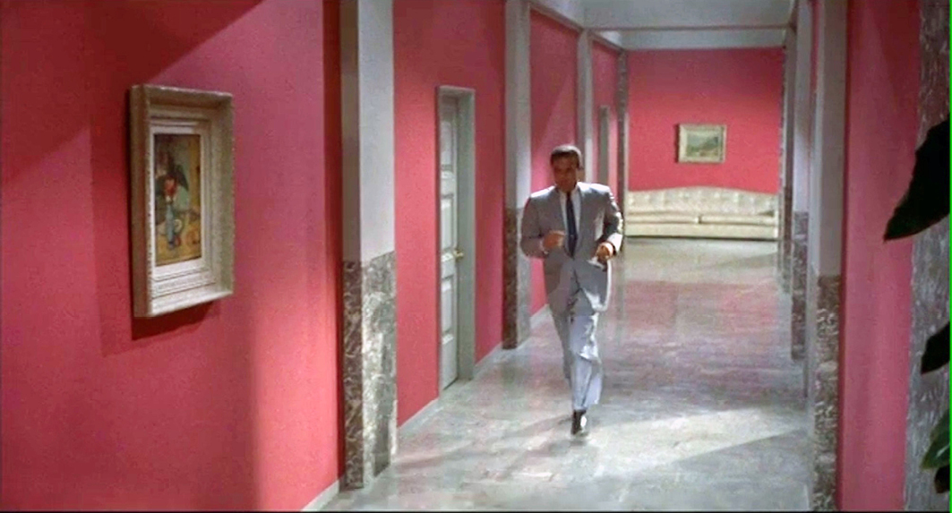
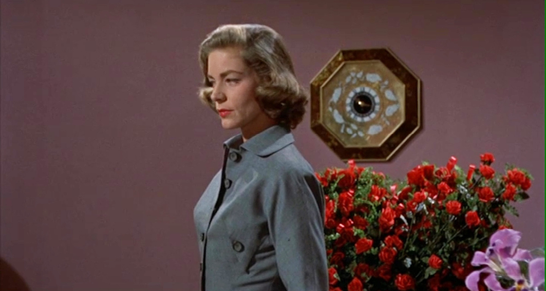
In 1964 Shamroy won a further Oscar for his cinematography on the film Cleopatra (USA / SUI / GBR 1963, Joseph L. Mankiewicz, Technicolor V). It appears that even though Leonard Doss was credited as colour consultant for the film, he did not do much actual consulting on site—in an article, ‘Photographing “Cleopatra’” (Arthur, 1963) in The American Cinematographer, Doss is not mentioned once. All the finer details of the filming in colour, including the lighting effects, were left to Shamroy. His colours in this film are quite wild, and he only occasionally uses the neutral backgrounds that used to be so popular. The film mostly uses saturated colours for the costumes, such as the Romans’ red cloaks or Cleopatra’s brightly coloured garments, and introduces a colour aesthetics that combines coloured lights, coloured smoke, semi-transparent curtains and colourful, sometimes shimmering backgrounds [Figs 5.6–5.7].
Figs 5.6 and 5.7 Transparent curtains and colourful, shimmering backgrounds in Cleopatra (USA / SUI / GBR 1963, Joseph L. Mankiewicz). DVD Twentieth Century Fox Home Entertainment, 2002
Of course, the emergence of chromogenic camera material between 1945 and 1963 marked an important technological shift in colour film technology as it rendered the making of commercial colour films far easier. Consequently, around 1955, Technicolor introduced Technicolor V; it abandoned three-strip Technicolor IV technology in favour of chromogenic Kodacolor negative. As filming in Technicolor was now less complex, the services of specialist Technicolor cameramen controlling the technology and light settings were no longer required. Still, as Lucy Fife Donaldson convincingly shows in her video essay ‘Tracing the threads of influence,’ (2022) colour consultants did keep an important role in the production process of a film and its aesthetics and colour palette. Also, the fact that the production company Warner, which started to work with Eastmancolor negatives quite early in the 1950s, supposedly missed the colour consultancy they were used to when working with Technicolor, shows a continued wish for colour consultancy. Especially the poor latitude of the early Eastmancolor stocks made a colour consultant a welcome advisor on how to use the material the best way possible (Heckman, 2014: 138).
Functional Colours
Colour consultancy was not only a film industry practice; in fact, the most significant figure in the field of colour conditioning and control in the 1950s and 1960s, Faber Birren, did not work in cinema at all. Birren—who had an extraordinary influence on the colour culture of his time—entered the colour market in 1934 with the establishment of his own ‘industrial colour consultancy’ (Kaufmann, 1974: 73), advising companies, shop owners and factories on how to improve the safety, health, mood and efficiency of their employees, and boost their sales, with the help of colour. In other words, he explained how to increase productivity and profit by using colour to influence and control workers and consumers. To consolidate the reputation of his consultancy services, Birren also produced a number of books on the subject—in 1937, for example, he published Functional Color, ‘his first full-length analysis of how business could use color to increase productivity and morale’ (Blaszczyk, 2012: 222), and he followed this with works such as The American Colorist (1939) and Selling with Color (1945). According to Regina Blaszczyk (2012: 237, 2017: 209), by 1950 Birren’s company, American Color Trends, was the leading colour consultancy in the US.
One of Birren’s large industrial clients was DuPont, and his work for the paint and chemical manufacturer won attention far beyond the USA (Blaszczyk, 2012: 237).5 The UK, for example, officially adopted the concept of functional colour around 1946, following the publication of a booklet by Robert F. Wilson, Colour and Lighting in Factories and Offices (Blaszczyk, 2017: 209), which drew heavily on Birren’s work. Wilson himself made a trip to the USA a year later, where he met his exemplar and exchanged ideas with him. Meanwhile, Maurice Déribéré and Yves le Grand founded the ‘Centre d’informations de la couleur’ in France in 1951. Italy followed suit with the ‘Centro Italiano di Studi per l’applicazione del colore’ in 1957, inspiring the launch of new magazines dedicated to the study of colour, and the organization of exhibitions, and national and international conferences on the subject (Pierotti, 2019: 55–58). In the Netherlands, paint manufacturer Sikkens adopted Birren’s concept of functional colours (functionele kleuren) in 1951,6 mounting presentations on the subject across the country.7 A little later, in 1957, a specialist course was created with the aim of training colour consultants who would spread the word throughout the Netherlands.8 In all, after the Second World War, the colour-conditioning and functional-colours movement had an increasingly international character, as seen in the title of its representative organisation, the International Association of Color Consultants. In the late 1950s, Birren himself began to create new offices for his American Color Trends company to enable it ‘to assist clients in Australia, Austria, Belgium, Canada, Denmark, France, Germany, Italy, the Netherlands, New Zealand, Norway, Sweden, Switzerland, South Africa, and the United Kingdom’ (Blaszcsyk, 2017: 215). All this implies that the strategy to control bodies and minds through the structured and organised use of colour in the practices of colour conditioning, functional colours and colour consultancy had gained international leverage.9
Although Birren was not directly involved in the film industry, his influence as a colour consultant who played the entire western market can be traced in cinema as well. For example, his ‘colour safety code’, promoting the idea that colour could be used to create safety, health and comfort, found its way into the films of the 1950s and 1960s—as seen in the excerpt from Il deserto rosso at the beginning of this chapter. Federico Pierotti argues in ‘Biopolitics of colour in mid-century Italian visual culture’ (2019) that this sort of regulation of subjects’ lives and bodies can (and maybe should) be analysed as an element of biopolitics. As he explains:
The premise of biopolitical governmentality is not necessarily linked to a state mechanism, rather it is apparent ‘at every level of the social body and utilized by very diverse institutions’, with the specific aim of ‘the investment of the body, its valorization and the distributive management of its forces’. (Pierotti, 2019: 54)
Thus, colour could be used to manage and control the health, efficiency, productivity and profitability of workers’ bodies through the dominant cultures of capitalism.
In an advertising flyer from 1956, Birren’s principles of colour conditioning are explained in an illuminating way. The text is full of phrases like ‘more productive employees’, ‘boosting efficiency’, ‘speeding […] convalescence’, ‘efficiency’, ‘tireless seeing’, all indicating the focus on maximising the productivity of the human body, be it at work or in recovery from accident or illness. Birren also discusses specific characteristics of colour perception, such as complementary colours that enhance each other, the after-image and the phenomenon of simultaneous contrasts such as irradiation.
Birren began his collaboration with DuPont in 1944, developing what was called the ‘three-dimensional colour’ (an idea that dated from 1937) into an official colour safety code for the industry that would go on to become a national standard (Kaufmann, 1974: 74; Blaszczyk, 2012: 226). The code included the colours ‘fire-protection red’, ‘safety green’, ‘high visibility yellow’, ‘traffic white’, ‘alert orange’ and ‘precaution blue’. More important than their supposed signalling functions was the fact that the colours were saturated, thus increasing their visibility, especially when encountered in an otherwise overwhelmingly dull grey factory building. To illustrate their use in situ, the advertising flyer was illustrated with a couple of images in which the monochrome background was overlaid with colours, like spots of dye added to a black and white photographic image, recalling the hand-and stencil-colouring techniques of silent cinema [Figs 5.8–5.9].
Figs 5.8 and 5.9 Birren’s colour safety code as distributed by DuPont in the flyer Color Conditioning from 1956.

|
|

These images are also reminiscent of the colour aesthetics associated with Suprematism, and later with De Stijl (Piet Mondrian, Theo van Doesburg, Gerrit Rietveld) and Bauhaus (Wassily Kandinsky, Herbert Bayer, Hinnerk Scheper). Here, colours were used in art, design and architecture, with geometrically shaped planes of saturated colour placed on top of more neutral backgrounds. At Bauhaus, most of these colour practices were the result of work by the ‘Wall Painting Workshop’, initially run by Johannes Itten and Oskar Schlemmer, and after it moved to Dessau by Hinnerk Scheper. Scheper gave colour a more controlling, functional role. For example, he used colours to assist orientation around the Bauhaus school’s new building in Dessau: ‘Inside […] paths through the building were painted in colors corresponding to the functional articulation (workshop, administration, and so on) of the spaces and underscoring the school’s complex organization’ (Michelis, 2009: 186).
We can also find literal references to the aesthetics of the safety colour code in films of the 1950s and 1960s, mostly in representations of industrial and technological environments. We have already visited the scene in the factory in Il deserto rosso in which functional colours are so prominent. Another example is Destination Moon (USA 1950, Irving Pichel, Technicolor IV): the scaffolding surrounding the rocket destined for the moon flight is colour-coded, and following the launch, the film takes us inside the rocket itself where we encounter colour-coded tubes, apparently indicating the kind of gases or fluids they contain, and whether they are hot or cold [Figs 5.10–5.11]. Interestingly, another space film, this time from the former East Germany, Der schweigende Stern (GDR 1960, Kurt Maetzig, Agfacolor) has an almost similar use of colour on a rocket’s pipes and scaffolding, displaying the code’s international reach [Figs 5.12–5.13]. The pipes (and other constructions), for example, are painted in bright oranges and yellows, signifying that caution is needed. Meanwhile, functional colours abound in the factory interior in Jacques Tati’s Mon oncle (FR 1958, Eastmancolor): a fire extinguisher is painted ‘fire-protection red’ and a blue door indicates the exit
[Fig. 5.2]. The fact that these films, produced in a variety of countries, all contain a direct reference to the colour safety code again shows the international nature of Birren’s work, as well as that of the film industry at the time.
Figs 5.10, 5.11, 5.12 and 5.13 Examples of colour coding in the films Destination Moon (USA 1950, Irving Pichel). DVD: Image Entertainment, 1999, and Der schweigende Stern (GDR 1960, Kurt Maetzig). DVD: Icestorm Entertainment, 2009.

|

|
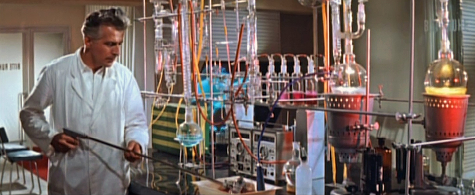
Fig. 5.12 Der schweigende Stern Time code: 00:02:53
Fig. 5.13 Der schweigende Stern Time code: 00:13:43
Figs 5.14, 5.15 and 5.16 Space suits in Destination Moon (USA 1950, Irving Pichel) and Der schweigende Stern (GDR 1960, Kurt Maetzig).
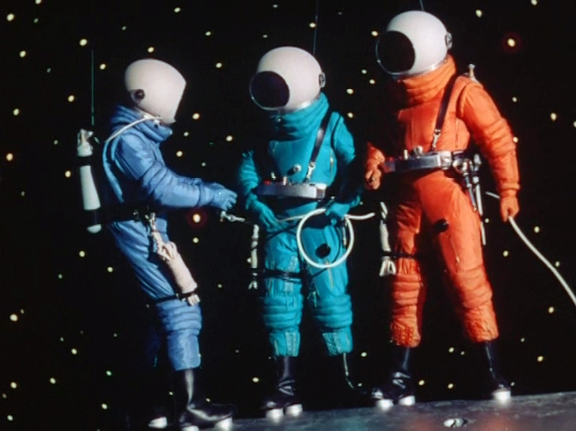
Fig. 5.14 Destination Moon. Time code: 00:51:06
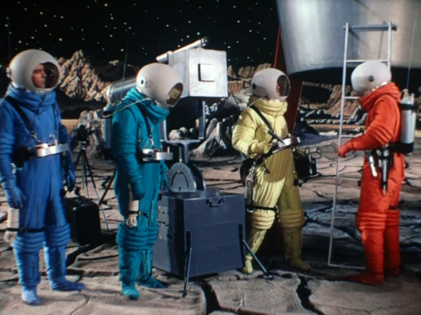
Fig. 5.15 Destination Moon. Time code: 01:09:49
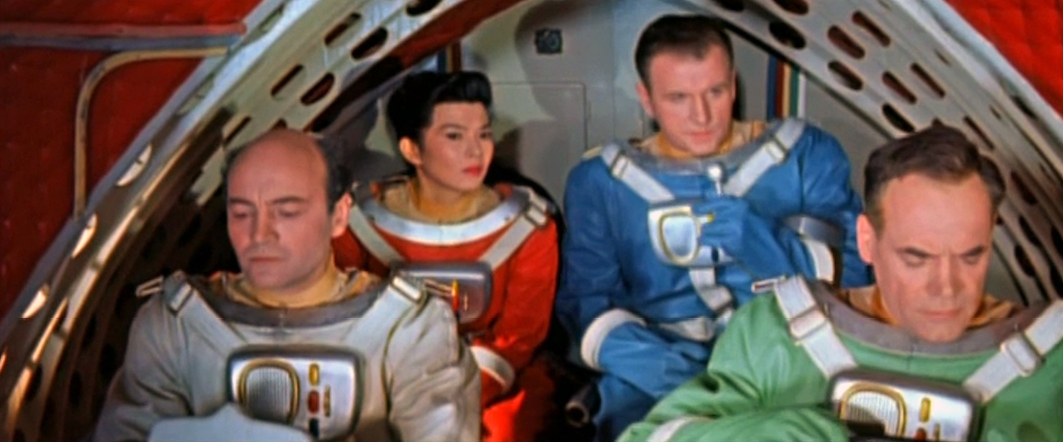
Fig. 5.16 Der schweigende Stern. Time code: 01:04:33
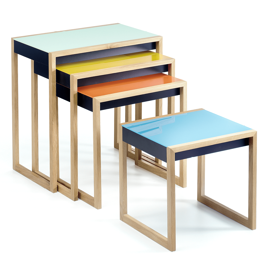
However, these films not only contain these literal references, they also reveal the way in which functional colours, in the form of primary colours, corresponded to other cultural forms. One example is the various hues of the astronauts’ costumes in both the space films [Figs 5.14–5.16]. Of course, this enables the audience to immediately recognise the characters even when they are wearing helmets, but more than that, it produces an aesthetic effect of ‘nesting colours’ that reflects the De Stijl/Bauhaus design aesthetics—as exemplified in Breuer’s and Albers’ nesting coffee tables [Figs 5.17]. Such nesting colours appear in many film interiors in the later 1950s and early 1960s, often in the form of multicoloured cushions scattered on a sofa.
Fig. 5.17 Example of Bauhaus ‘nesting tables’ from the mid 1920s by Josef Albers. Source:
https://shop.bauhaus-movement.com/nesting-table-josef-albers
Stanley Donan’s Funny Face (1957),10 a film about the operations of a fashion magazine, is a good example of how these aesthetic patterns trickled down into other forms of popular culture such as interior design and fashion photography. The magazine’s offices are predominantly white; however, they are shot through with colourful accents—for example, a series of doors, cushions arranged in the nesting-colour mode on a couch, and the samples of fabrics on display in the chief editor’s office [Figs 5.18–5.19]. The film is based on the life and (specifically) work of fashion photographer Richard Avedon. Avedon himself collaborated on the film as a colour advisor, and also designed the credits at the beginning of the film, whose aesthetics, with their patches of colour on a plain background, recall the colour safety code [Fig. 5.20]. Interestingly, some of Avedon’s fashion plates from 1957 reiterate this aesthetic and push it even further in the direction of the Birren/DuPont illustrations in the 1956 colour-conditioning flyer. His work shows models photographed in soft neutral colours, with brightly coloured dots of makeup that look as if they were added to the image after the printing process [Fig. 5.21]. Both the Avedon photographs and the Birren illustrations create a contrast between the black and white photographic images and the colours added later, mimicking a reality in which paint is added to walls, floors and machines, and make-up applied to the skin, lips and eyes. The contrast emphasises the colours as an addition that improves the original—one that is accessible to everyone since it can be bought in a tin or a bottle.
Figs 5.18 and 5.19 Colour use that reminds of the colour code and nesting table aesthetics in the film Funny Face (USA 1957, Stanley Donen). DVD: 2007 Paramount Pictures.

|

|
|
Time code: 00:02:01 |

|

|
|
|
Fig. 5.20 Credits of Funny Face by fashion photographer Richard Avedon recalling the colour code aesthetics. Time code: 00:01:40 |
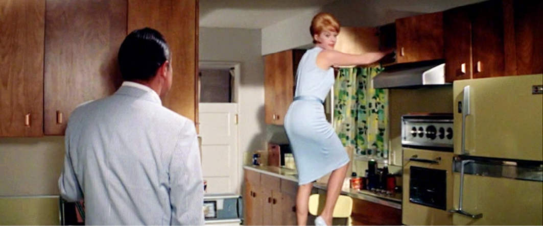
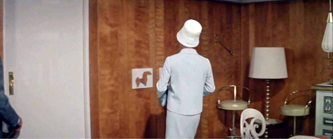
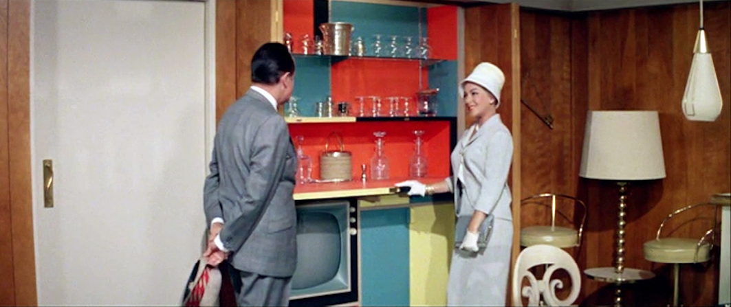
In Tati’s Mon oncle, the safety-code aesthetics in the factory are mirrored in the modern design of the home of M. Hulot’s sister. Its colour scheme plays with the aesthetics introduced by the Bauhaus style of design and architecture—occasional spots of colour on a grey or white background—creating a correspondence between the decor of the factory and the interior design of the modern living space [Figs 5.22–5.24]. This affinity, as well as the clear references to Bauhaus aesthetics, suggests a critical interpretation of the way architecture and design were meant to discipline and control the human body in both the workplace and the domestic space. This is illustrated in an extreme form in the scene where two women are walking towards each other on the meandering garden path, with their arms outstretched in greeting. Because they have to follow the layout of the path, they never actually meet, but continually turn towards and away from each other in a ridiculous dance of failed interaction.
Tati is ridiculing here the modernist ethos of the use of colours that supposedly demarcate spaces and control human behaviour. For example, M. Hulot entirely misunderstands the ethos of the factory, with all its disciplinary colour signals, and by the end of the film has inadvertently caused chaos [Fig. 5.25]. Meanwhile, the architecture of his sister’s modernist home seems to separate the family rather than bringing it together. The meandering path is an example of this, as well as the moments when we see the boy (M. Hulot’s nephew) eating alone in the kitchen, or the parents gazing out of their separate bedroom windows.11 The isolating effect of the design is clearly accentuated by the separate colour areas indicating various functions: green for the sofa, for example, and purple for the dining chairs. Tati presents these modernist spaces as dysfunctional: they cause miscommunication and are isolating, impractical, overly hygienic and uncomfortable. To emphasise the faults of this modern environment it is contrasted with M. Hulot’s neighbourhood, which is filled with haphazard liveliness, food, chaotic architecture and a lack of hygiene, but which enables adults to meet and communicate, and children to play together.
Figs 5.22, 5.23, 5.24 and 5.25 Disciplining architecture and colour use in Mon oncle (FRA 1958, Jacques Tati). DVD The Criterion Collection, 2001.

|

|

|

|
Tati’s references to disciplinary, controlling colours do not, however, result in a film that is itself disciplinary. Eye-tracking investigations have shown that in general Tati’s method of filmmaking does not steer or control the audience, but actually produces a more wandering and exploring eye due to the scattered focus of attention. Tati works with a slow editing pace, giving the spectator time to explore the image: he frequently uses long shots with a deep focus that increase the amount of visible information in the frame; he often locates the main action at the frame’s periphery; and he overlaps information by presenting various actions simultaneously (Bazin, 1967 [1958]: 35–36; Burch, 1973: 47; Faden, 2019).12 This creates a contradiction in the scenes in Mon oncle that use modernist functional colour aesthetics, since the colours refer to control and discipline while the film’s style scatters the attention.
Other films do not ridicule the idea of controlling and disciplinary functional colours quite so directly, but play with it in another way. One such is Niagara (USA 1953, Henry Hathaway, Technicolor IV), in which Marilyn Monroe plays Rose Loomis, a woman who is cheating on her shell-shocked husband. She convinces her lover to murder him, and the two agree that once the deed is done, he will set the bells in the ‘Rainbow Tower’ ringing the song ‘Kiss’ to indicate all went well. However, the husband survives the attack, and instead kills the lover. It is only when she attends the morgue to identify the corpse, which she initially believes will be her husband, that Rose finds out that something went terribly wrong. After a period in hiding, the husband returns to punish Rose for her criminal, uncontrolled behaviour. He has the bells play the same song as a warning to her that he knows all. She tries to escape but he follows her up into the Rainbow Tower, where he kills her beneath the bells that have turned her dream into a nightmare.
An interesting point here is that inside the Rainbow Tower we see various functional uses of the colour red: the elevator door is red, highlighting the way up to this important location; a red light above the elevator buttons indicates that it is occupied; and a red light in the room below the bell tower seems to signal danger. Red, the colour of warning, is used in the narrative to announce and then dramatise Rose’s murder. Just before she is killed, we see Rose in a medium close-up, standing beneath a red lamp that throws its colour onto the wall behind her, creating a halo of red light around her hair. It is as if a red aura were radiating from her body like a visual metaphor for her inner state of fear [Figs 5.26–5.27]. Finally, I would suggest—possibly risking the charge of overinterpretation—that the use of these functional and controlling colours at this moment in the film refers to the control that Rose’s cheated husband is about to recover through his fatal deed.
Figs 5.26 and 5.27 The colour red shifts from functional warning into an indication of an inner feeling of fear in Niagara (USA 1953, Henry Hathaway). Blu ray: 20th Century Fox, 2013.

|

|
Selling with Colour
Not only did Birren develop and finalise the colour safety code, but the entire raison d’etre of his business was to advise clients on how to profit from the use of colour. This becomes clear when reading his book Selling with Color (1945), in which he elaborates his ideas on how colour could help increase sales. To add authority to his advice, he often refers to psychological or other more-or-less scientific discourses on colour, using them to add a patina of authority to his attempts to convince potential clients that colour has direct physiological, biological and psychological effects (Birren, 1945: 159–72; 1961a: vii), including his claim that the colours used in interior design could influence mood (1945: 123). Of course, if the colour of the walls in an office or hospital could be said to affect the state of mind of staff or patients, so too could the colours encountered on a cinema screen, not least because they are projected back onto the audience, producing a colour effect in both the filmic space and the auditorium.
Birren’s main purpose was always of a commercial nature—and it was not without success: he could number among his clients ‘DuPont, the Hoover Company, General Electric, Masonite, Minnesota Mining, National Lead, House & Garden Magazine, the West Virginia Pulp & Paper Company’ (Morrow in Birren, 1961a: xiv). What is of more interest to us, however, is the way he turned the theories and scientific discourses he discussed in Color Psychology and Color Therapy (1950) into practical advice. To better understand this procedure, we need to take a closer look at two other texts that Birren published during this period. The first is the 1956 flyer, mentioned above, which introduced his DuPont Color Conditioning system, while the second is his book Color for Interiors (1963). The flyer not only presents the colour safety code, but also a so-called colour programme focusing on colour as the ‘veritable storehouse of hidden power that can sway our emotions and our actions, too’ (Birren, 1956: 2). Birren assures his clients that colour conditioning would work beneficially (and profitably) in factories, hospitals, offices, schools and homes. In addition to the colour safety code, he claims that the correct use of colour improves visibility and prevents eyestrain in factories, gives the hospital patient a psychological lift, reduces eyestrain and lessens ‘classroom fatigue’ in schools, and encourages emotional and physical relaxation in the home, as well as in restaurants, hotels and motels (3). Incidentally, colour conditioning not only existed as a prescriptive project, but was also the name of a brand of paint sold by DuPont (Birren, 1956: 26). Hence, it is probably safe to claim that the main purpose of the colour-conditioning programme was to sell paint [Fig. 5.28].
Fig. 5.28 Can of DuPont paint by the name ‘Color Conditioning’. Source: Color Conditioning (1956)
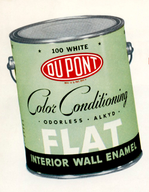
In all, I would argue that DuPont and Birren’s concept of colour conditioning is an excellent example of a biopolitical project harnessed to the demands of capitalism: tying the programme in with a brand of paint made it clear that it was almost entirely a commercial activity, with the aim of controlling the bodies and minds of factory workers, office personnel, consumers, patients and students in the interests of productivity, efficiency and profit.
As mentioned earlier, the discourse of functional colours and colour conditioning took off internationally during the 1950s, coinciding with a postwar demographic shift in Western society. Europe was experiencing poverty and a housing shortage (the result of intense bombing raids during the war) and was gripped by a fever of reconstruction. At the same time, in the US, millions of African Americans started to colour the urban centres in the Northeast, Midwest and West of the country, fleeing the poverty and racism of the south. In turn, many of the white inhabitants of the city centres moved into newly constructed bungalows in the suburbs. Mass suburbanisation in the USA took off between 1945 and 1970; during the 1950s ‘suburbs grew at a rate ten times faster than […] central cities’ (Avila, 2004: 4). This ‘white flight’ from the cities had the effect of a de-facto segregation of citizens from different cultural and racial backgrounds (16). In addition, suburbanisation not only produced uniform and monotonous landscapes, characterised by a compartmentalisation of spaces into various functions such as shopping malls, highways, churches and houses, but also created an environment in which people could be managed and potentially steered into adopting a consumerist lifestyle.
In his chapter ‘The senses of the marketplace: Commercial aesthetics for a suburban age’ (2014), Adam Mack writes that this 1950s desire for control was rooted in Cold War tensions. As already discussed in Chapter Three, the West had entered the so-called ‘atomic age’, dominated by the testing of atomic bombs and an escalating arms race between the USA and the Soviet Union that created an atmosphere of existential anxiety. In response, people ‘nestled’ into their suburban homes, seeking shelter in the nuclear family (Mack, 2014: 88). The creation of an orderly, comprehensible environment seemed to promise the individual control over their personal lives in a world that was perceived as chaotic and threatening.
A promotional film for suburban homes, Westinghouse all Electric House (1959), for example, presents its audience with just such a functional compartmentalisation of a domestic interior. The house showcased in the film is organised around several ‘electric centres’: ‘the entertainment centre’, ‘the laundry and home planning centre’, ‘the food preparation centre’, ‘the dining centre’, ‘the child’s education centre’, ‘the health and beauty centre’, ‘the hobby centre’, and last but not least, ‘the outdoor living centre’. This was a highly functional house, with a high standard of comfort and the possibility of control over every detail of domestic life. Of course, such a house also controlled its inhabitants, disciplining behaviour and movement through its controlled spaces, each dedicated to specific activities. Furthermore, these modernist houses (and the films advertising their high level of functionality), with their ‘control centres’ supposedly easing the burden of managing a household, were also intended to persuade women back into their traditional role of mothers and housewives.13
Interestingly, despite the functional compartmentalisation of the home in Westinghouse all Electric House, its colour scheme—a combination of wooden walls with orange, yellow and blue details—remains the same throughout the entire building. Some spaces, such as the entertainment centre (or living room), have a preponderance of orange with touches of blue, presumably giving them a ‘warmer’ effect. Other areas, such as the dining room, are predominantly blue (a colour thought to produce a ‘cooler’ atmosphere), providing a complementary colour contrast with the living room. The camera pans from one space to another, emphasising the contrast and revealing the diversity and compartmentalisation of the house. This is also established by the shifting emphasis on one or another colour, although the fact that the colour scheme remains the same throughout the entire interior design helps create a harmonised whole.14 This is in line with Birren’s advice in the DuPont flyer for the interior design of an industrial plant:
If different sections of the plant were painted without regard for each other, the result would […] look chopped up. […] By treating the many departments as a related whole, Color Conditioning gives the plant a consistent, attractive appearance. (Birren, 1956: 11)
Yet, a search in VIAN shows that the strategy of brightly coloured walls that we see in the Westinghouse promotion were a rarity in the Hollywood films of the 1950s. Interiors were still predominantly rendered in restrained, subdued colours. It appears that even though Kalmus’s colour consciousness was never adopted in its entirety, filmmakers did put her idea of using subdued backgrounds for the colour-saturated characters into practice. Backdrops of coloured walls and furniture were decidedly not in line with Kalmus’s (1935: 146) ‘law of emphasis’: ‘nothing of relative unimportance in a picture shall be emphasized’.
Slowly Unleashing Colour in Film
During the second half of the 1950s, (Technicolor) colour consultants appeared to loosen their attitude towards colour control. One reason might be that the introduction of Technicolor V three-strip camera technology was no longer needed. This shift from a highly complex camera technology towards a much easier way to shoot colour made the presence of the Technicolor personal on set no longer needed. This might have included the colour consultants.
Film interiors began to show an increase in the sorts of colour schemes that could be linked to the concept of colour conditioning and the newer ideas of colour harmony propagated by Birren, the dye industry, and many others. For example, several scenes in Douglas Sirk’s Written on the Wind (USA 1956, Technicolor V) show a bolder use of darker and more colourful backgrounds than was usual up to then in a Technicolor film: the interior of a plane is depicted in soft greens and grey-blues, for example, and the walls of a bar in warm reds and ambers. Likewise, the interior of the hotel where the main characters are staying displays a controlled use of colour: the walls in the corridor are magenta, and this is repeated in a more subdued tone in the female character’s room, whereas the room of the two male characters has blue walls and yellow furniture. Thus, we see a differentiation in the use of colour according to character, with a strong focus on gender. The way in which this emotional connection between character and colour is manifest within the narrative of the film is rooted in the contemporary fashion of painting walls in colours that were believed to correspond to the emotional feel of a space (or to the attributes of a character in a film) [Figs 5.29–5.31].
Figs 5.29, 5.30 and 5.31 Coloured hotel walls in Written on the Wind (USA 1956, Douglas Sirk). DVD: 2005 Universal.
Time code: 00:16:03
Time code: 00:22:55
Interestingly, the gender-coded colours in the interiors in the earlier scenes of Written on the Wind prepare the audience for a later moment in the film when it becomes clearer which of the two men Lucy Moore (Lauren Bacall) is falling in love with. The emotional intensity of this moment is amplified with coloured lighting, a technique that Sirk, his cinematographer Russell Metty and colour consultant William Fritsche had already experimented with in All That Heaven Allows (1955). The scene shows Bacall, lit in blue and yellow—colours similar to those in the male characters’ hotel room, creating a visual connection between Lucy and the two men. This highly constructed way of making the emotional connotations of a scene explicit came to be known as the ‘Sirkian style’ of filmmaking [Fig. 5.32].
Fig. 5.32 Colour creates a visual connection between Bacall and the male characters she is involved with in Written on the Wind (USA 1956, Douglas Sirk). DVD: 2005 Universal. Time code: 00:17:20
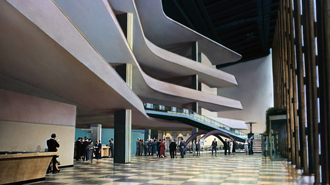
We also encounter colourful interiors in Alfred Hitchcock’s North by Northwest (USA 1959, Technicolor V),15 beginning with the film’s beautiful entrée depicting the United Nations building with its modernist architecture and pastel colours. We also see a train’s restaurant car—decorated in a combination of yellow, blue and rose—where the two main characters meet, apparently by accident, and a play of seduction begins. Again, as in Sirk’s film, an emotionally charged moment takes place in a space full of colour.16 The film exhibits a perfect example of colour harmony, combining the pastels that were so popular at the time. Kalmus’s rule that a film’s background should have a subdued and restricted palette in order to throw the characters into relief appears to have lost its influence in favour of the sort of colour combinations Birren and DuPont introduced into interior design in the second half of the 1950s [Figs 5.33–5.35].
Figs 5.33, 5.34 and 5.35 Colourful interiors in North by Northwest (USA 1959, Alfred Hitchcock). DVD Turner Entertainment, Warner Bros. Entertainment, 2009.
Time code: 00:53:14
Time code: 00:36:00
Besides the influence of fashionable interior designs, the increase in the use of colour for interior scenes in films might have been connected to the fact that film was increasingly shot on Eastmancolor, also known at the time as Cinecolor, Metrocolor, Warnercolor or Pathecolor. This colour system was not accompanied by colour consultants bound by Kalmus’s rules and regulations. Rebel Without a Cause (USA 1955, Nicholas Ray, Eastmancolor), for example, was shot on Eastmancolor negative and released on Warnercolor. The film’s interiors appear to follow the fads of the decade: the Starks’ bathroom is mint green; in Judy’s house, the corridor and her parents’ bedroom are pink, while her bedroom is blue; and in the school, the corridor has blue walls with doors painted peach. In addition, blue lighting is used to indicate night, and since most of the narrative takes place outside after nightfall, this lighting is present during a large part of the film. These examples can be explained by the fact that in real life it had become increasingly popular to decorate interior spaces in a wide variety of colours—possibly a result of the fairly aggressive marketing strategies that the paint companies used to convince consumers that it was essential to take into account colour conditioning, functional colours or colour harmony when decorating a room, be it in a home, restaurant or hotel [Figs 5.36–5.37].
Figs 5.36 and 5.37 Colourful interiors in Rebel Without a Cause (USA 1955, Nicholas Ray). Blu ray Warner Home Video, 2013
There are further examples of films that also show an obvious relationship between walls rendered in warm saturated colours (red or purple) and sex or sensuality—three of which I will briefly mention here. The first is Gigi (USA 1958, Vincente Minnelli, Metrocolor). The apartment where Gigi lives with her mother has dark red walls and furniture, with details of amber and gold. Logically, the saturated red that characterises this room indicates that Gigi is from a family of high-class prostitutes and is predestined to also become a rich man’s mistress. The intense red of this space contrasts strongly with the other scenes in the film, which use a far more subdued colour scheme. Other filmic spaces decorated with saturated reds and occasionally purples indicate ‘inappropriate’ sex before or outside of marriage, as in the living room of Mike Hagen’s mistress in Designing Woman (USA 1957, Vincente Minnelli, Metrocolor),17 and the dressing room of chorus girl Rebel Davis, where we see Jerry Webster massaging Davis in a suggestive manner in Lover, Come Back (USA 1961, Delbert Mann, Eastmancolor).18 These colours do not only engage the eye, but also speak to us on a more physical level, hinting at illicit sexual relationships or even prostitution. Here, we have definite examples of the way sexually charged spaces can be further intensified by colour—for example, by red’s connotations of sexual passion [Figs 5.38–5.39].
Figs 5.38 and 5.39 Sexually charged spaces intensified by colour
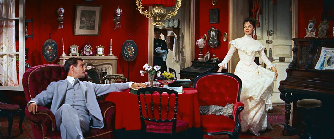
Fig. 5.38 Gigi (USA 1958, Vincente Minnelli). DVD Turner Entertainment, Warner Bros. Entertainment, 2007. Time code: 01:11:20
Fig. 5.39 Lover, Come Back (USA 1961, Delbert Mann). DVD Universal Studios, 2006. Time code: 00:20:29
Arguably, the increasing presence of such colourful interiors in Hollywood films represented a significant step in the evolution of cinema. As such, not only the shift from the formerly predominant Technicolor three-strip towards chromogenic camera material, but also the cultural context played an important role in the ‘colour turn’ in film during this decade.
Playing with Conditioned Colours
All this confirms the hypothesis that German film scholar Christine Brinckmann advances in ‘Chords of color’ (2015 [2006]), her article on colour aesthetics in Hollywood films between 1956 and 1964. Brinckmann (2015 [2006]: 53) argues that 1956 saw the beginning of a new attitude towards colour as a reaction to the long dominance of the Kalmus standards, ‘for the use of color was overripe and mannerisms and parodies were in the air’. In her article, Brinckmann discusses two films that are extremely interesting from the point of view of contemporary interior design: Bachelor in Paradise (USA 1961, Jack Arnold, Metrocolor)19 and Lover, Come Back. Both contain colour schemes in their indoor scenes that are reminiscent of the decoration displayed in the advertising film Westinghouse All Electric House, mentioned above.
Bachelor in Paradise, however, clearly parodies the ideal of suburban bungalow life that Westinghouse promotes. In the film, we follow the exploits of Adam Niles (Bob Hope), who writes books about sexual habits in foreign countries. When he is forced into hiding, due to sloppy tax management, he finds himself in a suburb called ‘Paradise Village’ that is fashioned to exclusively house young families. All the houses are built with the same motifs, the only touch of individuality being their different colour schemes.
The general manager of Paradise Village, Rosemary Howard (Lana Turner), rents Adam her own house. When she shows him around, Adam (and the audience) are presented with a perfectly styled living space. Similar to the house in Westinghouse All Electric House, it has a consistent colour scheme, characterised partly by the bar and television set (hidden away behind wooden panels) and partly by the cushions—another example of nested colours—arranged on the sofa. Only the red of the hearth and a plant pot show stand-alone touches that are not repeated in any of the other spaces (the red of the hearth might be a direct reference to the warmth this colour has been associated with ever since Goethe). Each more or less separate space has its own atmosphere due to the dominance of one or another colour from the overall scheme: for example, the bedroom is predominantly blue, whereas the kitchen is mainly yellow and green.
Interestingly, this colour scheme shows similarities to the recommendations Birren makes on home decoration in Color Psychology and Color Therapy (1950, 1961a). Birren (1950: 109) writes: ‘The kitchen may be nice cool tones of green or turquoise, such colors tending to shorten the apparent passage of time’ and ‘[b]edrooms may be in any color, preferably of light tint’. He repeatedly describes blue as a calming colour, and (in medical contexts) claims that it can be used to treat ‘intractable insomnia’. As the bedroom is painted in various gradations of blue (‘Painter couldn’t make up his mind, hey?’ Adam quips), its decoration seems to follow Birren’s suggestions, or at least shows that such colour coding was already part of ‘common sense’ in 1961. With the help of this neat colour scheme, the ‘working woman’ (a synonym for a young single woman at the time) is represented as organised and in control [Figs 5.40–5.42].
Figs 5.40, 5.41 and 5.42 In Bachelor in Paradise (USA 1961, Jack Arnold) Rosemary seems to have followed Birren’s advices for the decoration of her bungalow. DVD Turner Entertainment, Warner Bros. Entertainment, 2011.
Time code: 00:40:56
Rosemary’s house is one of the more modern ones in Paradise Village. For example, the television set and wet bar are hidden in a built-in cabinet in the 1960s fashion (Shonfield, 2000: 29). The colour design of the bar—a coarse checkered pattern in a soft darkish orange and light blue—is noteworthy: the contrast of saturated complementary colours has a vibrant effect (as we saw in Chapter Four when discussing op art), creating a sense of gaiety and restlessness at odds with the harmonious colour combinations in the rest of the house. Because the television and the bar, with its pulsating colours, are shut away when not in use, Rosemary even controls when it is time to surrender control: she decides when to open the built-in cupboard and let fantasy and intoxication loose in the living room [Figs 5.43–5.44].
Figs 5.43 and 5.44 The colour scheme in Rosemary’s bungalow changes drastically when she opens the build-in cabinet in Bachelor in Paradise. DVD Turner Entertainment, Warner Bros. Entertainment, 2011.
Time code: 00:18:10
Time code: 00:18:18
The interior of the house indicates great sensibility in its decor and colour scheme, and this is confirmed when we see Rosemary sitting in her office in front of a collection of samples of material showing potential combinations of colours [Figs 5.45]. Clearly, she is the colour specialist in Paradise Village, probably advising new residents on how to use colour in their interior design. It is telling that the decoration of her office space echoes a 1963 photograph of Birren standing in an (his?) office, similarly surrounded by colour charts and samples of material and tiles, implying that colour consultancy was an accepted cultural practice in the real-estate business at the time [Fig. 5.46]. Both representations show a greater flexibility in the combination of colours and invention of colour schemes. The colour charts, with their possibility of various colour combinations, show a far less rigid system than that of the colour safety code and its biopolitically charged recommendations for factories, offices and hospitals that Birren prescribed between 1937 and 1956. However, this accords with his arguments in a later book, Color for Interiors, Historical and Modern (1963), in which he advocates freedom in the use of colours in domestic interiors. He even states, in retrospect, that the end of the Second World War ushered in a revolution in taste that was not ‘one of dictation from above but of the democratic insistence of a massive population’ (Birren, 1963: 106). This of course contrasts with his earlier advocacy of the use of functional colours to increase productivity and efficiency.
Figs 5.45 and 5.46 Rosemary’s office in the film presents her as true colour specialist similar to Faber Birren.
|
|

|
|
Fig. 5.45 Bachelor in Paradise. DVD Turner Entertainment, Warner Bros. Entertainment, 2011. Time code: 00:11:49 |
Fig. 5.46 Faber Birren in his office. Source: http://www.araratrugs.com/blog-home/the-faber-birren-color-theory |

Bachelor in Paradise is an interesting example of how decor and colour can give very similar houses touches of individuality. The film shows the domestic interiors of a number of married couples, each one characterised by its own particular colour scheme, recreating the atmosphere of family life in varied ways. When Adam convinces the bored housewives to conduct an experiment in which they try to seduce their husbands, we get a glimpse inside a few of these homes, including that of Camille and Leland Quinlaw, which is a jarring mixture of the modern and the traditional. The mismatch seems to mirror the state of their marriage, since the husband runs out of the house as soon as he sees his wife appear in a pair of babydoll pyjamas [Figs 5.47–5.48].
Figs 5.47 and 5.48 The mixture between modern and traditional in the interior design echoes the mismatch between wife and husband in Bachelor in Paradise (USA 1961, Jack Arnold). DVD Turner Entertainment, Warner Bros. Entertainment, 2011.

|

|
Another couple also appears to have a somewhat rocky marriage: whereas the wife has prepared a candlelit dinner in the bedroom, strategically placing it by the bed, which she has covered with a red duvet, the husband wants the light on so he can see his kids when he gets home, and he absolutely does not want to have a ‘romantic dinner’ in the bedroom. Finally, the Delavanes’ house shows an interior design with traditional furniture and curtains with strong detailed patterns. The colours are mainly pinks and purplish reds, all in quite subdued tones. Although it is much less full of saturated colours, their living room reminds us of the interior in Gigi which acted as a synonym for sensuality and promiscuity. And as a matter of fact, this is the house of the most sexually compatible married couple we encounter in the film. All the different couples’ feelings about their marriages are thus mirrored in the interior designs of the suburban houses of Paradise, despite the fact that they all resemble one another in their architectural layout.
Figs 5.49 and 5.50 Similarities in colour schemes of two apartments in Lover, Come Back (USA 1961, Delbert). DVD Universal Studios, 2006.
|
|

|
|
Film still with a VIAN visualization of colorimetric analysis of the image. |
|


|

|
|
Fig. 5.50 Film still with a VIAN visualization of colorimetric analysis of the image. Time code: 01:19:53 |
|
In the other film that Brinckmann discusses, Lover, Come Back (1961), we meet Carol Templeton (Doris Day), who also is a ‘working’ or single woman. Carol lives in a similar modern apartment to Rosemary’s in Bachelor in Paradise. The house is light, with an overall colour scheme of blue, yellow and orange, and a modern, tasteful design. The living room’s blue and yellow decor match Day’s hair and eyes and is repeated in her dresses. The soft light blue also has religious connotations, referring to the Virgin Mary, hinting at Carol’s purity and presumed virginity. The male love interest in the film, Jerry Webster (Rock Hudson), is a bachelor with no moral scruples, be it in matters of business or love. His apartment ‘turns out to be the somber counterpart to Day’s’ (Brinckmann, 2015 [2006]: 56)—and both apartments contain touches of the same orange of the built-in bar in Bachelor. Could this be foreshadowing a future relationship between the two? [Figs 5.49–5.50]. On the other hand, Birren’s Color for Interiors displays two colour charts with a quite similar colour called ‘sunset orange’, one for the modern American home of the 1950s and the other demonstrating the optimal colours for offices, indicating that this shade of orange was particularly fashionable in this period [Figs 5.51–5.52]. Still, even though the colour scheme of the two interiors appears to reference the fashion of the time, if analysed in the context of the film, it presents a ‘well-calculated concept’ with a narrative function, and reflects the personalities of the characters.
Figs 5.51 and 5.52 ‘Sunset orange’ can be identified as a popular colour of the time in Birren’s Color for interiors from 1961.
|
|
|
|
Fig. 5.51 ‘Sunset orange’ indicated as popular colour of America during the 1950s. |
Fig. 5.52 ‘Sunset orange’ as a colour to be used in offices. |


In addition to its narrative functionality, Brinckmann draws attention to several moments in the film where the colour scheme spills over the borders of colour consciousness and colour control. The clearest of these is the scene in which we see a chemist developing a new mysterious product called ‘VIP’ in a basement laboratory; he is surrounded by an array of test tubes which occasionally produce explosions of large colourful clouds that leak from the laboratory into the street above. Brinckmann (2015 [2006]: 55) notes that ‘color becomes autonomous as a result of exaggerating a plot element to the point of absurdity, thanks to the sensuous appeal these color interludes possess’. Thus, colours form a sensuous deviation from the rest of the narrative or, as Brinckmann writes, they appear to be ‘pushing the action into the unreal’. Finally, when the product is finished, it presents another example of colourful extravagance: ‘[A] torrent of metallically shining sweets rains down on the table—an event that is privileged with a close-up, justified solely by the fascination of the colors’ (Brinckmann, 2015 [2006]: 56). Indeed, the VIAN visualisation of the colorimetric analysis of this image reveals a wide range of hues, creating a multicoloured effect similar to those used by clowns and other ‘deviant’ characters [Fig. 5.53].
Fig. 5.53 VIAN colorimetric analysis shows a gaudy colour scheme for the candy called VIP in Lover, Come Back (USA 1961, Delbert). DVD Universal Studios, 2006. Time code: 01:31:20

|

|
These various examples of films from the late 1950s and early 1960s reveal a loosening of formerly rigid colour aesthetics. Functional colours, when present, were translated into strong emotional responses in films such as Niagara and Il deserto rosso, and the fad of colour conditioning, promoting the idea that the use of colour in interior design was synonymous with good taste, replaced the more restricted use of (subdued) colours in interior scenes. Many of these ideas were influenced by Birren’s writings on colour conditioning and the notion of colour harmony. The loosening of (Kalmus’s) strict colour schemes in Hollywood cinema enabled an increase in the interplay of contrasts, emphasising difference of gender by the colour of rooms, for example, or introducing clashing or swirling colours to indicate intoxication or trance.
In all, this chapter has shown the ways in which the more or less controlled colour culture in film (and in wider society) slowly but surely started to break free of the conventions and regulations that dominated the first half of the twentieth century—although it is interesting to note that the new uses of colour can be traced back to yet another, equally prescriptive fad: that of functional colours and colour control (as promulgated by Birren). However, we also see directors such as Tati taking an ironic view of such uses of colour and colour schemes. All this dovetails with the conclusions of Part I, in which the use of colour contrasts also led to the interplay of colour and perception in forms like (or similar to) op art. The next chapter turns to a discussion of the idea of ‘losing control’ in relation to the use of coloured lighting to create immersive, atmospheric spaces.
1 Kalmus was not the only one to connect colour to consciousness. Leonard Troland, who later developed the Technicolor dye-transfer technology, published an article called ‘Color as a form of consciousness’ in 1918. However, Troland saw ‘consciousness’ as a form of perception, as opposed to Hayden Rorke and Kalmus, who considered it a form of awareness.
2 Examples of colour consultants working with Technicolor include: Natalie Kalmus (1928–50); Morgan Padelford (1938–59); Joan Bridge (1938–58); Henri Jaffa (1937–58); Richard Mueller (1941–64); Monroe W. Burbank (1948–55); William Fritzsche (1944–57); James Gooch (1948–56); Leonard Doss (1954–58); Lansing C. Holden (only on the Garden of Allah (1936); Charles K. Hagedon (1955–63); Robert Brower (1944–57, later colour coordinator for TV); Francis Cugat (1946–57); Mitchell G. Kovaleski (1944–54); Alvord Eiseman (1952–54); John Craig (1954) (Source IMDb). Colur consultants working for other systems: Wilton R. Holm (colour or cinecolour consultant 1948–1953); Clifford D. Shank (colour or cinecolour consultant 1948–54); Alvord Eiseman(n) (1952–61, Agfa and Ansco); Gerhard Huttula (only on 1x Agfa); Charles K. Hagedon (1955–63, Metrocolor, 1967–68, TV); Leonard Doss (1954–63); Clifford D. Shank (1948–54); Hoyningen-Huene (1954–63, Technicolor) (Source IMDb.)
3 ‘[…] prouver que la couleur [...] pouvait [...] devenir un élément pleinement fonctionnel de la narration dans la mesure où sa présence était contrôlée d’une manière adéquate. Le discours de Kalmus exprimait la nécéssité d’un changement de stratégie’ (translation by the author).
4 The Technicolor director of this film is credited as Natalie Kalmus, with Mueller as her assistant.
5 DuPont was also a manufacturer of film stock. For more information on their film stock manufacturing activities, see: Better Pictures Through Chemistry (Marzola, 2015).
6 ‘Ons Restaurant krijgt een nieuw aspect!’ (1951), Het Vaderland: staat- en letterkundig nieuwsblad (January), p. 16.
7 A quick search in Delpher.nl shows that from the 1950s until well into the 1970s the concept of functionele kleuren was in common usage in the Netherlands.
8 ‘Ze Drukken m’n Stukjes in de Verkeerde Kleur! Klein Beeld’ (1958), Trouw, Dag, 16: 10 April. (Koninklijke Bibliotheek). See: https://resolver.kb.nl/resolve?urn=ABCDDD:010816305.
9 Linda Nead explains how with this practice of colour consultancy, colour names and their sometimes-racist connotations also were distributed. For example, the naming of a bright red as ‘Kenya Red’ was in line with the idea that bright colours were for ‘primitive’ people, children and women (Nead, 2017: 148; Batchelor, 2000; Taussig, 2006). Another brilliant source to learn more how colour control naturalised existing hierarchies along the lines of gender, race and class I advise the work of Lida Zeitlin-Wu, ‘What’s Your Color? Mood Conditioning the Postwar Domestic Interior‘ (2023).
10 Funny Face was filmed in Technicolor V, and the colour consultant was Richard Mueller.
11 This image gives the house the appearance of a face with eyes.
12 In his video essay and accompanying blog, Eric Faden (2019) compares Tati’s style of ‘invisible cinema’ with Hollywood’s so-called ‘invisible style’. The latter, he explains, in fact controls and disciplines the eyes of the spectator in such a way that they are compelled to follow the narrative.
13 As discussed in the previous section, the film Mon oncle mocks the disciplinary functions of the modern house (and factory). The aforementioned scene on the meandering garden path is a perfect example of Tati’s ridicule of the way that architecture and landscaping control and discipline behaviour and movement. The film turns this upside down when, for example, the old-fashioned M. Hulot parks his bike inside a painted rectangle meant for a car, and causes a series of minor disasters inside the factory, messing up the plant’s well-structured modernistic spaces.
14 Westinghouse all Electric House (Color). Available at: https://www.youtube.com/watch?v=jyrTgtPTz3M from 10:07-10.30.
15 North by Northwest was shot in Technicolor V, with Charles K. Hagedon as colour consultant.
16 Another example is put forward by Christine Brinckmann in her article ‘Filmische Farbe als Artefakt’ (2014 [2001]). This is a scene in Pal Joey (USA 1957, George Sidney) that is set in a blue-and-green bedroom with a bright yellow bed, where femme fatale Vera (Rita Hayworth) is shown in a yellow negligee after spending the night with Joey. Brinckmann argues that the colourful space is clearly related to sensuality and sex, since the atmosphere of a steamy night of passion still hangs in the room.
17 Charles K. Hagedon was the colour consultant on Designing Woman.
18 Lover, Come Back was shot in Eastmancolor by Pathe, and the colour consultant was Henri Jaffa.
19 Bachelor in Paradise’s colour consultant was again Charles K. Hagedon.