16. The History, Geography, and Politics of Human Genes
© 2024 Marianne Sommer, CC BY-NC-ND 4.0 https://doi.org/10.11647/OBP.0396.20
Part III has brought us up to the 1960s, when anthropologists had increasingly begun to take on the results of blood group studies or indeed carried them out themselves. Part III ended with Carlton Coon welcoming a new way of drawing phylogenetic trees. He explained to his readers of The Living Races (1965), how computer technologies and genetic data allowed the Italian population geneticist Cavalli-Sforza and the British statistician and geneticist A. W. F. Edwards to create what they called the first evolutionary tree of human populations (reproduced in Coon 1965, Fig. 7, 288). This was before it was possible to sequence DNA. What Cavalli-Sforza and Edwards did was analyze twenty alleles from the five main blood group systems of fifteen populations (three per continent). The analysis of the frequencies of variants of blood group alleles in human populations resulted in a phylogenetic tree of a wild mix of population labels from “English” to “Eskimo (Victoria I)” (Cavalli-Sforza and Edwards 1965, Fig. 5, 929).
Data from Indigenous, supposedly isolated populations was preferred in the endeavor to reveal the original human population relations. Some of the labels used in this tree and others for such populations were a legacy of the kind of racial and colonial anthropology we have met with in the preceding parts. However, the young human population genetics was very different from the racial typology of old. Other assumptions underlay this tree than the ones we have met with in Part III, some publishers of which thought of human varieties as separate species or even genera that had evolved in parallel, thus basically decomposing the tree into disparate stalks. In human population genetics, genetic variation was of central interest and the notion of pure races or race in general was often emphatically rejected. At the same time, the tree – the dominant icon to visualize and communicate human evolution, history, and kinship at one glance – continued to organize human diversity into clearly demarcated groups.
Another aspect that we have found to be present in the early tree building of physical anthropology survived into the genetic approaches: the fact that phylogenetic trees could also be maps, or narratives of human dispersal across the globe. This was certainly true for ‘the first human population-genetic tree’ by Cavalli-Sforza and Edwards; it was a diagrammatic rendering of a narrative of common origin and subsequent differentiation through migration without intermixture. Indeed, Edwards and Cavalli-Sforza (1964, Fig. 1, 75) projected the ‘first genetic tree of human populations’ on a map even before they published it in the form mentioned above. They assumed in their model that populations evolved in isolation from each other as well as at a constant rate of genetic change, with regular population splitting and speed of migration. Mother populations would split into genetically identical daughter populations, from when they would accumulate genetic differences. Thus, this genetic distance (due to genetic drift) was taken to be proportional to the duration of independent evolution, and it was also taken to be proportional to the geographical distance populations had put between themselves in the course of time: space and time overlapped in the tree of human populations projected on a global map (Edwards and Cavalli-Sforza 1964, 72; Cavalli-Sforza and Edwards 1965, 925; 1967).
It is further interesting to note that in Cavalli-Sforza’s and Edwards’ ‘first evolutionary tree of human populations’, the main fork divided “Europeans” and “Africans” from “Asiatics” (1965, 929). Through the way in which this tree was projected on the world map, the origin of migration and the root of the tree were placed somewhere in today’s Iran, somewhat reminiscent of the understandings of an Ernst Haeckel or Henry Fairfield Osborn who also imaged the cradle of humankind in the east (Lemuria/South Asia, respectively Mongolia). The time of the ‘great synthesis’ of paleoanthropology, prehistoric archeology, and the new genetic anthropology under the paradigm of ‘out-of-Africa’ was still in the future. It was only in the research on mitochondrial DNA (mtDNA) in the 1980s, in some of which Cavalli-Sforza, now as professor at Stanford University, was involved, that the “Caucasian” line began to be closer to the “Oriental” and “Am. Indian” ones than to the “Bantu” or “Bushmen” (Johnson et al. 1983, Fig. 7, 267). This meant, even if still ambiguously, that the main fork in the new mtDNA tree could separate the African populations from ‘the rest’, and that the root of the tree was about to be planted in Africa.
One influential study, in which mtDNA-samples from 148 people, labelled “Africans”, “Asians”, “Caucasians”, “aboriginal Australians”, and “aboriginal New Guineans”, were sequenced, suggested that all human mtDNA could be referred back to a single female ancestor who had lived in Africa some 200,000 years ago – our ‘African or mitochondrial Eve’ (Cann, Stoneking, and Wilson 1987, quotes on 32). The mitochondrial tree that accompanied this 1987 publication once again came with a narrative, or a mental map, in the shape of the recent out-of-Africa and replacement scenario (out-of-Africa model). It suggested that the most recent common modern human ancestor had lived in Africa about 200,000 years ago. No more than 140,000 years ago, modern humans had begun to spread and conquer the globe. In this process, modern humans replaced archaic forms of Homo, like the Neanderthals in Europe and Asia, without interbreeding. Two of the researchers of this paper, Mark Stoneking and Rebecca Cann, contributed to The Human Revolution volume shortly thereafter, which came out of an international conference at Cambridge (GB) organized by the archeologist Paul Mellars and the paleoanthropologist Chris Stringer. It brought together experts from human evolution, archeology, and molecular genetics to discuss the revolutionary new methods developed in the latter field and their application to human evolution. It signified the advent of a large out-of-Africa consensus (Stoneking and Cann 1989; Stringer and Mellars 1989; Sommer 2015a, 116–30; 2016a, 257–73).
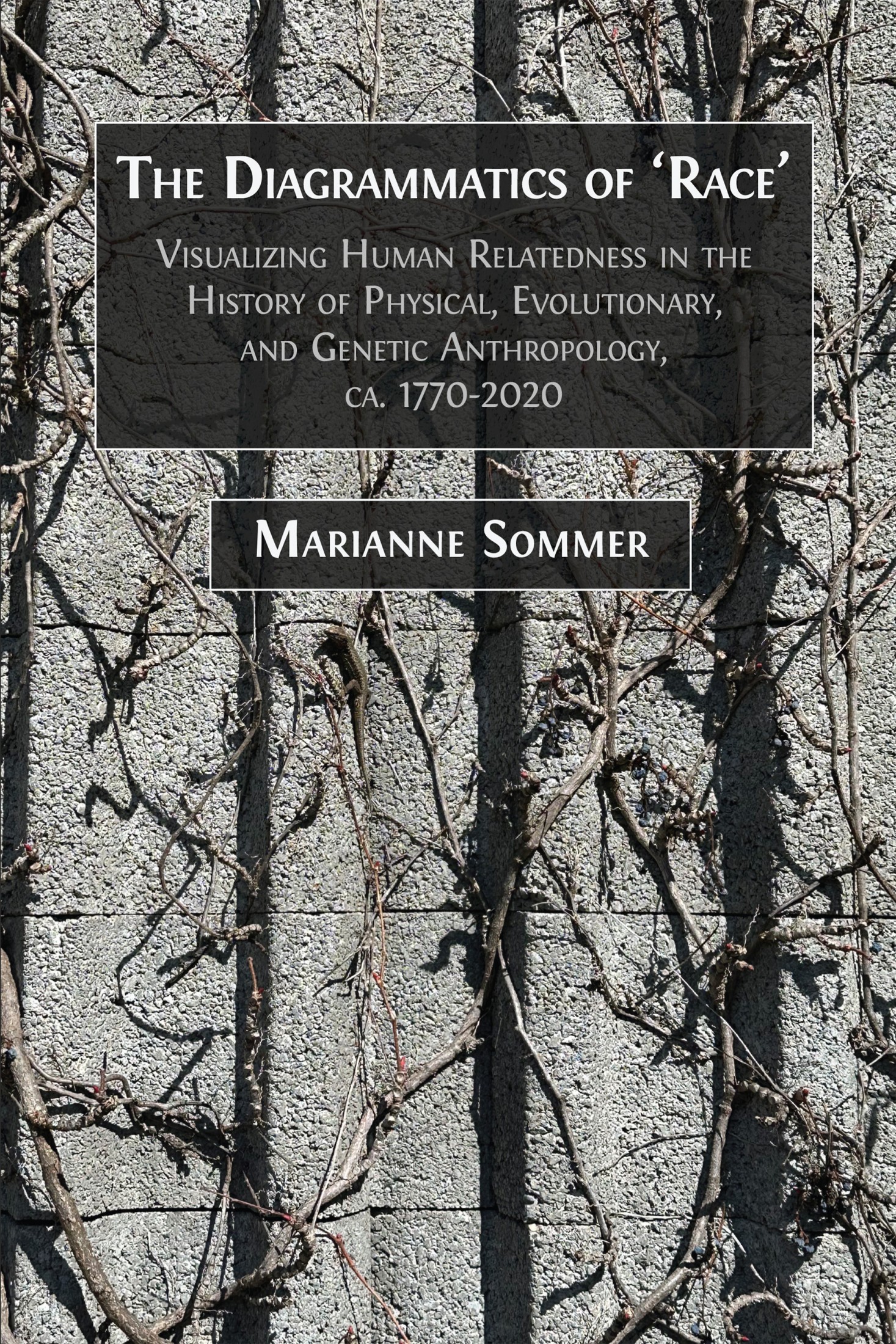
The global genetic history was codified with the grand The History and Geography of Human Genes (1994) of Cavalli-Sforza and his Italian colleagues Paolo Menozzi and Alberto Piazza. The authors promised nothing less than to reveal the history of migration and differentiation of entire humankind over the span of the species’ existence on the basis of the distribution of mostly classical genetic markers in Indigenous or what were considered isolated populations worldwide. The diagrams – the maps, trees, tables, and graphs – to present data, models, and results from statistical analyses were integral to this goal. Figure IV.1 is a map showing human migration paths adapted from The History and Geography of Human Genes (Cavalli-Sforza, Menozzi, and Piazza 1994, Fig. 2.15.1, 156), in which the Americas have been moved from the right of Eurasia (original) to its left with the effect of giving the Mercator projection but cutting off the human journey from Asia into America across the Bering Strait. In fact, The History and Geography of Human Genes contains so many maps that it may be described as an atlas. It has an appendix with maps mostly giving frequency distributions of alleles. This appendix makes up by far the larger part of the book, also providing tables of allele frequencies for the populations analyzed and a reference list for the alleles studied. In this way, it is reminiscent of the skull atlases of the nineteenth century discussed in Part I.
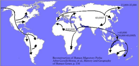
Fig. IV.1 “Reconstruction of Human Migratory Paths After Cavalli-Sforza, et al., History and Geography of Human Genes, p. 156”. Drawing by Patrick Edwin Moran (2006). Wikimedia, CC BY-SA 3.0, https://commons.wikimedia.org/wiki/File:Cavalli-Sforza_Human_Migration_Paths.jpg
At the same time, The History and Geography of Human Genes (1994) followed in the footsteps of encompassing anthropological treatises like James Cowles Prichard’s Researches into the Physical History of Man (1813) and subsequent editions in that it begins with a panhuman genetic history succeeded by chapters on Africa, Asia, Europe, America, Australia/New Guinea/Pacific Islands. Also as in Prichard’s work, the comparative study of languages constituted a central element in The History and Geography of Human Genes (1994). Furthermore, part and parcel of this genetic history was knowledge from archeology, (paleo)anthropology as well as insights about climate, ecology, and human history. Cavalli-Sforza, Menozzi, and Piazza thus also treated results from other approaches to human evolution, such as the multivariate statistics of the renowned anthropologist William Howells, whom we have met in Part III, and they for example used archeological dates to study the constancy of molecular clocks.
Howells, who had followed Earnest Hooton to the Chair of Anthropology at Harvard, pioneered quantitative cranial methodology for the establishment of population relations. His Skull Shapes and the Map (1989) presented fifty-seven different measurements on twenty-eight skull series, for example from a village, a ‘tribe’, a nation, or generally from a region like Tasmania. Firstly, he equated these series with populations, and, secondly, they stood for six major geographic regions of the earth. Howells himself saw this search for specific distinctions between these populations and geographic regions as “analogous to the idea of ‘racial’ differences of past anthropology, but on an objective and systematic basis, not on one of typology” (1). It was a search for the pattern of human skull variation brought about by processes of differentiation in place before 1492, when intermixture on a global scale would have set in.
Skull Shapes and the Map (1989) together with the preceding Cranial Variation in Man (1973a) can be seen as following the old cranial-atlas genre discussed in Part I, with measurements and instruments explained and results tabulated, but Howells did not include images of the skulls. Rather, Howells (1989) produced dendritic diagrams to find out whether the eighteen populations build major geographical clusters. While the skull trees differed between the sexes and with the number of populations included, Howells answered the question in the affirmative. He also used something called principal component analysis – a clustering visualization technique central to Cavalli-Sforza’s human population genetics and discussed below. These clustering analyses on the basis of skull measurements, too, were interpreted as confirming the differentiation of major geographic groups. Finally, integrating Neanderthal and other premodern skulls in some analyses, Howells read his findings as supporting the out-of-Africa scenario of human evolution and as in line with those of geneticists like Cavalli-Sforza and colleagues (1988) and Cann and colleagues (1987) (even though Howells’ dendrograms did not support an African origin of modern humans).
In The History and Geography of Human Genes, Cavalli-Sforza, Menozzi, and Piazza (1994, 66, 72–73, 160) on their part referred to Howells in the context of the question after the right model for human evolution. They granted that Howells’ (1973a) method to build trees on anthropometric data had overcome some of the problems in Cavalli-Sforza’s and Edwards’ (1964) early genetic attempts. However, the analysis of genes seemed to be especially relevant as it was seen to provide the most direct access to human history. Genes were much less than bones affected by environmental factors like climate that were not about naked genealogy but living conditions. This sense of the gene as documenting evolution unperturbed by the common understanding of history brings to light the tensions between the different approaches Cavalli-Sforza and colleagues synthesized. Population genetics was a mathematical and information-technological approach, it reduced history to stochastic change in molecules (Sommer 2015a; 2016a, Ch. 11).
However, despite this severing of phenotype from genotype, the similarity the new genetic approaches showed to Howells’ work suggests a lingering association with the phenotype, and in fact racial stereotypes. The association was certainly facilitated by the use of old racial labels (also found in Howells 1989) like “Caucasoid” (Cavalli-Sforza, Menozzi, and Piazza 1994, e.g., 17), “Mongoloid” (e.g., 64), and for Black Africans (e.g., 160). It was also catalyzed by the use of established diagrams like the tree and the tree (or paths of migration and differentiation) on a theoretical or actual map. The combination of conventional diagrams and labels acquired its own life in other disciplines and in diverse public realms. Before beginning to illustrate this with the example of Figure IV.2, let me consider what such labels might mean in the context of human population genetics or genetic history. For the results presented in their magnum opus, Cavalli-Sforza, Menozzi, and Piazza had extracted genetic data on populations from publications (which constituted a data base that was “the result of thousands of more or less haphazard collections and analyses of blood samples” [1994, 157]), using geographic and ethnolinguistic proximity to increase the number of genes per population through population pooling. The 491 populations thus arrived at were subjected to f-statistics to estimate the genetic distances between population pairs (coefficient of coancestry). These populations were the substrate for building the detailed trees and maps in the book parts on the different world regions, while more pooling and culling created the forty-two populations which underlay panhuman or global analysis. Finally, in panhuman trees, populations could be further clustered under labels like “Caucasoid” (see, e.g., Figure IV.3).
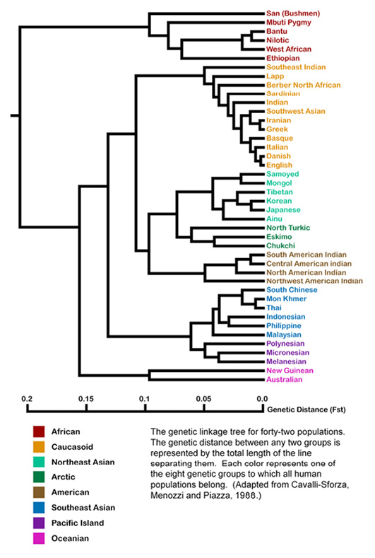
Fig. IV.2 Genetic Tree of Human Populations, “Adapted from Cavalli-Sforza, L.L., Menozzi, P. & Piazza, A,. [sic] Reconstruction of Human evolution: Bringing together genetic, archaeological, and linguistic data, 1988”. Created by Jonathan Kane (2009 [version between 17 July 2011 and 7 September 2023]). Wikimedia, CC BY-SA 4.0, https://commons.wikimedia.org/wiki/File:Populations.png
Prior to September 2023, my Figure IV.2 was identified on Wikimedia Commons as an adaptation of a population tree by Cavalli-Sforza, Menozzi, Piazza, and Joana Mountain published in the year 1988 (Fig. 1, 6003) reproduced below as Figure IV.3. This tree was again based on classical rather than DNA markers, but, compared to the early study published in 1965, far more alleles sampled across “the world aborigines” (6002) were used. For the original tree of 1988, archeological dates for steps in human expansion across the globe were taken to calibrate genetic differentiation as well as to check for constant rates of genetic evolution. Thus, this tree once again is analogized to a map of human migration across the globe in the shape of bifurcating paths from a common origin.
Fig. IV.3 “Comparison of genetic tree and linguistic phyla”. Luigi Luca Cavalli-Sforza, Paolo Menozzi, Alberto Piazza, et al., “Reconstruction of Human Evolution: Bringing Together Genetic, Archaeological, and Linguistic Data” (Proceedings of the National Academy of Sciences of the United States of America 85.16 [1988]: 6002–6006), Fig. 1, p. 6003. © The Authors, all rights reserved.
Like Haeckel, Cavalli-Sforza saw in languages a powerful tool to not only identify or classify ‘populations’ – the abbreviation “ling.” in the tree of Figure IV.3 stands for the practice of pooling populations on the basis of language. Cavalli-Sforza also considered the evolution of languages – their common origin and differentiation – as analogous to the evolution of populations (Sommer 2016a, 277–78). The original tree of 1988 that was said to underly Figure IV.2 was thus part of an image that indicated parallels between linguistic and genetic evolution (even if the latter was considered as proceeding more slowly), in that the genetic tree was merged with a linguistic tree to its right (see Figure IV.3). The tree of language evolution as shown in Figure IV.3 supported the story incorporated in the tree of human populations: it suggested that “linguistic phyla” like human populations shared a common origin, but had separated at one point (more or less) far back in time and not mixed again. According to the authors, modern humans had also not interbred with the local archaic humans they encountered in their new homes ‘out of Africa’; rather, they came to replace the previous inhabitants (Cavalli-Sforza et al. 1988, 6005).
Thus, possible converging processes in human evolution and history, interactions between languages and peoples, were downplayed by choosing the imagery of the tree. A bifurcating diagram – a tree – cannot truly convey genetic exchange. Possible genetic admixture could be hidden in short branches in trees in which the total length of branches from root to present populations was not forced to be equal by the method of average linkage (or maximum likelihood) that assumes constant mutation rates. With the latter methods, an admixed population would be placed in a tree closely to the parent population with which it is genetically most similar. For the genetic population tree in Figure IV.3, however, it was once again assumed that human populations are discrete, homogenous entities that have had independent evolutionary histories after the last population split (Cavalli-Sforza et al. 1988, 6004). In fact, Cavalli-Sforza and colleagues did only use data from populations that they considered to be “aboriginal, with little or no admixture” (6003). Such trees therefore created a perfect order in what would turn out to be the much messier affair of human genetic history and diversity.
This perfect order was highlighted even more strongly by a Jonathan Kane when he supposedly worked on the originally black and white image published in 1988 (Figure IV.3) to produce Figure IV.2. Kane introduced colors to visually group different populations to eight ‘intuitive’ larger entities like “American” “to which all human populations belong” (Kane in caption of Figure IV.2). In doing so, he upheld labels, including “Caucasoid”, that we have seen established in Part I and that were also used by Cavalli-Sforza and colleagues in Figure IV.3. The very tree shown in Figure IV.2 is actually reproduced on the Wikimedia Black Lives Matter Talk, where such genetic diagrams are criticized as racist for the use of terms like “Mongoloid”, “Australoid”, “Caucasoid”, or similar expressions for Black Africans.1 While we have seen and will further notice that there are issues associated with such trees other than the labels handed down from early racial anthropology, it is interesting to have a closer look at this issue.
In the original tree of 1988, Cavalli-Sforza and colleagues did use the term “Caucasoid” (Figure IV.3), but the branching within that group, and elsewhere, looks somewhat different than in Figure IV.2. In fact, it seems as though, contrary to the acknowledgement in the caption (until 7 September 2023), the 1988 tree had not been the template for Figure IV.2 at all. Cavalli-Sforza, Menozzi, and Piazza themselves reused their tree of 1988 in their 1994 classic The History and Geography of Human Genes (Fig. 2.3.2.A, 78) nearly unchanged, with the small alterations approaching Kane’s tree. The names for higher clusters, including “Caucasoid”, are still included. Furthermore, in The History and Geography of Human Genes, there is a second tree given below (Fig. 2.3.2.B, 78). This image is again in black and white, but it shows the exact same clustering as Figure IV.2, this time without using the term “Caucasoid” or naming any other of the higher clusters. It therefore seems as if Kane created an amalgam of the two trees of 1994, joining the components of both that were most to his liking, rather than having been inspired by the original of 1988. From Cavalli-Sforza’s and colleagues’ Figure 2.3.2.A, he took the term “Caucasoid” and in general the naming of higher clusters which he highlighted with colors; from their Figure 2.3.2.B, he took the splitting pattern, including the breaking down of the European group (Cavalli-Sforza, Menozzi, Piazza 1994, Fig. 2.3.2.A and Fig. 2.3.2.B, 78). In fact, before 2011, the caption of Figure IV.2 referred the adaptation not to the original tree in Cavalli-Sforza et al. (1988), but to The History and Geography of Human Genes (Cavalli-Sforza, Menozzi, and Piazza 1994).2
The appendix of The History and Geography of Human Genes, too, contains a colored image, one that superimposes the genetic tree of Figure IV.3 and a mirrored linguistic tree on the world map. However, rather than Kane’s distinct colors of Figure IV.2 that emphasize the clear boundedness of continental clusters, Cavalli-Sforza’s, Menozzi’s, and Piazza’s tree-map has colors blend into each other to visualize gradients (color map 8). Like Petrus Camper’s and Johann Friedrich Blumenbach’s skull series, these colored maps are horizontal and dynamic; they merge human varieties into each other. That genetic trees could be misread, because they suggested human populations to be clearly demarcated entities that evolved in isolation, and because they continued the labelling from early physical anthropology, becomes even clearer when following the story of Figure IV.2 one step further. Looking more closely at the publication history of Figure IV.2 on Wikimedia, one realizes that the citation initially, up to October 2009, did not refer to either Cavalli-Sforza et al. (1988) or Cavalli-Sforza, Menozzi, and Piazza (1994) as the direct source of the tree, but to Berkeley Emeritus-psychologist Arthur Jensen’s The g Factor: The Science of Mental Ability (1998, Fig. 12.1., 429).3
In this book, Jensen brought as much of the available ‘evidence’ as feasible to bear on the claim that IQ correlates with social achievements such as in education and occupation, and that it also correlates with ethnicity (and gender). It was one in a series of books Jensen was publishing on the topic of intelligence and, like Reginald Ruggles Gates before him, he considered himself in the footsteps of Francis Galton (Jensen 1998, xi). The biggest gap in IQ according to ‘this evidence’ separated the “[W]hite” from the “[B]lack” communities in America (350). Jensen postulated that this seemingly markable difference in IQ had not changed since IQ was being measured and had nothing to do with any cultural bias in the tests. Furthermore, the average differences in IQ that the tests revealed were claimed to be an expression of how strongly they measure g (meaning ‘general intelligence’, or abstract thinking and problem-solving) – the more g-loaded a test, the greater would be the difference in “[B]lack and [W]hite IQ” (352). To make these claims look like hard scientific evidence, they were bolstered with measures, formulae, and diagrams, such as a juxtaposition of the normal curves of IQ distribution for “[W]hite and [B]lack populations” (Fig. 11.1., 356; 350–530).
Cavalli-Sforza’s and colleagues’ population-genetic diagrams came in when Jensen wanted to provide the reasons for the discrepancies in “[B]lack and [W]hite IQ”. Introducing The History and Geography of Human Genes (Cavalli-Sforza, Menozzi, and Piazza 1994) as “the most comprehensive study of population differences in allele frequencies” (Jensen 1998, 428), or of genetic distances between populations, Jensen reproduced the “average-linkage tree for 42 populations” from The History and Geography of Human Genes (Cavalli-Sforza, Menozzi, and Piazza 1994, Fig. 2.3.2.B, 78; Jensen 1998, Fig. 12.1., 429). So this is probably where Kane originally took it from. Between this tree and the tree already published in 1988 for the same set of populations, but using a different distance method (Cavalli-Sforza, Menozzi, and Piazza 1994, Fig. 2.3.2.A, 78; Figure IV.3 above on the left), Cavalli-Sforza, Menozzi, and Piazza observed a remarkable similarity, with the first fission unmistakably separating “Africans from non-Africans” (1994, 77). This is what Jensen so clearly saw, indeed what everybody clearly sees, especially in those tree diagrams in Cavalli-Sforza, Menozzi, and Piazza (1994, 79, and Fig. 2.3.3, 80) that only relate the larger geographical units. Jensen also reproduced one of these as shown in Figure IV.4. In these trees, Cavalli-Sforza and colleagues used the term “Caucasoid”, but in the text they disclaimed that “we […], unlike others […] [sic] do not give to the clustering obtained in the tree of figures 2.3.2 or 2.3.3 any ‘racial’ meaning […]” (1994, 80).
However, also without the use of old racialist or racist labels, trees misrepresent or downplay intra-human kinship – a fact the authors of The History and Geography of Human Genes were aware of:
In conclusion, there has probably been enough intermingling of the clusters that a network representation (i.e., a tree with interconnections between branches) would be highly desirable. But the tree in figure 2.3.3 is probably the best result that can be obtained using present methods, that is, a phylogenetic tree without interconnections. (Cavalli-Sforza, Menozzi, and Piazza 1994, 81)
For Figure 2.3.3, Cavalli-Sforza, Menozzi, and Piazza had clustered the already repeatedly artificially pooled forty-two populations into nine geographic groups. This kind of clustering was unusual, however. The usual procedure was not to join all populations in clusters, but to pick a single, highly localized population to represent each cluster or a vast geographic region. The latter method of sampling and analyzing human variation made it more tree-shaped because the geographically and genetically intermediate populations were not part of the study and thus “links between branches are less likely to be observed” (Cavalli-Sforza, Menozzi, and Piazza 1994, 81). In other words, “[i]t is doubtful whether the sharpness thus acquired is real. Considering that the nine large clusters we have used represent large, geographically contiguous regions […], it may be almost surprising that the tree we obtained is reasonably reproducible in different bootstrap samples” (ibid.).
It is this “sharpness”, however, that was attractive to Jensen. What was important to Jensen in the tree he reproduced from The History and Geography of Human Genes (and Kane from him) was that “the greatest genetic distance […] is between the five African groups […] and all the other groups” (Jensen 1998, 428), and that he could steer the reader
to “[n]ote that these clusters produce much the same picture as the traditional racial classifications that were based on skeletal characteristics and the many visible physical features by which non-specialists distinguish ‘races’” (ibid.). In also reproducing one of the diagrams from The History and Geography of Human Genes (Cavalli-Sforza, Menozzi, and Piazza 1994, 79) in which only the bigger population clusters – or in Jensen’s parlance “the traditional racial classifications” – were linked, or rather separated, in a tree diagram, Jensen rendered both of these claims more fact-like (see Figure IV.4).
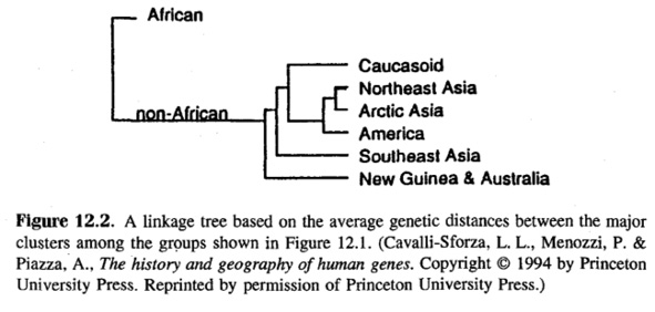
Fig. IV.4 Diagram reproduced in Arthur Jensen, The g Factor: The Science of Mental Ability (Westport, CT: Praeger, 1998), Fig. 12.2., p. 430 (all rights reserved; used with permission of Princeton University Press, from Luigi Luca Cavalli-Sforza, Paolo Menozzi, and Alberto Piazza, The History and Geography of Human Genes [Princeton: Princeton University Press 1994], p. 79; permission conveyed through Copyright Clearance Center, Inc.).
To bolster his claims further, Jensen drew on yet another “wholly objective mathematical procedure” (1998, 430), namely principal component analysis. Its introduction into population genetics had been based on a computer program that allowed the representation of genetic variation in a principal component synthetic graphic analysis from a matrix of genetic differences.4 Principal component analyses are used to detect structure in the relationships between variables, to discover patterns hidden in data. They reduce the dimensionality of data without losing a significant amount of information. To reduce the complexity in the data and the number of factors possibly affecting it, these analyses search for those factors that affect the data most. The first principal component thus accounts for the greatest variance in the data, in our case the largest amount of the genetic difference found, and so forth. In the ideal case, the tree and principal component graphic analysis would be closely related, with the first split in the tree corresponding to the separation of populations by the first principal component (Sommer 2016a, 263–64).
While having this relationship to trees, principal component analyses are maps, most obviously so when synthetic maps are created on their basis in which allele frequencies are transformed into scaled deviations from the sample mean and plotted on the geographical regions from where the samples originated. Figure IV.5 represents such a map of the first principal component for the panhuman analysis carried out in The History and Geography of Human Genes. It was seen to agree with the first branching of the general genetic tree that splits “Africans” from “non-Africans” (Cavalli-Sforza, Menozzi, and Piazza 1994, 135). (The ‘anomaly’ that western Europe clustered with Africa was ‘corrected’ in lower principal component analyses.) In this way, principal component analyses produce grades of gene frequencies across the globe: they are used as a tree, map, and narrative of expansion.
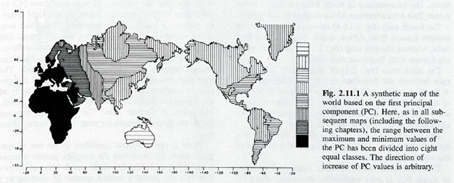
Fig. IV.5 “A synthetic map of the world based on the first principal component” (all rights reserved; used with permission of Princeton University Press, from Luigi Luca Cavalli-Sforza, Paolo Menozzi, and Alberto Piazza, The History and Geography of Human Genes [Princeton: Princeton University Press 1994], Fig. 2.11.1, p. 135; permission conveyed through Copyright Clearance Center, Inc.).
In addition, Cavalli-Sforza, Menozzi, and Piazza (1994, colored maps in appendix) combined the first three principal components to create a color map of the world that was color-coded for “Africans (yellow), Caucasoids (green), Mongoloids, including American Indians (purple), and Australian Aborigenes (red)” (136). While this visualization technique could not inform about expansions (contrary to single components), its coloring suggested “admixtures between Africans and Caucasoids in North Africa and between Caucasoids and Mongoloids in Central Asia” (138).5 However, Jensen (1998, Fig. 12.3., 431) made use of Cavalli-Sforza’s and colleagues’ principal component analysis to show that taking the first two components as axes, the populations clustered and were neatly separated from each other in the diagram to form “the ‘classic’ major racial groups – Caucasians in the upper right, [Black Africans] in the lower right, Northeast Asians in the upper left, and Southeast Asians (including South Chinese) and Pacific Islanders in the lower left” (Jensen 1998, 430) (see Figure IV.6). Cavalli-Sforza and colleagues therefore referred also to this sort of diagram as a “Principal-component map” (Cavalli-Sforza, Menozzi, and Piazza 1994, Fig. 2.3.5., 82). The conclusion Jensen wanted to draw from the population-genetic trees and maps that he handpicked from The History and Geography of Human Genes was that the genetic differences between populations largely explained the phenotypic differences between “races”. Natural selection would have worked on gene frequencies leading to differences in physical, behavioral, and mental capacities between the populations (1998, 432–33).
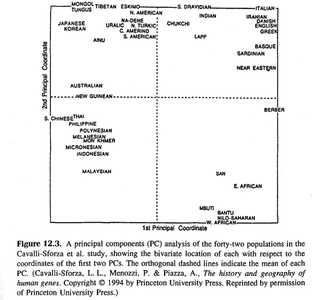
Fig. IV.6 Principal component map reproduced in Arthur Jensen, The g Factor: The Science of Mental Ability (Westport, CT: Praeger, 1998), Fig. 12.3., p. 431 (all rights reserved; used with permission of Princeton University Press, from Luigi Luca Cavalli-Sforza, Paolo Menozzi, and Alberto Piazza, The History and Geography of Human Genes [Princeton: Princeton University Press 1994], Fig. 2.3.5, p. 82; permission conveyed through Copyright Clearance Center, Inc.).
This constituted an abuse of Cavalli-Sforza’s and colleagues’ research, for whom the genetic differences between populations were less phenotypical or due to natural selection. Directly relating to Jensen’s more specific assertions, Cavalli-Sforza had been among those who early on opposed the notion that social structure and cultural potential were genetically based. Cavalli-Sforza and his Stanford colleague, the mathematician Marcus Feldman, tried to refute such allegations with a model for characteristics like IQ that took into account cultural influences (e.g., Cavalli-Sforza and Feldman 1973; for a book-length treatment of cultural transmission, see Cavalli-Sforza and Feldman 1981). This was also directed at policy suggestions such as ‘racial’ segregation in education or Jensen’s claim that compensatory education programs were misguided because the answer to the question “How Much Can We Boost IQ and Scholastic Achievement?” (1969) was ‘barely’. The 1960s not only witnessed the civil and minority rights movements, but also a renewed racism in Europe and the United States, one pillar of which was the resurfacing idea of ‘race’-related differences in IQ (Sommer 2016a, 290–91). Jensenism, the belief that IQ and ‘race’ are correlated, was not only fought on paper, but publicly debated (on the controversy, see Panofsky 2014, 71–101). Jensen was symbolically and physically attacked and at times protected by bodyguards due to death threats.
This controversy actually never ended. Following the debates and aggressions of the 1970s, there was the uproar provoked by The Bell Curve (Herrnstein and Murray 1994), which positively received Jensenism, and in the wake of which Jensen presented his The g Factor (1998). The psychologist Richard Herrnstein and the political scientist Charles Murray asserted that differences in social status between classes and ethnic groups were no longer due to socioeconomic privilege, but that the American society had largely become socially stratified according to differences in intelligence that were highly heritable (Sommer 2016a, 377). Adam Miller (1994) and others have shown how the scholarship on differential intelligence has been linked to the Pioneer Fund (founded 1937) that sponsored research on genetically based differences between the ‘races’. Its constituents promoted restrictions to immigration and variants of segregation to curtail intermixture, and worse. At the time of Miller’s writing, Jensen, who strongly influenced the public debate about ‘racial’ abilities, seemingly explaining underrepresentation of African Americans and thus justifying their discrimination, had received over a million dollars from the Pioneer Fund. Scientists associated with the racist journal Mankind Quarterly that we encountered in Part III in connection with Gates also figured among the recipients. William H. Tucker (2002) could evidentially link the Pioneer Fund to attempts at repatriating African Americans and to sabotage the Civil Rights Act. Books like The Bell Curve used as fodder racist research that was sponsored by the Pioneer Fund.
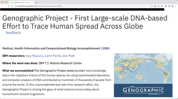
Fig. IV.7 Screenshot taken from a website of the Genographic Project showing a genetic tree-map (https://researcher.watson.ibm.com/researcher/view_page.php?id=6909 [link no longer active], last accessed 17 July 2023).
Cavalli-Sforza was appalled by such scholarship – but Jensen, and to a certain extent Kane, read Cavalli-Sforza’s and colleagues’ findings, particularly their diagrams, as not simply objectively demonstrating clear-cut differences between human groups in the way a tree shape or a principal component map can, but, in combination with old racial labels, as corroborating racial or racist classifications and stereotypes. The claim for neutrality by human population geneticists like Cavalli-Sforza that seemed to be strengthened by the diagrams is clearly put in jeopardy by the service these trees and maps could render to racist science and politics. Cavalli-Sforza was not only a central driver of human population genetics, he also played an important role in the public perception of this knowledge, not least through trees and maps. He rendered The History and Geography of Human Genes (Cavalli-Sforza, Menozzi, and Piazza 1994), the standard work for specialists, more accessible in Genes, Peoples, and Languages (Cavalli-Sforza 2000 [1996]). Throughout his career, Cavalli-Sforza took great efforts to acquaint audiences with the genetic histories his science produced, in popular writings in different languages as well as through exhibition. Last but not least, he co-initiated the Human Genome Diversity Project (HGDP) and was involved in the Genographic Project – large endeavors aimed at finalizing the map of human population migration and the tree of their relatedness (see Figure IV.7) (Sommer 2015a, 123–35; 2016a,
Part III).
The call for the HGDP was issued in 1991 and was linked to the canonical The History and Geography of Human Genes (Cavalli-Sforza, Menozzi, and Piazza 1994). The concerted population-genetic effort should not only include classical markers and the new autosomal and mtDNA systems, but also advance the Y-chromosomal system with its own tree, map, and narrative. With the Genographic Project, the Y chromosome became a star, and it was especially the Genographic Project and genetic ancestry tracing companies that have made the human population-genetic diagrammatics known to a wide range of people (see Figure IV.7). The Genographic Project was popularized in books and films, it was associated with citizen science, and the (western) people who opted to partake in the project by having their genome analyzed for money were referred to as participants. When the project terminated, there were over one million such participants in more than 140 countries. At the same time, both the HGDP and the Genographic Project were criticized from diverse sides, including the Indigenous Peoples Council on Biocolonialism. The projects were seen as exploitative in the use of Indigenous peoples as ‘objects of scientific study’ in continuation of nineteenth-century anthropological collecting as treated in Part I. The impression was that researchers would collect bodily material for the realization of their own goals, such as generating histories that might even contradict Indigenous knowledge (e.g., Sommer 2016a, Chs. 13 and 14; on the legacy and ethical issues of the HGDP see in particular Reardon 2005).

Fig. IV.8 Screenshot taken from a website of the genetic ancestry testing company Family Tree DNA (https://www.familytreedna.com/products/y-dna [image no longer online], last accessed 22 February 2024, with kind permission from FamilyTreeDNA).
The tree and map to render the genealogy and history of human groups thus had a particular revival in human population genetics and its popularization in public projects, books, and films, as well as through its commercialization in ancestry tracing firms. I end this chapter with a screenshot from a genetic ancestry tracing company that shows how a paying costumer might be linked to a branch in the panhuman family tree spread on a map originating from ‘Y-chromosomal Adam’ in Africa (the counterpart of mitochondrial Eve) (see Figure IV.8). While Figure IV.8 paints a simple picture indeed, Figure IV.7 actually hints at the fact that the tree-on-a-map received more and more branches, increasingly gaining in complexity and losing unidirectionality. Do we still see a tree, or is it a net? It is time to look more closely at the issue of admixture. Let me remark at this point that the sources I analyze throughout Part IV may use terms like ‘admixture’ differently and do not always clearly differentiate between diverse ways in which ‘genes’ can move from one population into another. The term ‘gene flow’ generally refers to the exchange of genetic material between populations, for example through migration. ‘Admixture’ in a stricter sense implies that two or more populations that have been isolated from each other interbreed to give rise to a new population with a mixed gene pool. In Chapter 17, it is mostly but not exclusively the latter which is at stake.
1 “Talk:Black Lives Matter,” Meta-Wiki, https://meta.wikimedia.org/wiki/Talk:Black_Lives_Matter, last accessed 18 January 2023. Cavalli-Sforza and colleagues were not alone in these respects. This may be indicated by the work of another influential population geneticist, Masatoshi Nei, who studied human molecular evolution and developed statistical methods from the 1970s. Nei and colleagues showed that “the net gene differences between the three major races of man, Caucasoid, [Black Africans], and Mongoloid, are much smaller than the differences between individuals of the same races” (1985, 41). Nonetheless, the interracial genetic differences were seen to correspond to ‘racial divergence times’ of up to around 100,000 respectively 50,000 years. Furthermore, while gene flow was acknowledged as an important factor in human evolution, Coon was evoked in support of isolation between the “major races”, and on the basis of protein as well as DNA data, phylogenetic trees were built for these as well as for smaller populations.
2 See file history on https://commons.wikimedia.org/wiki/File:Populations.png (30 December 2009), last accessed 16 January 2023.
3 See file history 3 July 2009 on https://commons.wikimedia.org/wiki/File:Populations.png, last accessed 16 January 2023.
4 It seems that, mathematically speaking, Karl Pearson (1901) introduced the basic ideas underlying principal component analysis.
5 For a critical discussion of reading principal component maps in terms of human expansions, see François et al. 2010.