Introduction
© 2024 Marianne Sommer, CC BY-NC-ND 4.0 https://doi.org/10.11647/OBP.0396.00
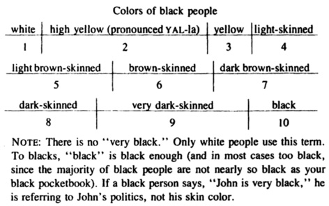
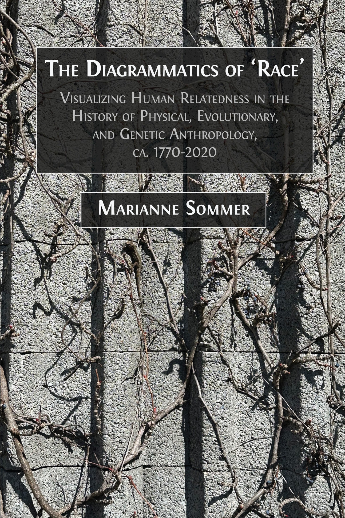
Fig. 0.1 “Colors of [B]lack people”. By Fran Ross, from OREO, p. 5, © 1974 by Frances D. Ross, all rights reserved. Reprinted by permission of New Directions Publishing Corp.
Fran Ross begins her by now classic novel Oreo (1974) with the shock of ‘racial mixing’. The shock hits both sides of the family, the African American and the Jewish. Immediately, however, Ross complicates this ‘racial mixing’ by giving more detailed information on the African American family members’ shades of skin color. Continuing the stinging satire, she brings to the aid of the reader a diagram, which should allow to color the book’s characters throughout the story (Ross 1974, 5; see Figure 0.1). Oxymoronically titled “Colors of [B]lack people” (ibid.), the numbers 1 to 10 refer to a particular shade from “white” to “black”, with attributes like “high yellow”, “brown-skinned”, and “very dark-skinned” in-between. Throughout the novel, the characters practice grotesque physical anthropology, when they make far-fetched correlations and use hand-made evolutionary classifications. They grapple with ‘race’ as a fabric made up from the threads of social systems, personal experiences, common sense, and scientific knowledge.
Ross’ diagram of skin colors is part of what I refer to as a diagrammatics of ‘race’ – that is, the construction and representation of ‘races’ and their relations through diagrams. Figure 0.2 represents a diagram that was actually used in the study of ‘racial crosses’. It was designed by the geneticist and anthropologist Reginald Ruggles Gates, one of the figures of interest in this book. Gates explained:
A colour chart of skin colours, derived entirely from [Black people] X White [people], was published as the frontispiece to Pedigrees of [Black] Families (Gates 1949). The skin colours were originally painted on canvas by a portrait painter, and afterwards reproduced on paper, using the spectrophotometer to obtain the correct values in each wave-length of the spectrum. A number of spectrophotometer reflectance curves were also published (Gates 1952) of various [Black persons] and Chinese.1
This provides some insight into the practice of diagrammatic anthropology. Gates’ diagram was a tool in the establishment of ‘races’ and their relations to each other, or their classification. In a letter to an anthropologist Gates added: “[T]he frontispiece of the book is a colored plate which reproduces the skin color of nine individuals ranging from pure black to white”.2 As we learn from the original caption of Figure 0.2, number 9, “the skin color of a [W]hite person”, was taken from Gates himself. This indicates that such diagrams may provide an identity to the anthropologist in differentiation from various ‘others’, and that the resulting structure is hierarchical – Gates turned himself into the representative of the highest number, respectively of the lightest shade. That such tools circulated and were discussed between researchers is further demonstrated by the fact that the sheet depicted in Figure 0.2 is taken from the papers of Gates’ colleague Earnest Hooton at Harvard University’s Peabody Museum archives, among his correspondence with Gates.
Fig. 0.2 A color chart of skin colors (995-1, Earnest A. Hooton Papers, Peabody Museum of Archaeology and Ethnology Archives, Harvard University,
I. Correspondence, G, Correspondence R. Ruggles Gates, Box 10, Folder 4)
© Peabody Museum, all rights reserved, reproduced by kind permission.
Such diagrammatic tools and their production of entities like “pure [B]lack” people are satirized by Ross when she captions her diagram of “Colors of [B]lack people” with the note: “There is no ‘very black.’ Only [W]hite people use this term. To [Black people], black is black enough […]” (1974, 5). In this book I am interested in diagrams of this kind – in what I refer to as relating diagrams. As Figure 0.2 illustrates, relating firstly refers to the practice of producing particular (hierarchical) relations between human types; secondly, it entails that these types themselves come into being through this diagrammatic practice; and thirdly, relating means ‘storytelling’. The last sense reminds us that also diagrams do not stand for themselves. They need to be studied in relation to text, as the indented quote above, with its important information on the production and context of Gates’ color chart, suggests. However, we will see that diagrams may also incorporate stories. The third meaning of relating further highlights that diagrams themselves may be of a verbal nature. We will encounter this phenomenon throughout the book, for example when I enquire into the role of language in conveying diagrams of relatedness, such as the scale of being and the tree of life.
While Ross suggests that the methods of racial anthropology have come to inform our everyday lives in which we constantly classify, even if unconsciously, the human beings around us, it was far from obvious that the diagrammatic method would be at the core of what was defined as anthropology or ethnology in the decades around 1800. In Part I, I ask how diagrams were integral to a certain approach to the study of human varieties. I focus on the very beginnings of physical anthropology to show how a decidedly diagrammatic tradition was established in competition with the historical-comparative method. I discuss a wide range of diagrammatic imagery that was introduced to produce human ‘races’ and their relations in the first place, such as geometric renderings of skull outlines, in which the lines for comparative measurement might be shown, skull superimpositions, and tables presenting craniometric results for different ‘races’. I also address the violent practices behind such diagrams. Indeed, in the context of imperialism and colonialism and the concomitant atrocities of slavery and genocide, rather than aiming at the creation of kinship, these diagrams were developed to deny close affinities between human groups. Contrary to the long-standing, religious image of the human family that also underlay early anthropology, this new diagrammatic approach could support polygenism and thus work for the justification of ‘racial’ exploitation and cruelty, even though there was no universal association of either polygenism or monogenism with a specific approach to anthropology (or in fact a specific politics).
The diagram that has become dominant in the presentation of a particular understanding of human evolutionary history and diversity is the tree structure. At the same time, trees did not stand alone, but depended on the continuation of other diagrammatic techniques, such as those discussed in Part I, which were imported from physical anthropology into evolutionary anthropology and paleoanthropology. How the icon of the family tree made it into anthropology, or, better, from which existing visual techniques it was imported, is unclear. Rather than uncovering direct connections to the history of tree diagrams in other cultural realms like religious and secular genealogy or animal breeding, scholars have so far pointed to general discursive and visual formations (Bouquet 1996). The same holds true for the early attempts to bring organismic diversity in general under the order of the tree (e.g., Gontier 2011; Hellström 2012).
The use of trees also to depict intra-human relations entered anthropology independent of an evolutionary understanding. In Part II, I use the first such image that I have found, dating from 1857, to discuss this diagram’s links to religious imagery like the mappa mundi, the tree of life, and the tree of Jesse, to the hierarchical scale of nature, as well as to other diagrammatic techniques that were used in natural history. The genealogical conception of humanity, which predates the beginnings of anthropology in the eighteenth century, has long been part of Christian cosmology. Also already present in the Christian worldview was the differentiation of humanity and the associated prioritization of certain branches of the tree (Hieke 2003). The human family tree that is so central to our understanding of relatedness within humankind, in medieval and early-modern depictions indicating Noah and the branches emanating from his sons, too, is always both uniting and dividing. The genealogical perspective must be regarded as one inspiration for the transfer of this powerful diagram from the realm of individual descent to panhuman kinship (with the sons of Noah standing for ‘nations’).
It was this thinking in terms of genealogy that led Charles Darwin to move from human unity to a genealogical conception of the entire living world. Of course, by that time, tree iconography had become most prominent in the practice of representing family genealogies, which increased in importance in the early modern period for royal and princely families, nobility, and urban elites. As I discuss in Part II, Darwin did widely experiment with tree-like shapes, but he did not visually subdivide humans in this way. It was Ernst Haeckel who was prone to excessive and racist phylogenic treeing. To envision the use of the family tree in anthropology as simply the natural continuation of its application in diverse cultural contexts or in natural history and biology is inadequate. Rather, this transfer requires not only explanation but also investigation into its epistemic and political consequences. This transmission shapes human relatedness in three fundamental ways.
First, the tree diagram minimizes variability within taxa. This is why the application of the image that captures kinship between individuals to the relations between species and higher taxa is, in its tendency, typological. In place of individuals, we find entire groups that might be symbolized by species and genera names or even by icons like types of skulls. The same holds true for trees that include inner-human variation. These additionally run the risk of suggesting species status for the human varieties. Tree diagrams therefore maximize the distance between human groups and can even express polygeny. Thirdly, such trees might represent a narrative of local origin and subsequent global distribution. The shape of the tree, sometimes actually projected on a map, therefore communicates that human differentiation was the result of separation through migration and took place without intermixture: human groups split and thereafter evolved in isolation. Thus, the two tendencies of the tree diagram – to minimize variability within, and maximize distance between, human groups – are enhanced through the underlying (or accompanying) narratives. The human family tree can convey the impression of ‘pure races’ or even separate human species.
There actually existed theories of human classification and evolution in the history of anthropology that corresponded to these underlying notions. Sometimes explicitly drawing on Haeckel’s phylogenies that are treated in Part II, I show in Part III how some scientists published polygenist diagrams to convey their understanding of intra-human differences up to the middle of the twentieth century. In these visualization practices, the tree shape was increasingly radicalized or decomposed through prolongation of the lines leading to the modern groups that were thereby constructed in hierarchical order. And this is why there have always been critical voices that opposed this kind of thinking with diagrams. Some of these critics related humans differently, for example through the image of a meandering river, a skein, a trellis, a cable, or a net. It is especially during the interwar period that the racial trees of anthropology began to face criticism for being based on a faulty understanding of genetics and evolution, as well as for being racist – a critique that became louder in the aftermath of World War II. Nonetheless, up until that time, ‘human family trees’ were disseminated, expressing the belief in very different living human ‘races’ or even species that had evolved independently of each other, and whose anatomical similarities might be explained by parallel evolution.
While tree-like diagrams can capture important theoretical and methodological elements of the approaches described above, such as typology, evolutionary parallelism, or polygenism and ‘racial hierarchies’, and can visually distance ‘races’ from each other and humans from apes, it is harder to account for the diagram’s success in human population genetics. These new endeavors worked with very different concepts and theories, such as statistical populations marked by genetic variability, that seem to undermine the tree image. Despite the many possibilities to visualize genetic data on human populations, and despite challenges from diverse fields such as biological and cultural anthropology, linguistics, as well as genetics, from the 1960s onwards, a human population genetics developed that was structured by tree thinking and that represented modern human phylogeny in tree diagrams that, to the layperson, suggest independent development of pure populations (Sommer 2015a).
In Part IV, I begin with tree building and mapping in early blood-group studies, before moving on to the history and present of genetic admixture research and the diagrams pertaining to the so-called ‘ancient DNA revolution’. Around 2000, a certain shift in focus took place from the genetic differentiation of populations towards studies of admixture. At the beginning of the third millennium, new theoretical, statistical, and computational approaches could be brought to bear on the organization, analysis, and interpretation of an unprecedented amount of human genomic data. Global genome-wide data was visualized as colored bar plots that showed individual genomes to be mosaics made up of different contributions from several ‘ancestral populations’. While I argue that these relating diagrams still carry notions of originally pure populations, with the advent of ancient DNA studies, the phylogenetic trees of human populations have acquired more and more connecting branches. Since these have even come to connect living humans with archaic lines such as the Neanderthals, the human family tree is in jeopardy. Are we entering the post-Linnean and post-Haeckelian age, in which heterarchical understandings of diversity and net-shaped notions of human relatedness take over? And if so, what political connotations does this shift carry?
In the course of this book, I provide spotlights on the history of diagrams in (physical, evolutionary, and genetic) anthropology. While I am interested in ‘firsts’, that is the possibly first diagrammatics of ‘race’ or the first application of the family tree to produce intra-human diversity, this kind of inquiry is not in the foreground. Rather, I am concerned with the performativity of diagrams: how was human diversity diagrammatically constructed and reconstructed throughout the history of anthropology? Which kind of practices and inferences underlie diverse relating diagrams, and what are their politics? Did the visual strategies of communication capture the theories of the scientists or did they rather convey contradicting meanings? What kind of controversies, if at all, existed regarding the right kinds of diagrams to capture human kinship and evolution, and were these controversies also about politics? Following these guiding questions leads me from the last decades of the eighteenth century to the present day, with a geographical emphasis on Europe and the United States. I look at eurocentric and Western-centric projects of defining humanity, of subdividing and of ordering it, including the concomitant endeavors to acquire representative samples – bones, blood, or DNA – from all over the world.
Thus, my project is part of what some scholars have referred to as a diagrammatic turn (Bogen and Thürlemann 2003, 3). Diagrammatics has in fact been advanced as an interdisciplinary approach in the humanities and social sciences, with its own introductions, overviews, anthologies, and lexica entries (e.g., Bauer and Ernst 2010; Bender and Marrinan 2010; Ernst 2014; Bigg 2016). Yet, despite there being very thought-provoking theoretical treatises (see, e.g., Schneider, Ernst, and Wöpking 2016), historical reconstruction remains sparse (ibid., 7): Hardly any overviews of the cultural history of diagrams exist (see, however, Bonhoff 1993). At the same time, even though historians of science have only rarely focused their attention on diagrams as such (e.g., Kaiser 2005), diagrams are increasingly seen as an important epistemic tool that needs to be addressed on its own (e.g., Lüthy and Smets 2009; Jardine and Fay 2014; Priest, Findlen, and De Toffoli 2018; Sommer et al. 2018; Arni, Sommer, and Teuscher 2023; Sommer, Arni, and Müller-Wille 2023; Sommer et al. 2024). Diagrams have even been pronounced the secret weapons of the scientific revolution (Franklin 2000). One may speak of diagrams as paper tools with Ursula Klein (2003); as inscriptions, the material, performative, and cultural aspects of which matter (e.g., also Rheinberger, Hagner, and Wahrig-Schmidt 1996); or as technologies in the sense of the arduous work of collecting, selecting, and structuring data, as for example in the case of anthropological research (Sommer et al. 2018, 14–15).
Diagrams seem to suggest themselves as tools for the sciences that aim at classifying human groups, because diagrams are inherently about relations – they represent relations and proportions that characterize a phenomenon. However, they are also constructive – they may bring relations newly into being, and they may be informed by and inform ideological conceptions (Stjernfelt 2000). Despite their omnipresence, the role of diagrams in the history of anthropology has so far largely escaped scholarly attention. There are as yet no comprehensive engagements with visual traditions in anthropology beyond the figurative (there are especially engagements with photographs, (prehistoric) life-scenes, and museum exhibitions, see Sommer 2022a). This, coupled with the realization that understanding the functioning of ‘my diagrams’ would need a context of academic exchange between different disciplines, led me to initiate the inter-university project “In the Shadow of the Tree: The Diagrammatics of Relatedness as Scientific, Scholarly, and Popular Practice” that the Swiss National Science Foundation has funded from early 2019 to early 2024 (see Acknowledgements). My own goal regarding diagrammatics is to take diagrams seriously in their mediation between image and text as well as thought and action. I ask what went into them, how they were read and used, and how they circulated. I also endeavor to draw connections between diverse diagrammatic traditions, for example between human family trees and religious and natural-historic imagery. Throughout the book, I engage with specific philosophical-theoretical treatises on diagrams, beginning with Charles Sanders Peirce in Part I.
Prior to embarking on these endeavors, a note on terminology is needed. Throughout the book, I have changed the most offensive designations found in my sources. A particularly harmful term and its derivates I have substituted (including in quotes and publication titles) most often with Black Africans, as it usually appears alongside other geographical denotations. However, there is variation in terminology within individual sources and among different sources. In other cases, African Americans as a substitutive term was more appropriate. I have kept Black and equivalent terms, but capitalized and adjectivized them when applied to people (without also adding inverted commas). I capitalize White, since it does not refer to a real skin color but is a ‘racial’ grouping, even if mostly meant to be one of superiority. I have replaced disparaging colonial names for smaller populations with current usages where a corresponding self-identification exists. However, throughout the book, I have maintained some of the problematic nomenclature in order to show continuities into present times. This also applies to classifications like ‘Caucasian/Caucasoid’ and equivalents, which I maintained in quotes or in inverted commas. I have also retained the noun ‘race’ and the adjective ‘racial’ (again in inverted commas where distance is not already expressed), because the difference to terms like ‘varieties’ or ‘nations’ can be significant. Historical actors like Samuel George Morton, while working with several terms for each of the types they sought to establish, used Americans for Indigenous peoples of the Americas, Australians for Aboriginal Australians, etc. This is informative, as it highlights just how strongly some of them thought in racial terms. White people in contexts of settler colonialism were, in this racialized outlook, still European. One finds this practice sometimes even in current genetic research. Finally, many of the diagrams I reproduce in this book may be disturbing and contain offending language. They are strictly used as quotes or sources and are to be viewed as if in quotation marks.
1 “Heredity in the Races of Man” 1961, King’s College London Archives, Gates, Professor Reginald Ruggles (1882–1962), K/PP65 (hereafter Gates Papers KCL), 4/92/2. The artist Gates was referring to was Ilona E. (Deak-Ebner) Ellinger, who was born in Budapest, Hungary, and gained a PhD from Johns Hopkins University. At the time of the collaboration, she was Professor of Arts at Trinity College, Washington, DC.
2 “To Dr. Juan Comas, Mexico City”, 18 November 1949, p. 3, Gates Papers KCL, 4/81/16.